“CISHAN” is a catering company that possesses several catering brands. The office is located on the top floor of a building in a business park near Xixi Wetland. The company prides itself on a low-key, restrained, serene and rational atmosphere. We hope that in the design, the brand ethos and design concept can be subtly reflected thoughtful material selection, strategic spatial layouts, the interplay of solid and void spaces, seamless indoor-outdoor transitions, the integration of natural landscapes, and the display of antique furniture.
Work is a part of life. In contemporary workspaces, the warmth and homely ambiance are crucial elements that cannot be overlooked. Therefore, beyond the conventional office space design, we integrate diversified spaces to meet different demands, partially domesticize the office space, and make the environment for daily work more comfortable and pleasant. The space circulations are divided into dynamic and static to respectively corresponding to the usage paths for public communication and internal office work.
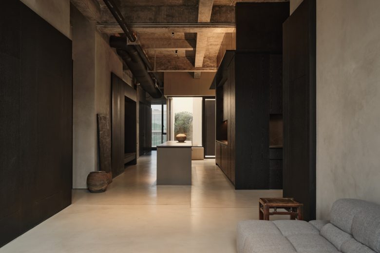
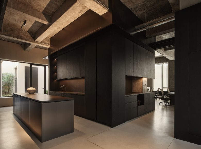
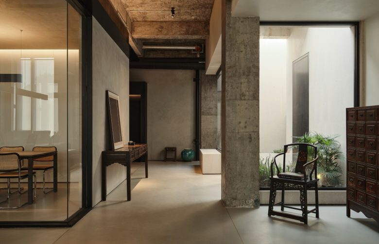
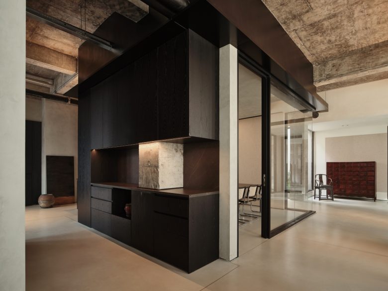
The original building layout features a square and regular column grid structure. We aimed to create an open office environment that seamlessly integrates with the external environment, blending indoor spaces with outdoor nature while maintaining areas of privacy. The overall spatial structure adopts a combination of solid and void. We enclosed a relatively “solid” central island area in the center of the column grid to accommodate small conference rooms, open kitchens, and photocopying storage functions. This multi-functional central island serves as a transition between public and private spaces, separating the public area for reception and communication from the relatively private and quiet office area. The columns are partially exposed, softening the sense of enclosed volume of the central island and allowing the space to flow.
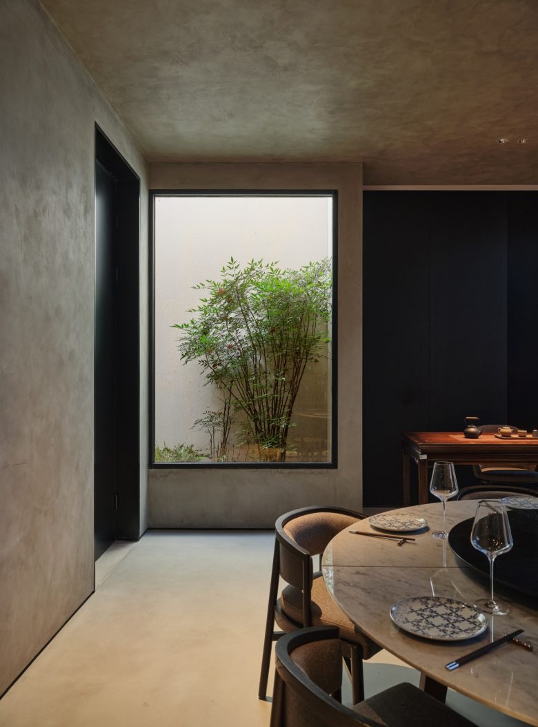
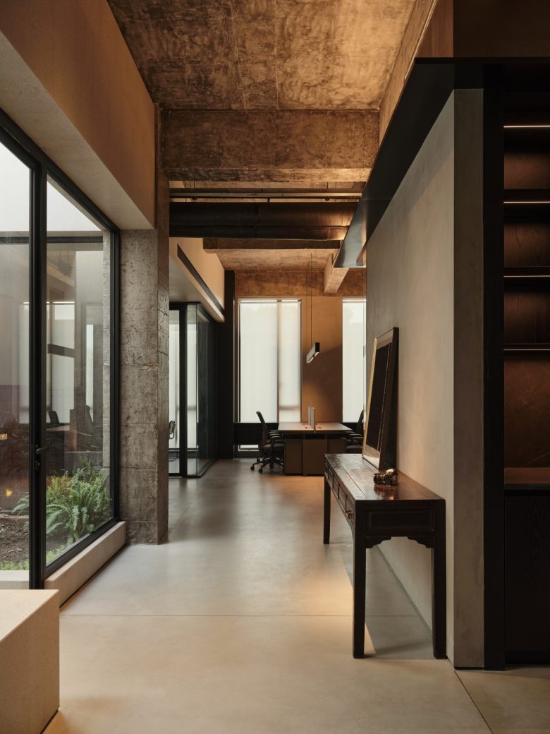
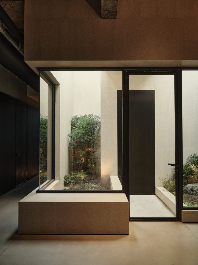
Next to the physical central island is a landscape void space to supplement the lighting, serving as another core element in the office. We hope to create a natural place for the enclosed indoor office space to connect with the outdoors. Utilizing the top-floor advantage, we partially renovated the building to design a sunken courtyard, introducing a skylight that connects the indoor space with the rooftop terrace. The courtyard features varying tree pits to accommodate different plant root systems, enriching the landscape. No matter from the “living room” reception area at the entrance of the elevator hall, through the open kitchen, or from the internal open office area and the aisle leading to the bathroom, you can see this opposite courtyard, and feel the outdoor atmosphere from the interior. The outdoor landscape and the indoor space are both independent yet intricately connected.
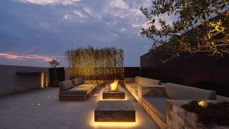
This natural area serves multiple functions, including providing views, lighting, partitioning, and spatial transitions, while also connecting the open office space and the meeting room. To access the meeting room, one must pass through the courtyard via a transitional gray space corridor, offering a unique experience of moving from indoors to outdoors and back. The wall design of the patio is ingenious in its extension to the roof terrace, which not only connects the upper and lower space, but also leaves a courtyard landscape frame scene for the reception room, retaining the privacy. The internal company stairs lead to the rooftop terrace, a completely outdoor space. Instead of using ready-made outdoor furniture, we custom-cast concrete into a fireplace, low tables, seats, and tree pits, backed by steel plate retaining walls and embellished with greenery, creating a multifunctional outdoor area suitable for both relaxation and work-related gatherings.
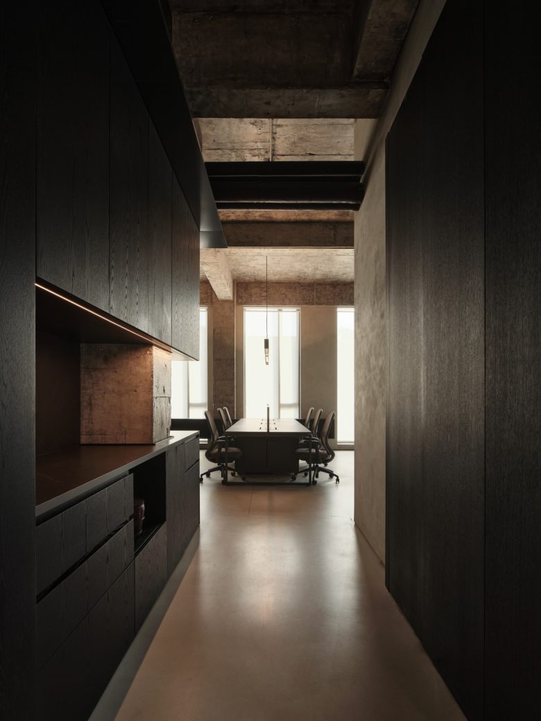
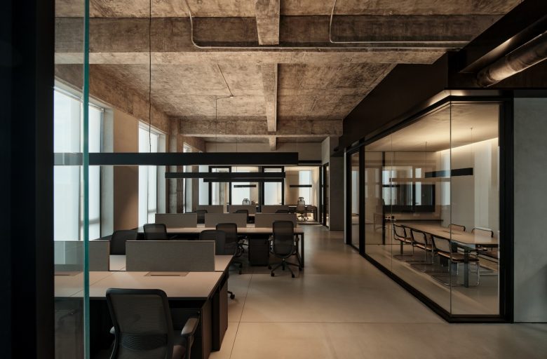
The entire office space employs a ceiling-free design, exposing the original beam structure, with spotlights providing precise lighting where needed. The pendant lights in the open office area offer both upward and downward illumination, creating a warm and inviting atmosphere. The indoor materials are simple and restrained, primarily using wood, artistic paint, and self-leveling cement. The public area’s open kitchen and tea space are wrapped in black wood panels, with black-framed glass facing the open office space. The same wood panel material is used to enclose the pipe shaft opposite the island, creating a semi-enclosed long bench space where people can rest, converse, and interact with the open kitchen. The window-side cabinets in the open office area also use black wood panels, integrated with office furniture, establishing a calm and restrained dialogue between different materials.)
Soft elements in the space come from the owner’s beloved antique furniture collection. The small stool and coffee table in the reception area, the tea table and chairs in the meeting room, the side table next to the light well corridor, and a Ming chair and a set of Chinese medicine drawers at the end of the open office area all subtly balance the office’s rational and rigid elements. Here, the combination of office space and old furniture creates a Zen-like atmosphere, serene with a touch of warmth. Extending the company’s brand ethos, the western restaurant “Shy table” is located on the ground floor of the building. From the top-floor office to the ground-floor restaurant, the design consistently conveys the brand’s restrained and serene image and character, from the overall concept to the finest details.
Designed by STUDIO8 Architects
