
Do Man by killeridea
posted by retail design blog on 2025-07-16
Add to collection

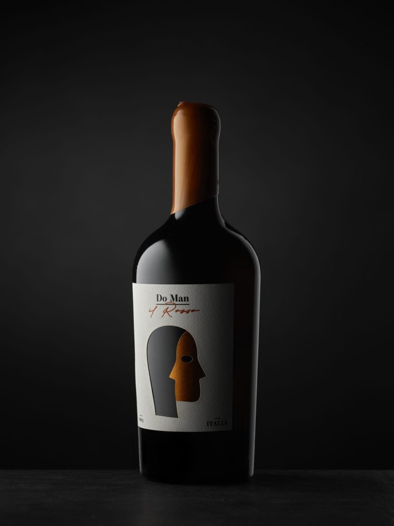
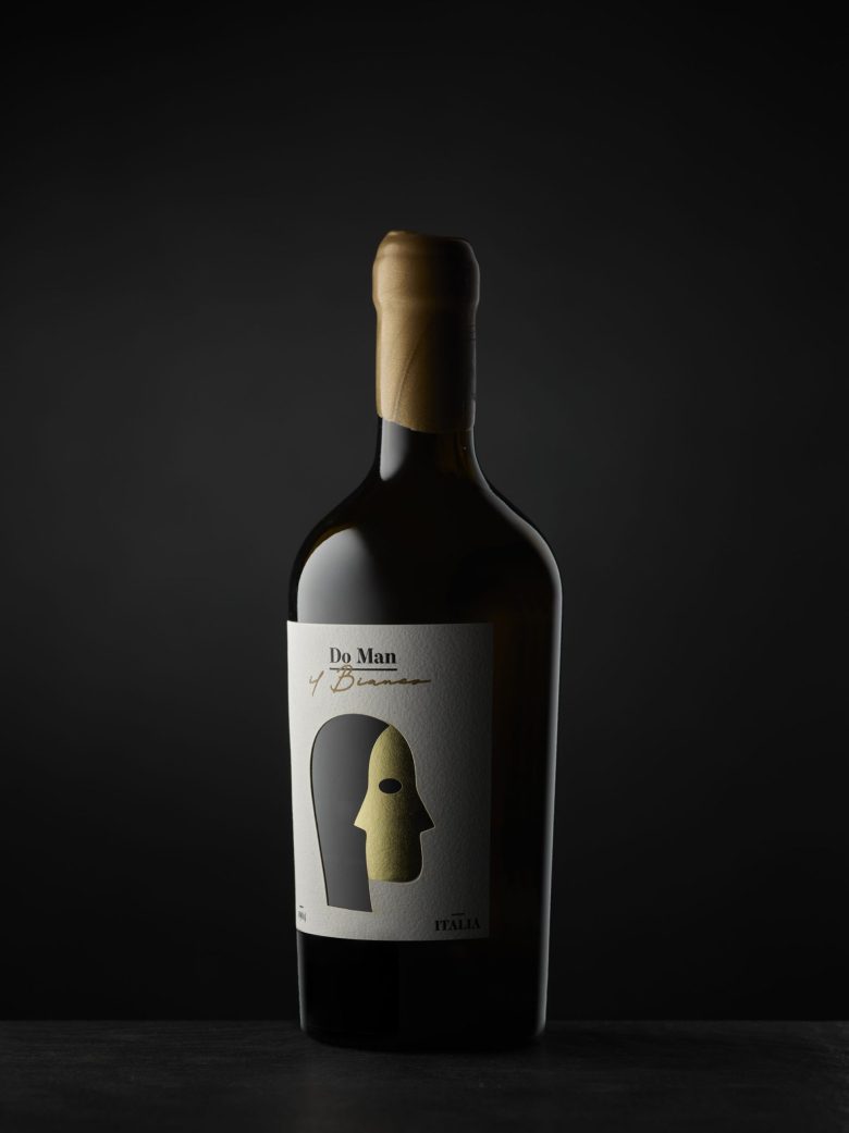
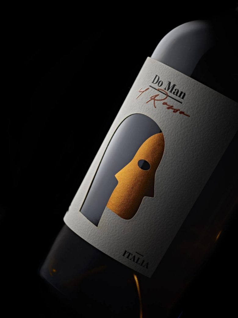
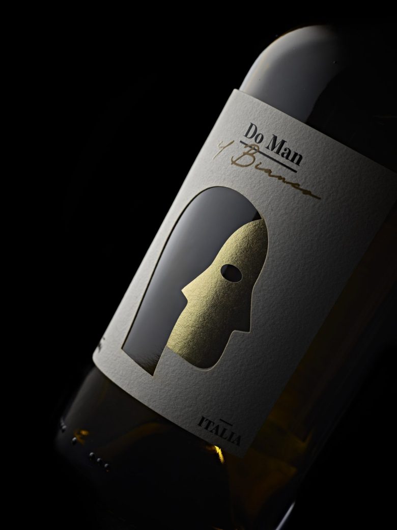
This label was created to tell the story of a collaboration: two people, one wine.
The central visual element is a stylized face—but not just any face. It’s an ambiguous, two-sided figure, built through a clever play of positive and negative space that recalls the principles of Gestalt perception. The dark area on the left, cut out with a laser die, reveals the glass of the bottle underneath—a choice that not only adds depth, but also makes the wine an integral part of the design, as if it were the soul glimpsed behind the face.
The label is made of two overlapping papers: the top one, textured, shapes the outline and silhouette; the bottom one, in gold, reflects the light and adds a sense of value and warmth, evoking an inner glow or a second identity. The overall effect is elegant, enigmatic, and deeply symbolic.
The name “Do Man” — which means two hands in Trentino dialect — reinforces the concept: a wine born from synergy, dialogue, and the understanding between two individuals.
Designed by killeridea
Add to collection