

Jun Shan Ye by 古戈品牌
posted by retail design blog on 2026-03-18
Add to collection
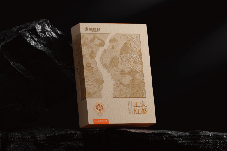
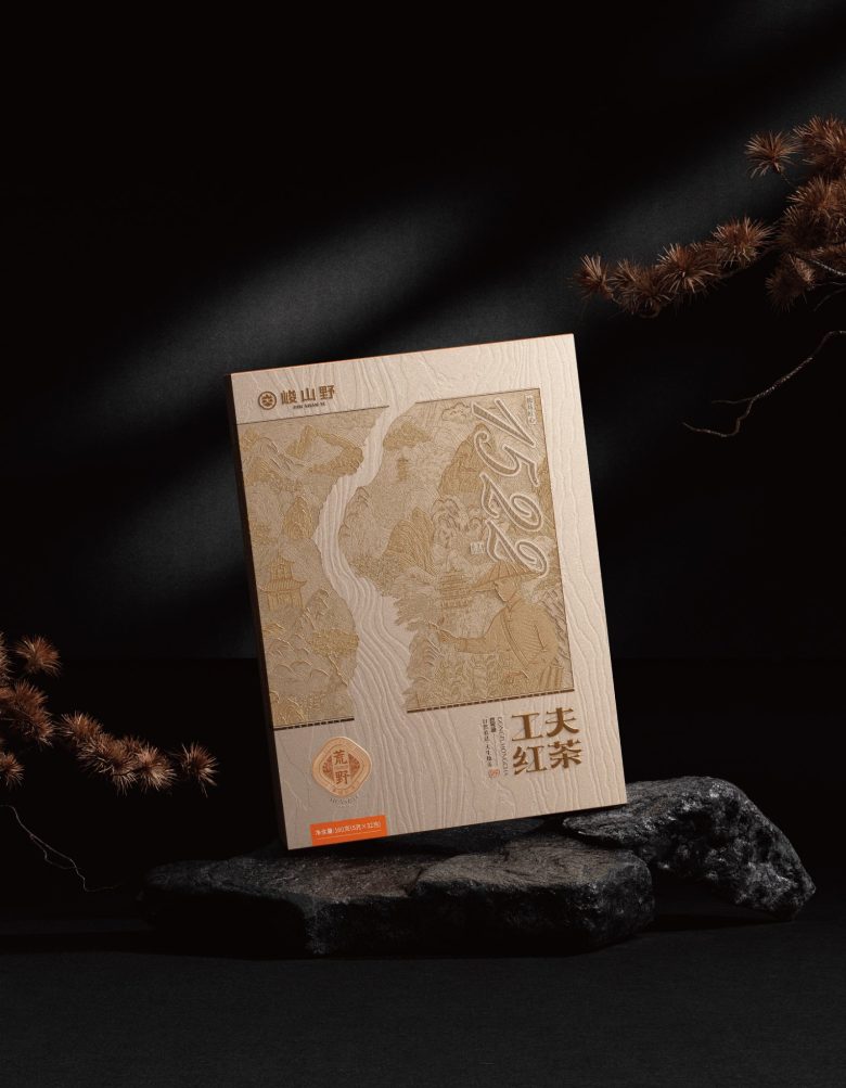
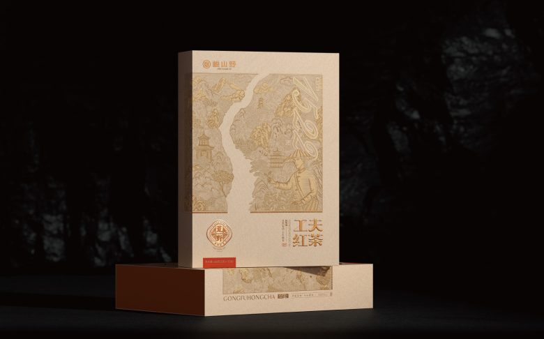
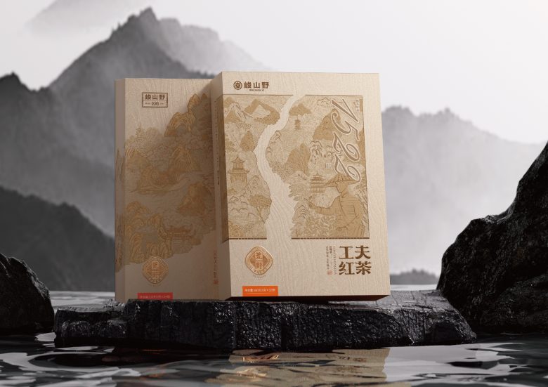
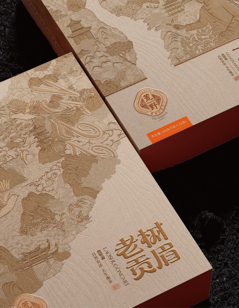
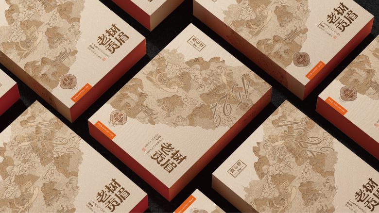
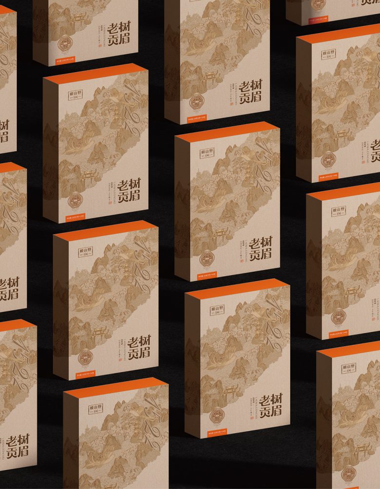
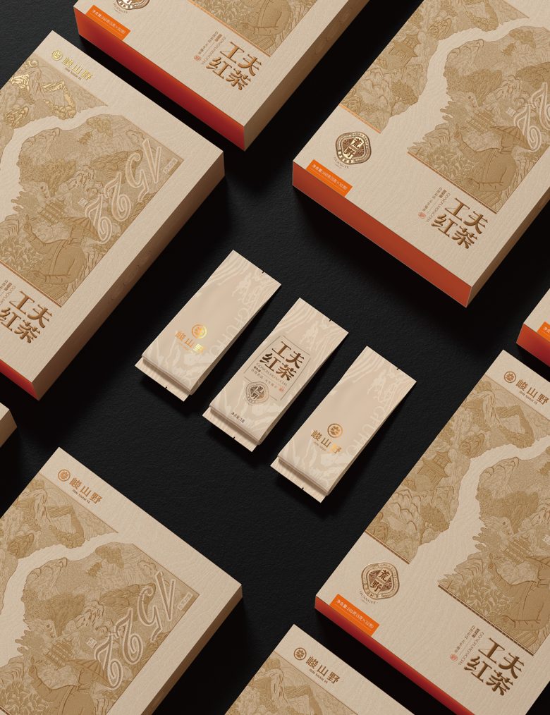
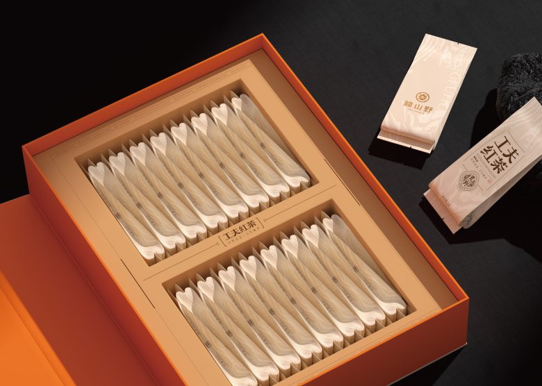
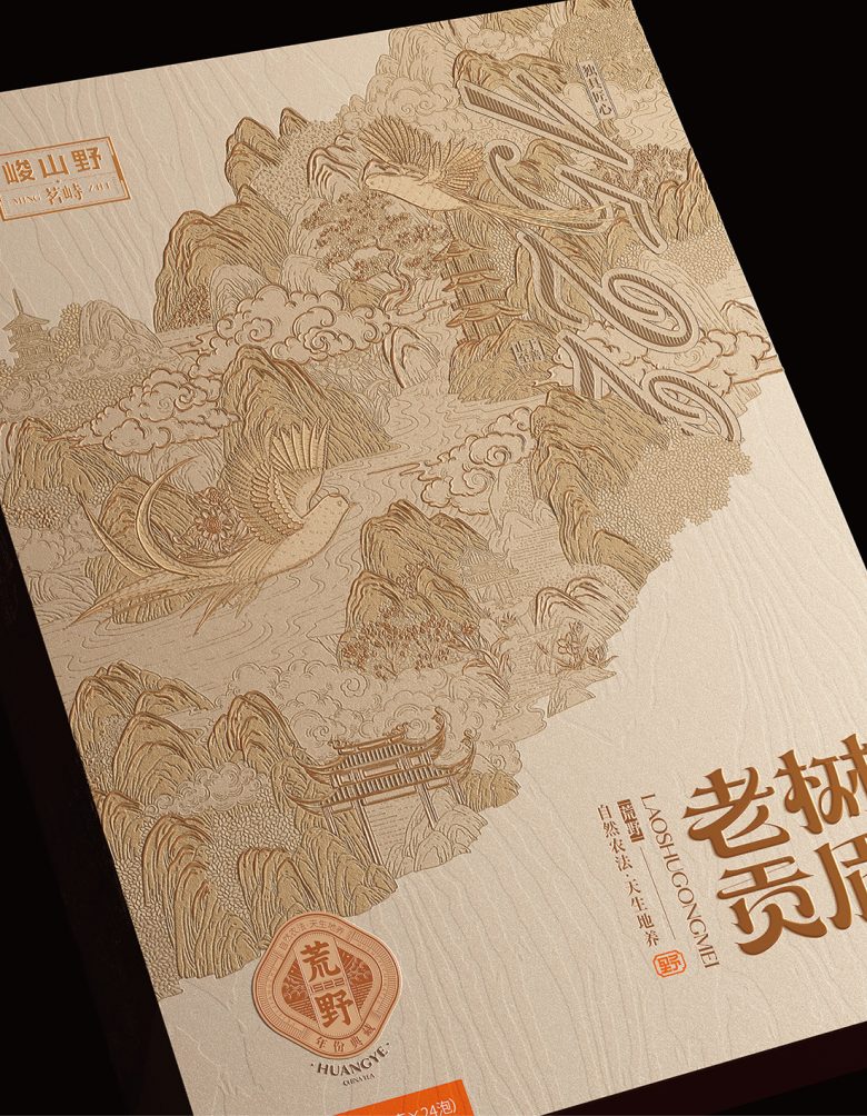
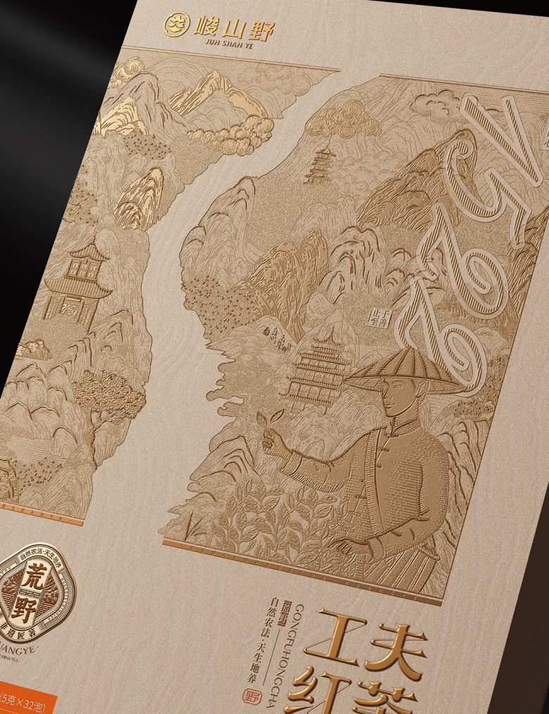
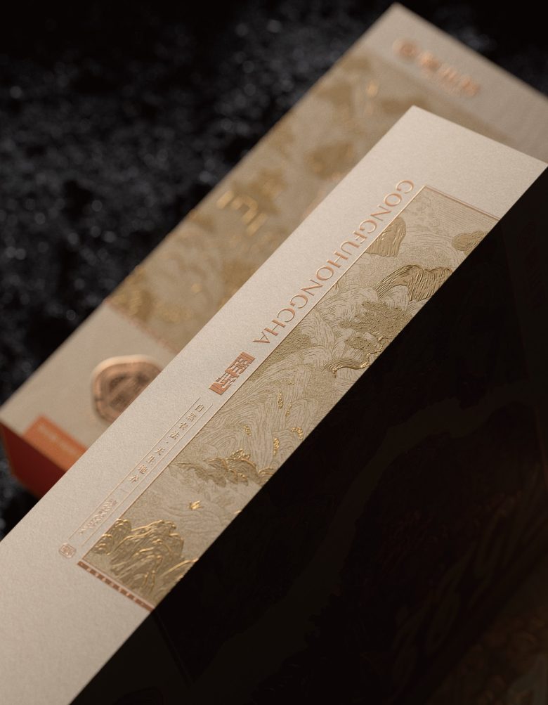
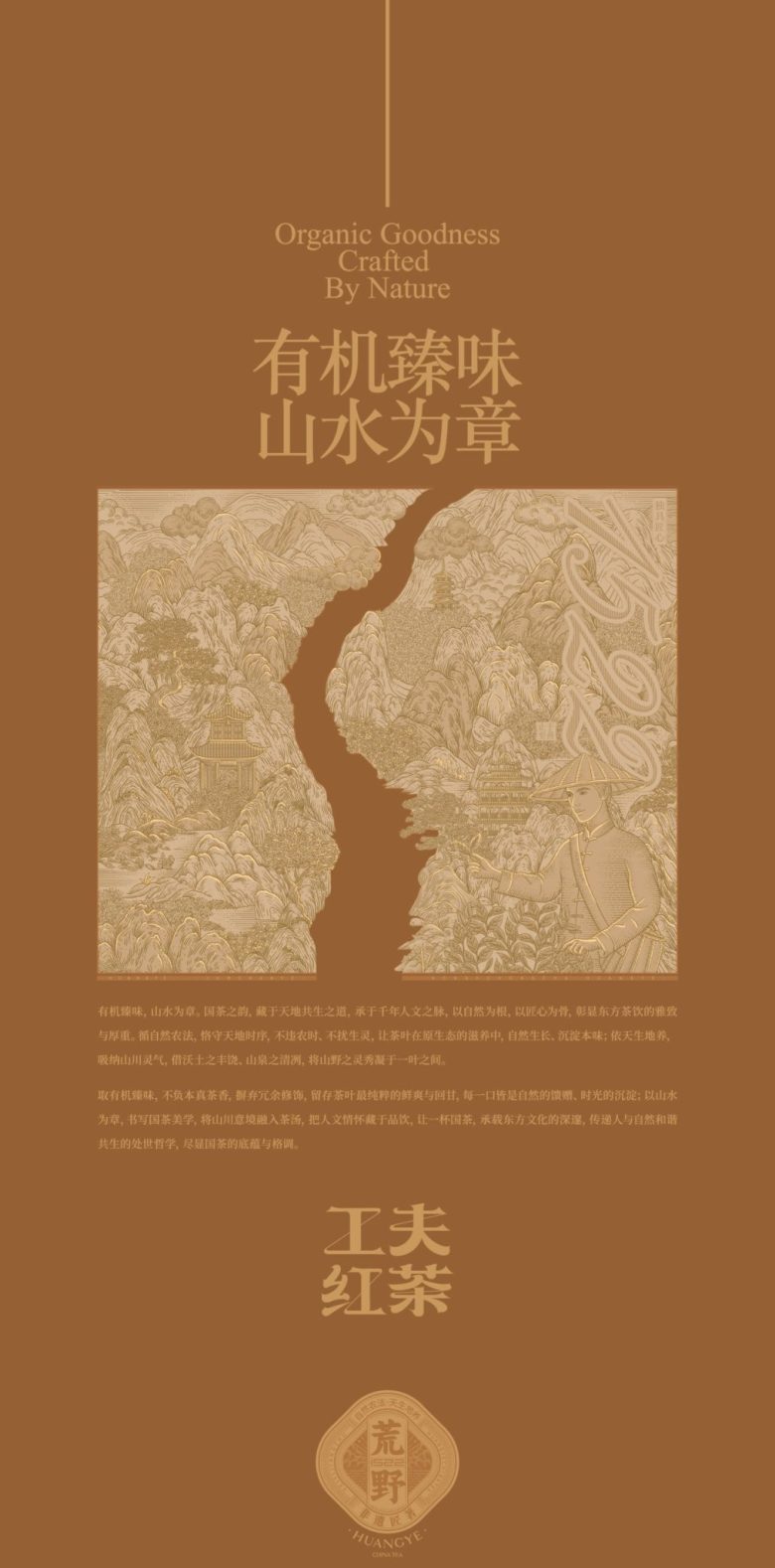
This packaging for Jun Shan Ye interprets organic tea through the visual language of traditional Chinese landscape art. The surface is dominated by an intricately embossed illustration of mountains, rivers, clouds, and flying cranes, forming a continuous scenic narrative that reflects harmony between nature and cultivation. Rendered in a single warm copper tone against a textured, paper-like background, the design evokes the feeling of classic woodblock or engraving techniques while maintaining a contemporary refinement. The landscape composition subtly guides the eye across the pack, transforming the box into a visual journey through nature. Elegant typography and seal-inspired brand marks reinforce authenticity and heritage, positioning the product within a cultural and artisanal context. By merging traditional aesthetics with restrained modern packaging structure, the design communicates purity, origin, and craftsmanship—elevating the tea as both a natural product and a culturally rooted experience.
Add to collection