
Add to collection
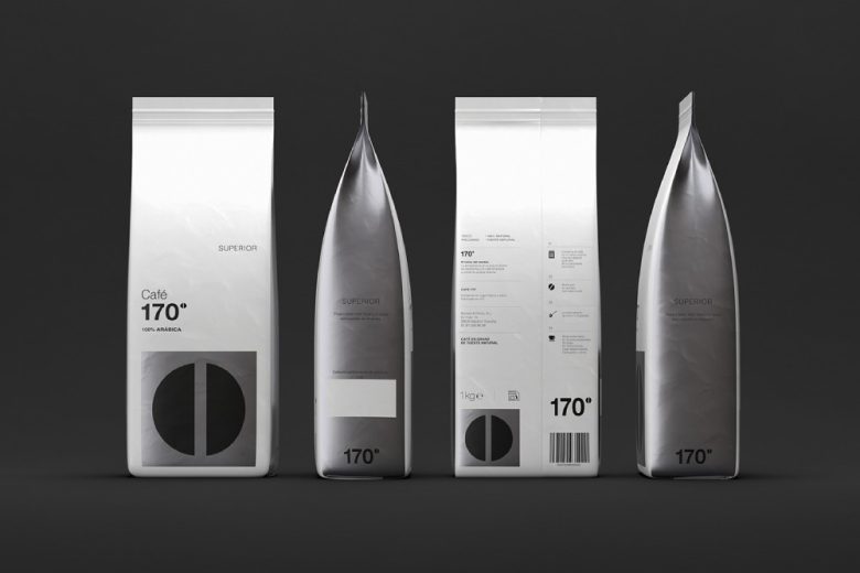
In a category dominated by stories of origin, tradition and craft, Café 170º, created by M+C SAATCHI Spain for Mahou San Miguel, takes a different route: building the brand from the behaviour of coffee itself.
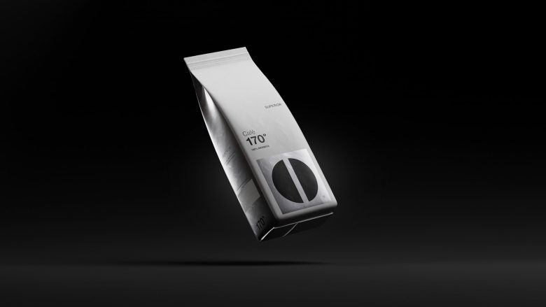
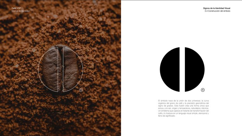
The concept is rooted in a precise moment. 170º marks the temperature at which coffee beans begin to transform and release their true character. What would normally remain a technical detail becomes, in this case, the core of the brand — a single idea that drives naming, identity and packaging.
From this starting point, the design follows a strict principle: if the brand is born from a moment of precision, every visual decision must reflect that same level of control.
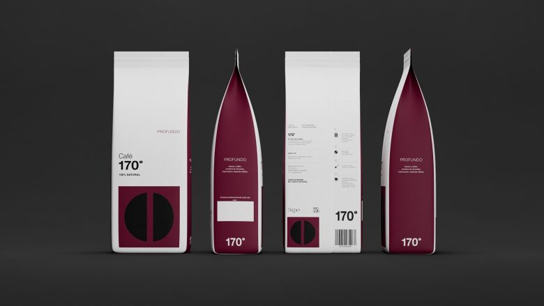
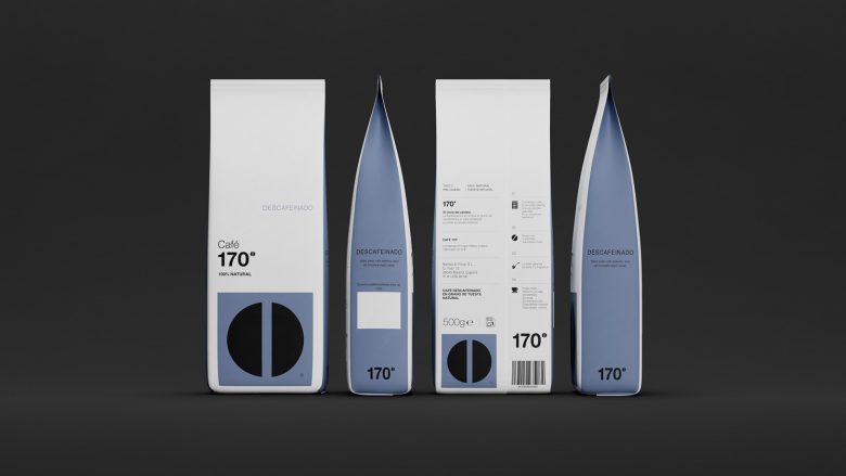
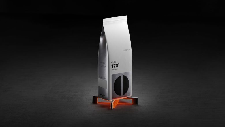
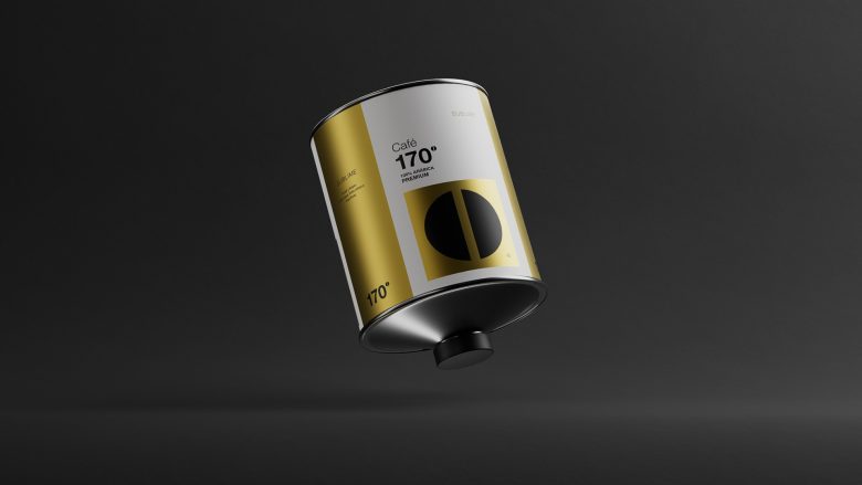
The result is a packaging system that strips away unnecessary elements to focus on clarity and impact. The 170º mark becomes the central visual asset — not as decoration, but as a structural device that organizes the entire layout. Its presence defines hierarchy, guides composition and ensures immediate recognition across formats.
“The strength of the design lies in turning a technical parameter into a visual system.”
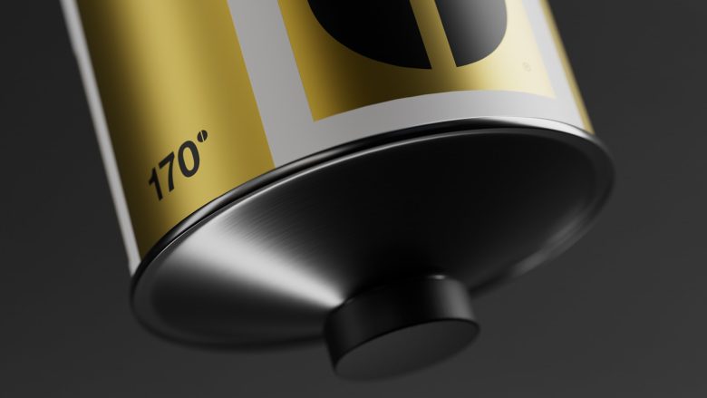
Rejecting the usual premium coffee codes, the project embraces a more restrained and contemporary aesthetic. A black and white foundation, supported by a controlled use of color and subtle metallic finishes, creates a sense of precision and sophistication without excess. Typography reinforces this approach, acting as a tool for clarity rather than expression.
Every element feels measured, intentional and aligned with the same idea.
“This is not packaging that decorates the product, but packaging that explains it.”
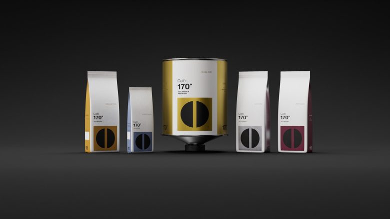
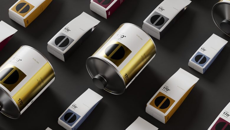
Where the project truly stands out is in its scalability. The identity extends seamlessly across different touchpoints — from coffee bags and takeaway cups to porcelain, plates and in-store signage — maintaining the same visual logic and consistency throughout.
Rather than designing isolated pieces, M+C SAATCHI has created a unified system where each application reinforces the next.
“Consistency is not repetition here — it’s precision applied across every surface.”
This coherence allows the brand to perform equally well in hospitality environments and future contexts, ensuring adaptability without compromising its identity.
“When a single visual idea can structure every format, packaging becomes a system, not a series of executions.”
Café 170º demonstrates how packaging can move beyond aesthetics to become a strategic tool — translating an intangible concept into something visible, functional and scalable.
A project where design doesn’t add layers, but removes everything that isn’t essential.
Client: Mahou San Miguel
Agency: M+C SAATCHI
CEO & Executive Creative Director: Andrés Martínez
General Director: Cristina Montero
Communications Director: Carolina González
Head of Art: Alejandro de Antonio
Creative Directors: Manu Gómez, Alejandro de Antonio
Art Director: Marta Villa González
Copywriter: Jorge Lamoneda Yustes
3D Artist: Sergio Ruiz Cáceres
Add to collection