Aurora Roasts by Musab Iqbal
posted by retail design blog on 2026-05-08
Add to collection
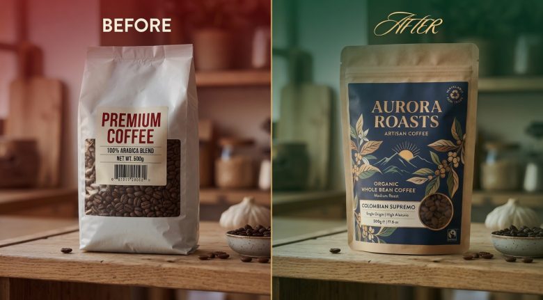
Premium Coffee Packaging Design That Commands Premium Retail Positioning. You’ve got a product that truly belongs among the finest offerings in specialty retail.
The kind of single-origin coffee that discerning enthusiasts seek out, savour, and return to again and again. The obstacle wasn’t the coffee it was that the packaging failed to convey its superior quality and origin story. Aurora Roasts faced this exact challenge.
World-class Colombian Supremo beans, meticulously roasted. Packaging that held it back from its potential. I set aside the usual “standard coffee bag” expectations and approached the project with fresh perspective.
What happened when the packaging finally matched the product:
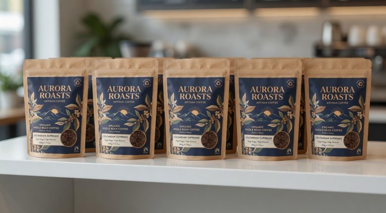
Within months of launch, Aurora Roasts gained strong traction with upscale specialty retailers, independent cafés, and premium online platforms.
The elevated design helped position the brand where it truly belongs among the respected names in artisan coffee. The project received positive recognition in specialty coffee and design circles.
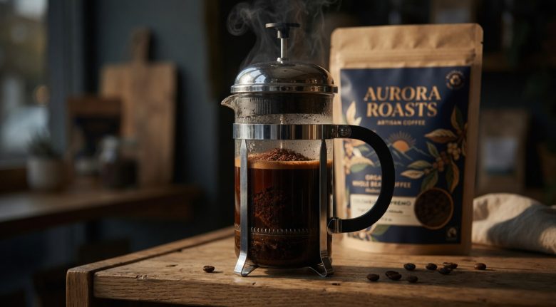
The coffee itself remained unchanged, exceptional from the very beginning. The packaging simply began to tell its story with confidence and clarity.
The Insight That Changed Everything
The real challenge wasn’t the coffee.
It was the packaging that unintentionally positioned it as an everyday commodity.
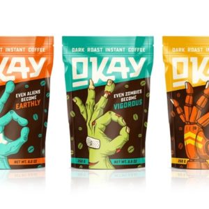
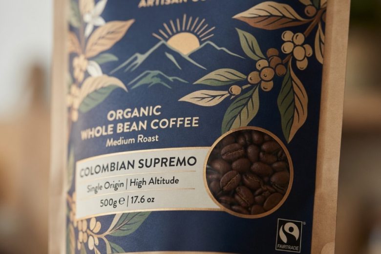
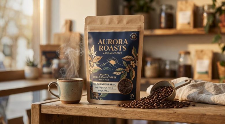
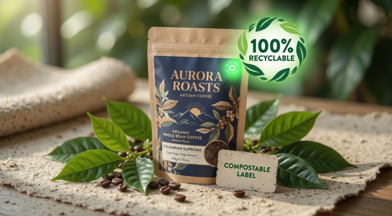
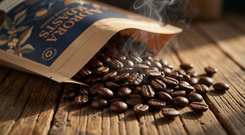
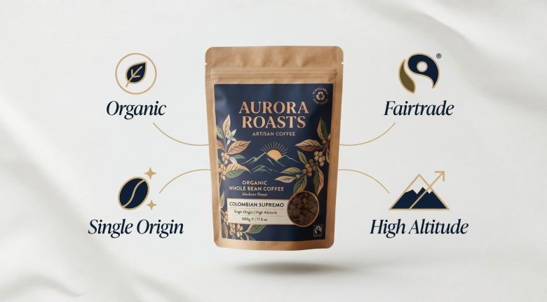
Aurora Roasts Colombian Supremo comes from carefully selected high-altitude farms in Colombia. It is organically cultivated, Fairtrade certified, and roasted to highlight bright acidity, rich chocolate notes, and a clean, lingering finish. Yet the earlier design didn’t reflect any of this distinction it looked interchangeable with mass-market options and struggled to support a premium price.
The key realisation:
Serious coffee lovers don’t just purchase beans, they seek a connection to origin, craftsmanship, and a sense of discovery. The packaging needed to evoke the first light over the Andes, the care of smallholder farmers, and the quiet ritual of a perfect brew.
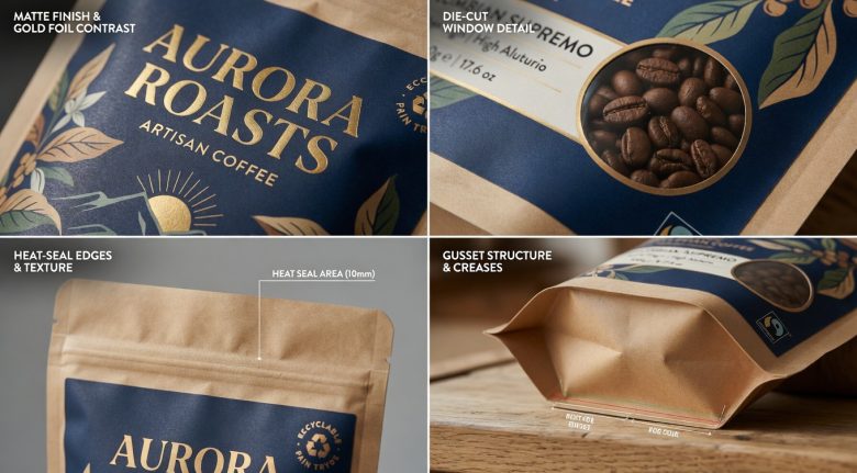
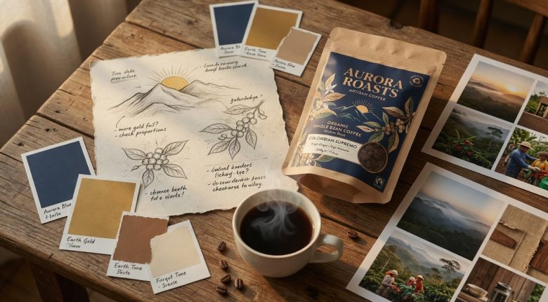
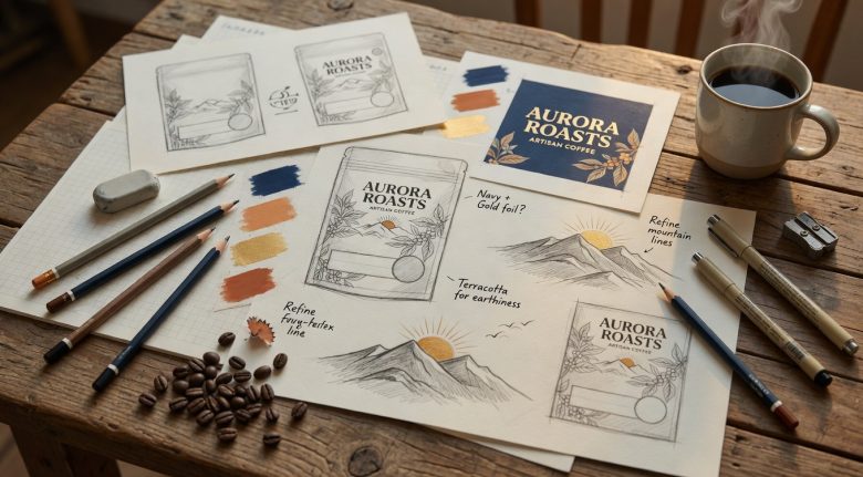
We moved away from conventional coffee packaging tropes and developed a refined visual system built around:
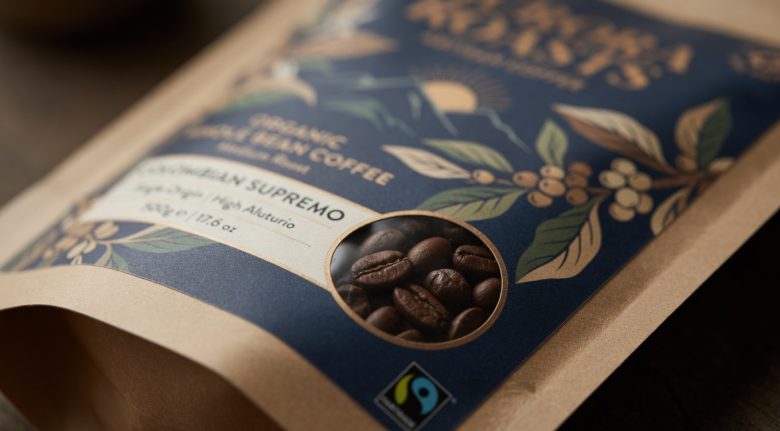
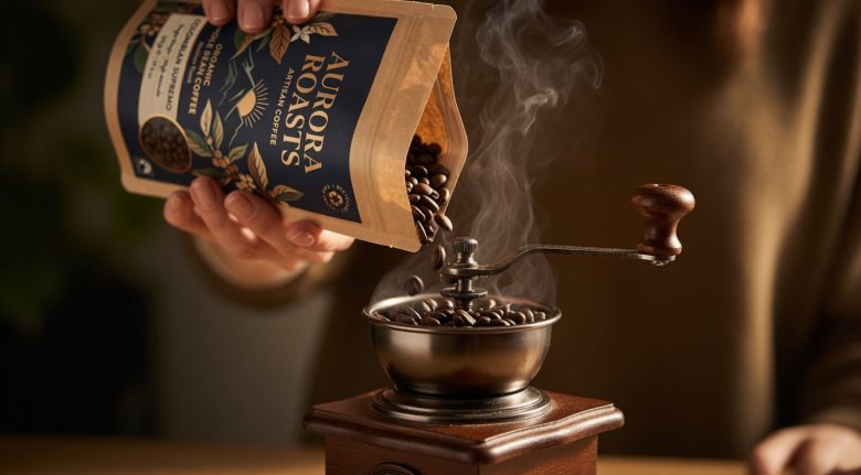
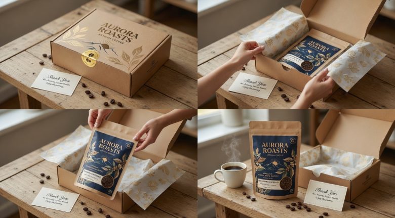
Rich navy matte kraft that echoes the deep mountain skies at sunrise
Sophisticated gold foil details and carefully balanced typography
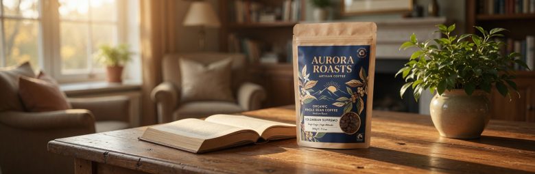
A clean, timeless aesthetic that feels equally at home in a modern kitchen or beside premium spirits and wellness products
Symbolic elements the mountain sunrise, delicate coffee botanicals, and thoughtful material choices that quietly signal authenticity and care
The new packaging transformed perception and allowed the product’s true value to shine through.
Designed by Musab Iqbal
Add to collection