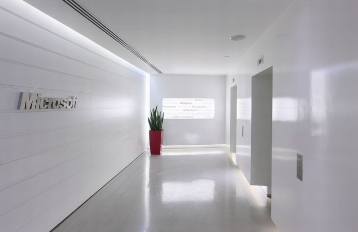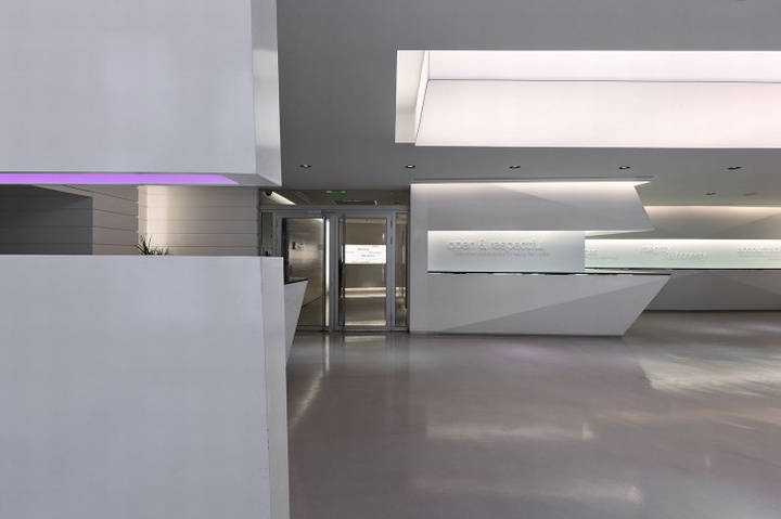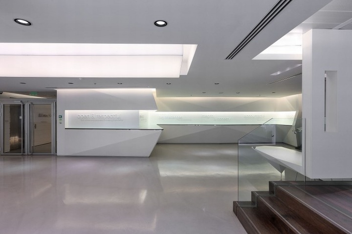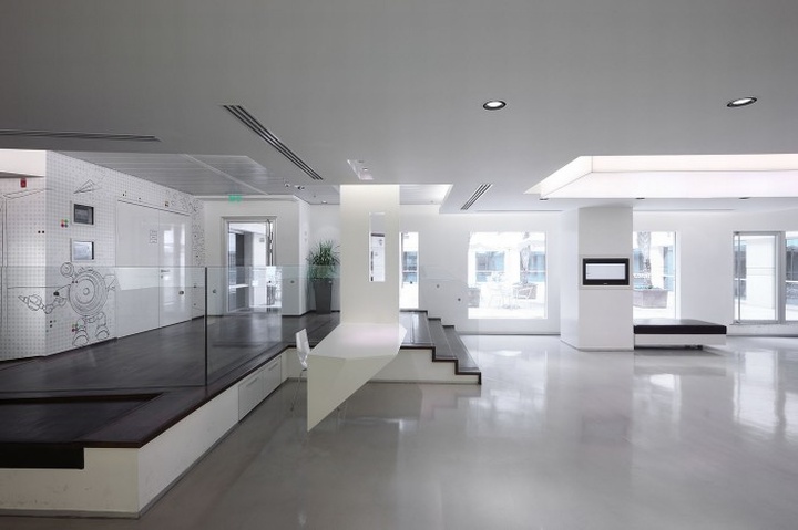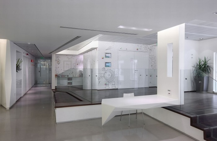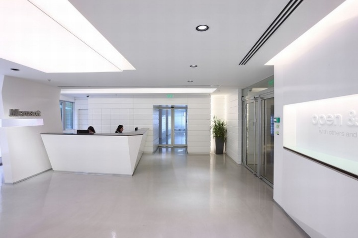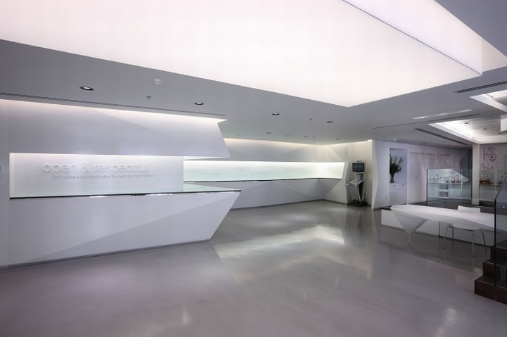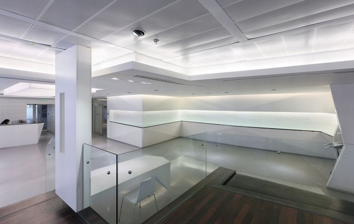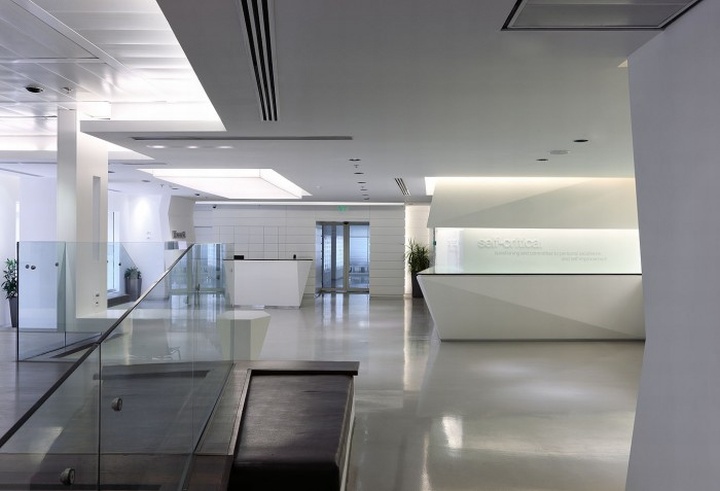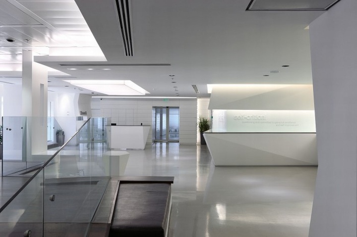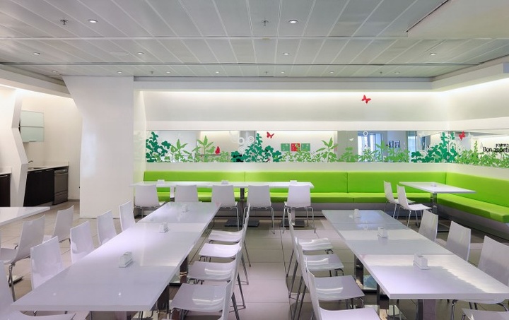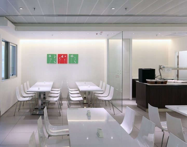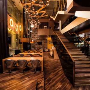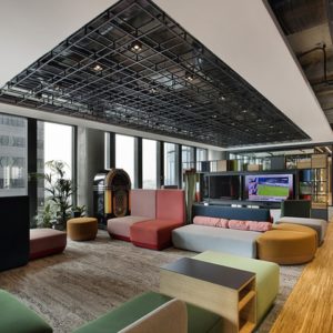
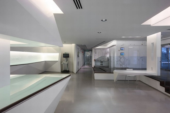

The lobby is the space that represents the new face of Microsoft towards the visitors and external partners. This space is used for events, product launches and business meetings of the Company. The client request was to design a space that contained designated areas serving food and drink instead the use of mobile tables whenever there is convergence.

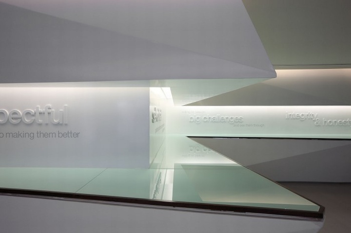
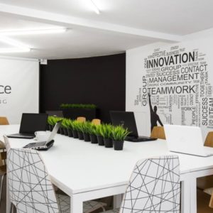
In addition we had to deal with at the entrance to the convention hall, which is in a higher level than the level of the lobby, to fit disabled access. To meet the client request geometrical niches were designed in the walls with glass shell which are used as shelves to place food and drink. The back inner walls of the niches were used as boards for three-dimensional texts that reflect the company’s values.

Due to space definition characterized as hi-tech space we used here materials such as glass and metal, giving a feeling of smoothness and shine. Lobby as well as the corridors was paved pandomo molded epoxy layer and it gives shine and looks watery. It penetrates floor conference rooms and meeting with a carpet-like gray red pixels. To enable disabled access a ramp was designed in the lobby that will bridge the gap between the two levels.
Design: Ron Grinberg, Ophir Nafshi
Photography: Uzi Porat


http://officesnapshots.com/2013/04/16/microsoft-israels-new-lobby-and-dining-room/
