
The Ferrari Store in Maranello is of crucial importance to the Ferrari branded retail sector, as it will be the first branch to be reworked in accordance with the new store restyling concept. The clear protagonists of the new design are the Ferrari product and the brand’s history, which is told through the merchandise and the iconic images which will accompany the store’s visitors as they peruse the internal space. The Ferrari Store in Maranello covers a total surface area of almost 650 m2, and includes a large exhibition window for products of Fan and Lifestile world. Thanks to its prominent location in front of the head quarter and near the Gallery Museum, the store has become a strong point of attraction for the flow of visitors.
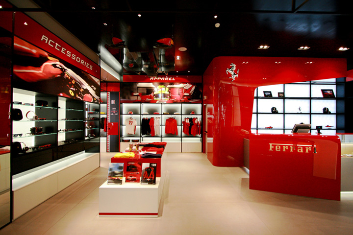
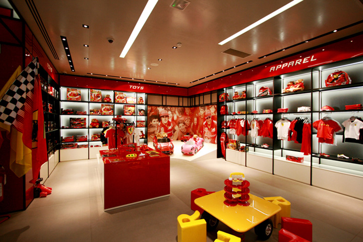
Architectural input from the Iosa Ghini Studio focused on enhancing the windowed frontage, which is used to communicate the Store’s racing spirit and tradition through the Fan space with the historic GT car and a window display dedicated to the Lifestyle world. Inside, the store spreads on one level with two entrances. The new entrance id dedicated to the Fan world, with the xposition of the Formula 1 car placed on a shaped and inclined platform that perceptively evokes the F1 GP circuit. The Fan area develops within the shop, expressing dynamism and an idea of speed thanks to the use of of racing world graphics. Within the Fan area was thought a space dedicated to Kids and Toys world, with glossy Ferrari images which draw the youngest visitors into the brand’s world.
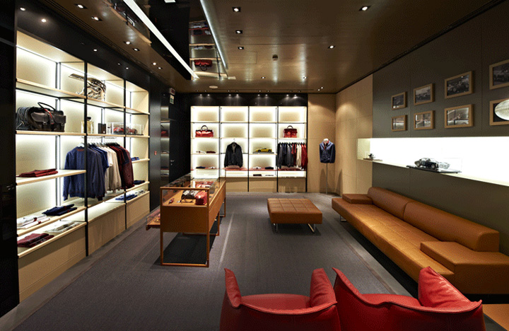
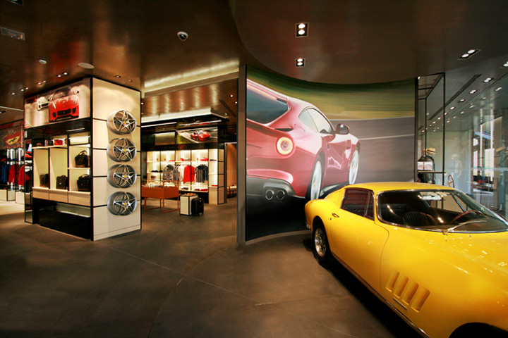
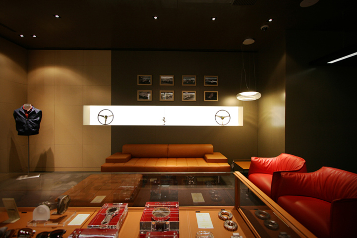
The historic entrance overlooks the Lifestyle area with the circular platform and the exposure of one of the cars symbol of Ferrari tradition. In harmony with the type of product on display, the memorabilia here consists of parts from GT vehicles, surrounding the store’s visitors in tradition, history and the elegance of the Ferrari brand. A special project inside the Ferrari Store in Maranello is represented by Tailor-Made VIP Room, where the leather clothing hangs along the wall racks, against subtle graphical illuminations of historic saloons which create a warmer atmosphere, exactly in line with the gentleman driver spirit. The sculpted cash desk with the large window display, and the shaped shield which hangs on the wall, represent the central focus of the store, visible from both the entries.
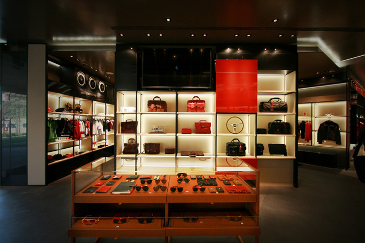
One of the main aims of the new Store restyling concept was to create a display space made from flexible steel displays: the option to reposition the floors means that a variety of display configurations are now possible in accordance with the requirements of the merchandise. The highest quality finishes and materials, along with the utmost attention to detail, reflect Ferrari’s soul, in a display which offers a balance between products and memorabilia which exudes the spirit of the Formula 1 “reds”. A specific chapter of the design was dedicated to the store’s lighting technology, which through a double level of false ceilings and hidden lighting strips, offers both functional and display-specific solutions for the products and for the decorative scenic effect.
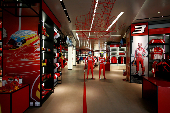
An integral part of the architectural design is the graphical communication of a series of dynamic and static images which accompany the visitors as they peruse the merchandise, introducing them to the various areas: their trip around the store becomes a metaphorical journey created through images which tell the company’s story.
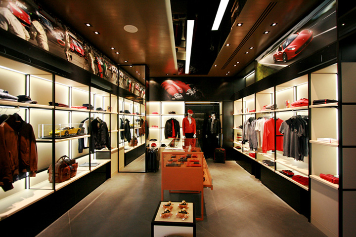
The Ferrari Store in Maranello doesn’t just want to be a store, it wants to be a place which reflects the Ferrari spirit and the brand’s history, which conveys the dual soul of the racing world and a luxury universe, whilst also ensuring responsible electricity consumption for the lighting thanks to the extensive use of LED technology. It is without a doubt a concrete representation of the added value of a brand made in Italy, which aims to offer as part of its style, elegance and functionality, elements which are typical of Italian design.
Arch. Massimo Iosa Ghini


Add to collection
