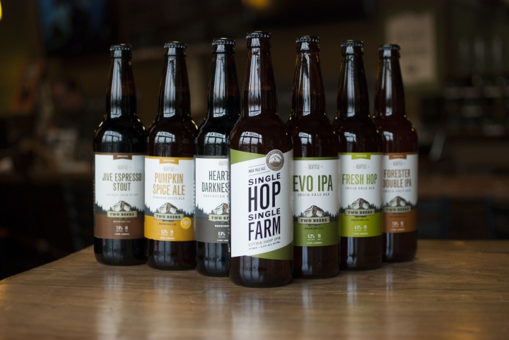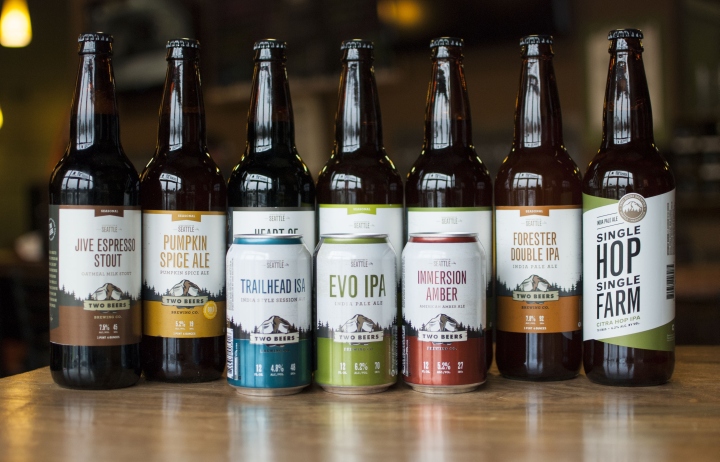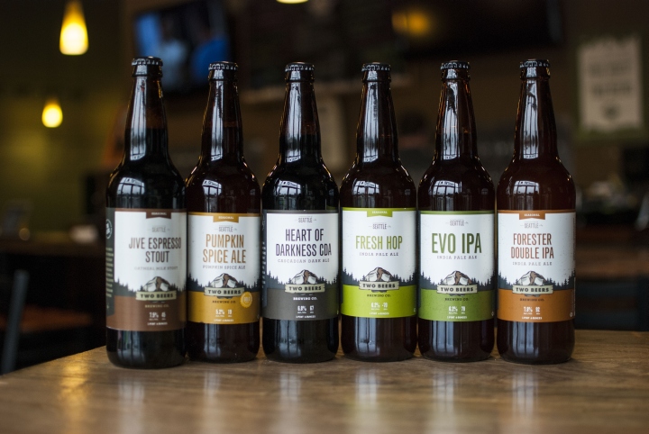
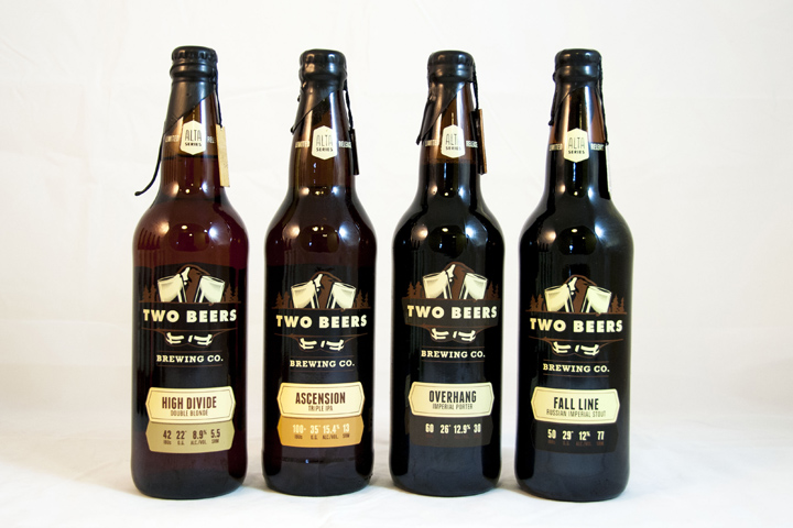

As a fast growing micro-brewery who had outgrown it’s early packaging designs, Two Beers engaged our team to design new bottles and cans that would better communicate their brand to the target audience. We worked closely with the Two Beers team to define a new look that was clean, modern, and connected to the Pacific NW outdoor lifestyle. It was important that the beer name be highly readable and that the cans and bottles would ‘pop off the shelf’ next to the competition.

The resulting designs were a success— paired with the company’s PR and distribution efforts (and of course their downright delicious beer), Two Beers saw an approx. 300% increase in packaging sales after the launch of their new cans and bottle designs. We also designed and developed a new website for Two Beers utilizing the established new look & feel. The website is build on a custom WordPress setup, features responsive layouts, and does a fantastic job providing information on the beer, Two Beers team, and the brewery’s tasting room.
Packaging design, Website design/development (WordPress), Print collateral design, Tap handle design, Photography by DEI Creative


