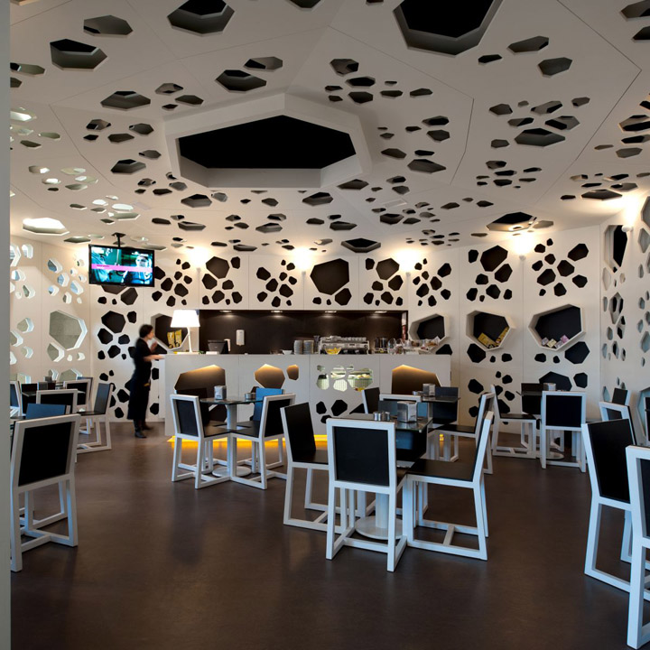

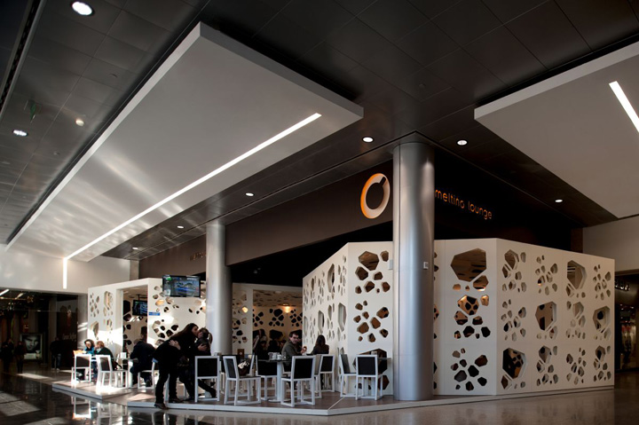
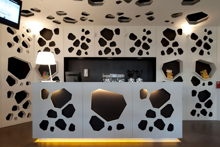
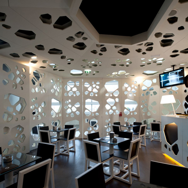
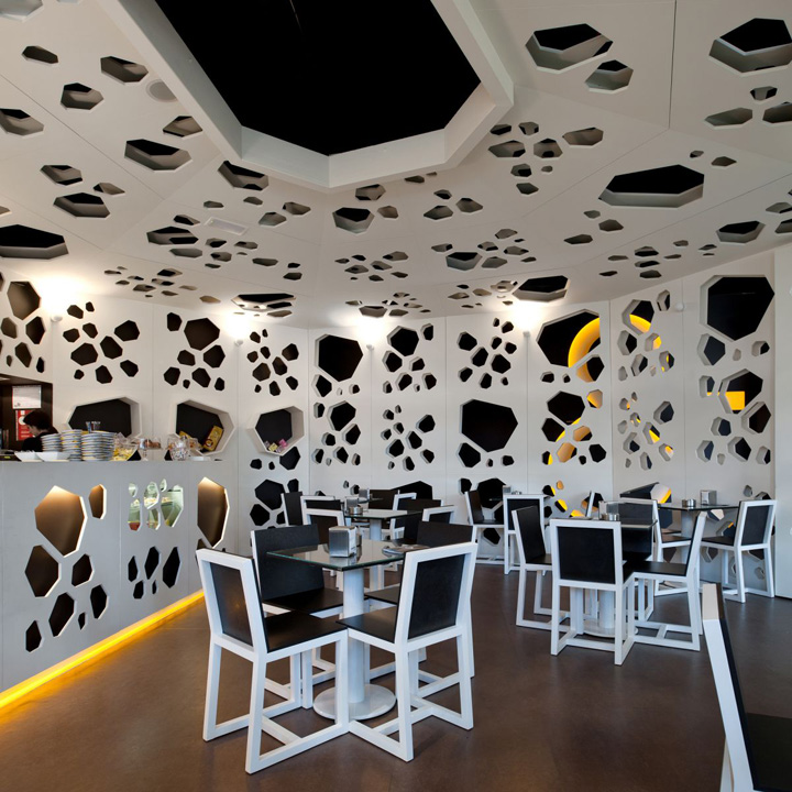
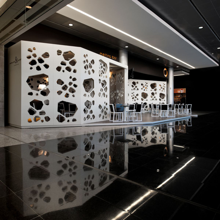
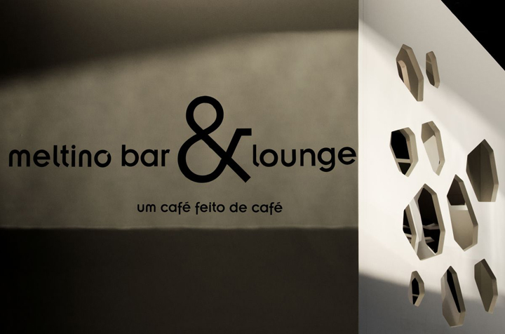
LOFF, a Portugeuse lighting design and architecture office, have designed the Meltino Bar & Lounge in Braga, Portugal. MELTINO BAR & LOUNGE is a place intended to update the concept of a coffee embedded in a shopping center. Having the strong presence of the design element, the furniture is the result of coffee derivatives, in order to allow that the community assimilates the singularity of a place that serves as a lounge and bar. Both are similar and transparent, although with different purposes. The lounge site has a relaxed atmosphere and offers gourmet products. The bar site is appropriated to drink coffee. Cláudia Costa, LOFF atelier mentor, conceived this project from the geometrization of coffee grains, always with the concern to exclude the idea presented in the space to the final consumer, that they are drinking coffee in a commercial gallery. The final result is the invasion made by the coffee Grains, instead of the Shopping layout. Meltino Bar & Lounge is a coffee grain that peeks, pierces walls, roofs and counters.
Meltino Bar & Lounge
In the first meeting with the client, it was asked to draw a charismatic and unique project for a bar with the identity of the brand Meltino.
The idea was to create a project that endured in the visual memories of the public. The first intention was to build a Bar inside a mall without a sense of enclosure in a confined space. The thought of how to be inside and have the feeling of being outside was always present. The box inside the box, the light, the transparence, the defragmentation of the space, the well-being associated with the simple act of drinking coffee.
Concept
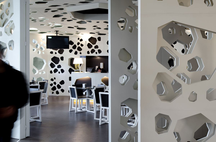
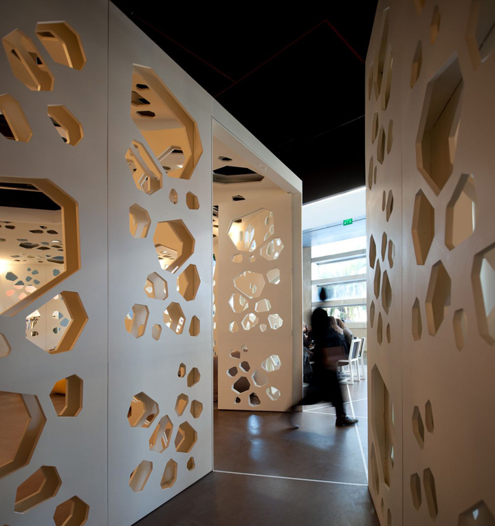
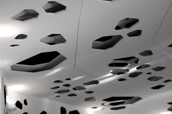
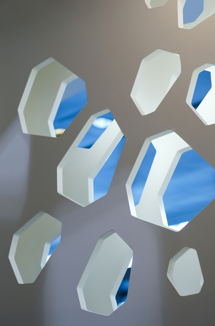
A coffee grain that draws the space… a coffee made of coffee… The underlying concept was the geometrization of the coffee grain that draws the two volumes / spaces in the plan. The grain conquers the Coffee, perforates and draws the volumes, the walls, the ceiling. Its shadow is cast in the floor, dancing in the space.
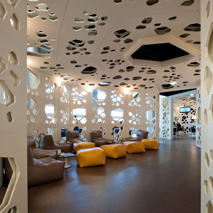
The project is divided in three areas: two volumes and an interior esplanade, which is elevated from the mall floor. The two volumes are identical and translucent. However, they have distinct uses and furniture. The 1st Volume (lounge space) comprehends a relax area where it is served gourmet coffee. In the 2nd volume (bar space) the public can take express coffee. The coffee grain conquers the mall gallery and spies the public space inviting the public to enjoy the Coffee. The grain was drawn on many scales. Then, a matrix was built in the form of 3 panels (3 meters high by 1 meter of anchor) which, inverted, created a total of 6 distinct panels. All the walls where developed based in the study of the 6 panel matrix.
Double walls
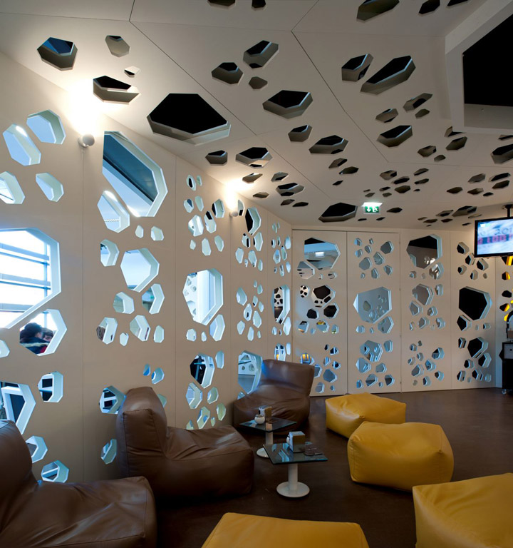
It intends to reinforce the perforation of the grain and proportionate a body to the space. For this reason the walls and ceilings were duplicated. The central part of the ceiling is higher to give space a more dynamic feeling. The structure is in pine wood which is light and easy to build. The covering of the walls, ceilings and balconies is in MDF, painted in white. The floor covering is in linoleum. The colors chosen were the white and the brown because of the association of these with the coffee fruit and the reflection of the light.
Furniture
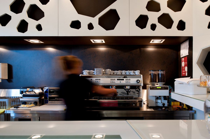
The crockery and the tables were also drawn with detail, aesthetics and comfort attention. The furniture was covered with a unique and new material that is a derivative from the remnants of coffee. The furniture fulfills the space and appeals to sensorial feelings.
Lighting Design
The entire project was thought to create a light balance atmosphere. For that, it was used indirect light with diachronic lamps and halogens lamps in the bar. Orange leds were applied in the brand lettering.
http://www.contemporist.com/2011/02/19/meltino-bar-lounge-by-loff/


Add to collection
