

Barneys Beverly Hills by Steven Harris Architects, Los Angeles – California
posted by retail design blog on 2015-05-14
Beverly Hills
Add to collection

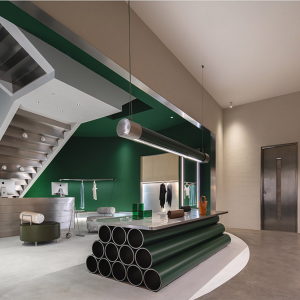
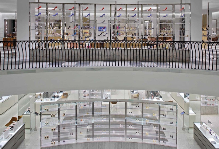
From the top of the winding oval stair at Barneys in Beverly Hills, a curious quartet of glowing, sinuous objects, six stories down, inevitably catches your eye. As you discover at the foot of this dramatic marble stairway, they’re perfume vitrines, curvy display counters lit from within. The luminous cosmetics floor they occupy was, until several months ago, a banal storage zone, a dark basement, off-limits to customers. Here and elsewhere in the building, Barneys’ recent renovation opens up untapped spaces as it strategically ushers shoppers through the merchandise.
Though this multiphased work by Steven Harris Architects (SHA) and the interiors firm of Rees Roberts + Partners (RRP)—both based in New York—later included the street level and fifth floor, plus lightening of the exterior color, it all began with that utilitarian subterranean realm. (The other shopping floors—the second, third, and fourth levels—have not been renovated.) The client, who recently had SHA and RRP update sections of its New York flagship on Madison Avenue, was looking to expand without expanding, seeking greater retail opportunities within the existing envelope, a structure architect Peter Marino had created for Barneys in 1994. Tired and lacking its former clarity, the place suffered from what SHA principal Steven Harris describes as the “casino effect.”

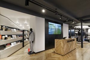
Certain original elements, however, had to stay, including the lavish, skylit, neo-Baroque stair: a grand stair is a signature Barneys feature, and this extravagantly costly one was still in good condition. But the entrance areas were ripe for renewal. The store’s official front door opens from the sidewalk along Wilshire Boulevard, but, in this city of cars, few shoppers arrive on foot, so the rear entry, beside valet parking, remains more popular. But one level down, off the parking garage, Harris saw a missed opportunity: here he created the entrance to the 8,000-square-foot cosmetics floor, a department his firm relocated from grade.

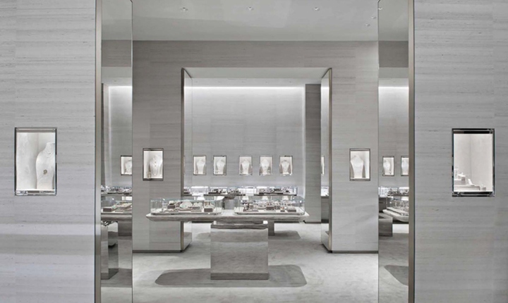
Before launching into redesign, SHA turned the irregularly shaped raw basement into a clean rectangle. “We made FAR [zoning floor-area-ratio] trades to give the space straight edges and four square corners. That was essential,” says project architect Andrea Mason. Unlike most department stores, Barneys does not let vendors design their own counters or in-store boutiques. “So, without the typical mini-mall clash of brand identities,” Mason continues, “we had the rare chance to compose a unifying setting.”
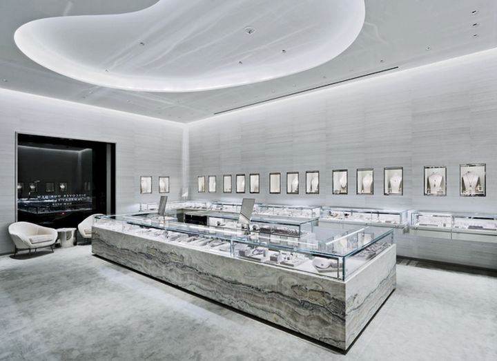
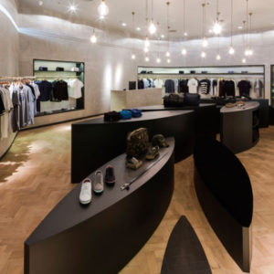
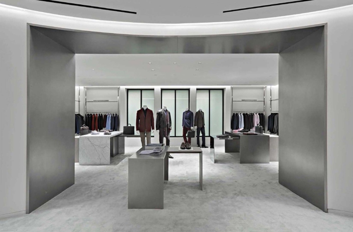
Her team enlisted artist Mig Perkins to create rhythmic, abstract wall panels for the cosmetics level. A subtly animated backdrop, her all-white bas reliefs, grazed with LED lighting, have illusory depth. (Surprisingly, the reliefs are only ⅜-inch deep and made of painted CNC-milled MDF rather than cast plaster.) “Our great challenge,” says Mason, “was to produce a clean, glamorous space to house hundreds of thousands of products—which, in so many department stores, becomes a mess.” Back stock discreetly fills cabinets behind the sculptural wall panels. Nearby, SHA-designed vitrines with clear acrylic shelves intentionally reference the finely crafted cabinets of artist Damien Hirst, known for giving such mundane objects as pills or scalpels the aura of precious relics. (For the 17,000-square-foot street-level space, SHA designed a variation on the sculptural cosmetics-area paneling.)
To open the lowest level to daylight and offer continuity from the top floor, SHA extended the original stair down one more level, matching its marble steps and wrought-iron balustrades. Now amoeba-shaped counters, rendered in materials as diverse as burnished steel or antiqued brass, form a recurrent motif throughout the store, echoing the outlines of the luminous ceiling coves that SHA also introduced. And inside the street-level entrances (which have reportedly drawn increased traffic since the renovation), pedestaled displays, with glass domes like cake stands, enshrine accessories. “Our constant play between graceful curvilinear and angular,” says Harris, “is about inviting movement and leading your eye.”
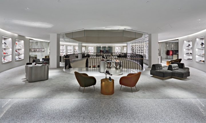
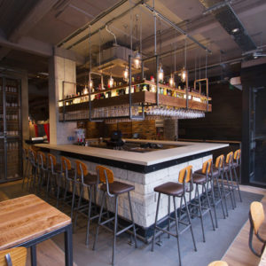
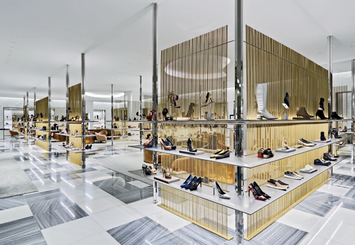
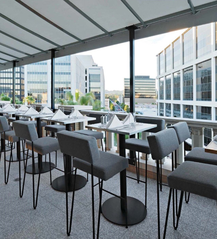
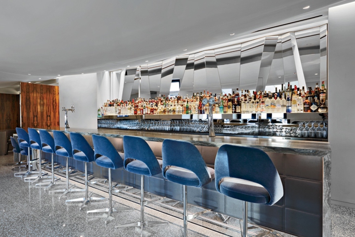
While a variety of devices frame choice items and more intimate areas, these gestures simultaneously reveal merchandise beyond. A Bertoia-inspired screen of vertical brass rods, for example, wraps a street-level footwear salon, and, along the stair, bowed, clear shelving showcases a matrix of women’s shoes, each jewel-like in its own glimmering, LED-lit compartment. A similar display punctuates the men’s shoe department, on the top floor, where SHA and RRP also redesigned the restaurant. This floor’s spaces include a small tower, 14 feet square, with a 31-foot-high ceiling, formerly an enclosed office, which the architects transformed into an intriguing lounge. And a long-unused terrace has become a drinking and dining venue with panoramic views of the Hollywood Hills.
As one descends from the top floor, a downside of the renovation comes into view: the yet-untouched shopping floors, two, three, and four, look drab beside their fresher counterparts. But at the store’s core, the theater of the grand stair thrives. The architects have modulated and balanced that with equally luxuriant yet finer-grained spaces and modern gestures. Now customers, many youthfully clad in shabby-chic attire, drift up and down the marble steps, past $1,100 sneakers in shimmering transparent perches.


Add to collection