
Add to collection

CLIENT & BRAND BRIEF
Creating a tranquil, soothing home ambience in a increasingly polluted and stressful environment of city has become the requirement of the day. Inspired by the increasing demands for pleasant and tranquil ambience through natural fragrances, Ripple fragrances launched the brand IRIS.

The founders, Ranga Rao & Sons established in the field for more than 50 years have made their places in millions of Indian homes through their in-house brands like Cycle Agarbatti or incense sticks. The Brand so popular and being exported to 20 countries across the globe. While they have spread their products across the country and globe, they realized an innate need for a concept store that would provide the apt backdrop to their product range. Thus came into being IRIS, the aroma boutique showcasing products pertaining to fragrances and lifestyle from Ripples.

Targeted at the house proud woman audience, Iris knew how to make a social statement about the finer things in life. What they needed was a space that spoke of the brand values, philosophy and imperatively about its concept. The need took shape of a design brief which was to create an ambience around the product without overwhelming the products & at the same time adding value to the same. The products were categorized under premium, luxury, ethnic and lifestyle ranges. The underlining brief was the create something simple, elegant, earthy yet contemporary.

DESIGN STRATEGY
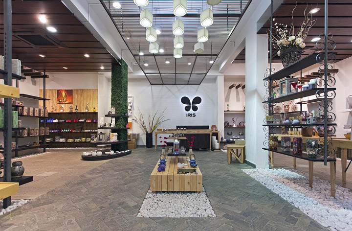
Iris was conceptualized from the very essence of it – The flower! Derived from its meaning, a flower, the environment of the store was conceived from the idea of picking fragrances from the garden. Much like its products, the store had to emulate the feel of nature and its authenticity. From winding pathways in the garden to creepers growing on the wall, from the wooden fence to the shade of pergolas, from the heap of pebbles to the exterior garden furniture, every bit was carefully blended to create the atmosphere within the store. On the other hand the aroma of the Products itself and the handpicked music play in harmony for crafting an experience that enforces a recall time and again.

STORE DESIGN SIGNATURE
The Store design signature is the concept of using and treating the store as a flower in the Garden and the way you signify elements in co-relation to the entire ambience envisaged. The signature evolves from the overall essence in portraying IRIS as a brand in the overall sense and carrying it in every element of the store design.

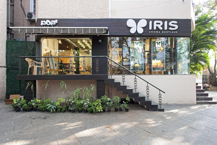
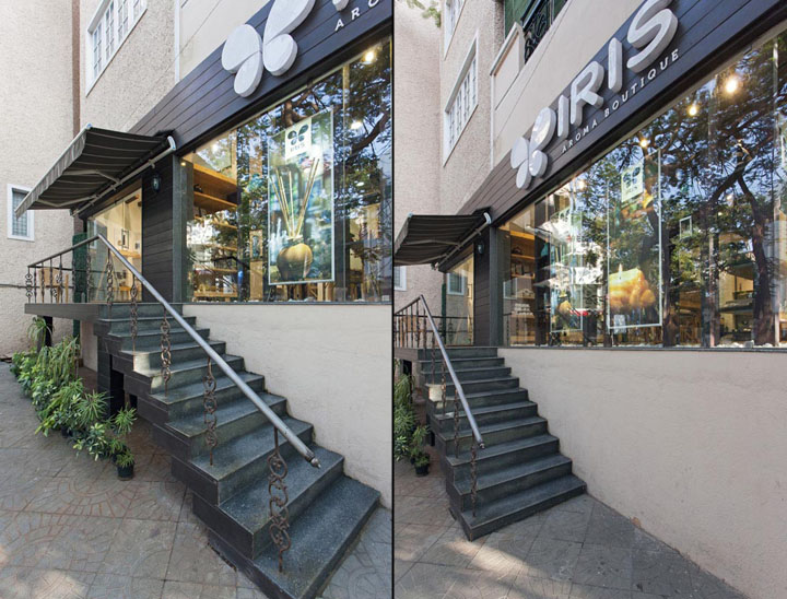
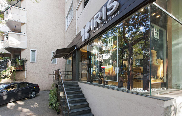
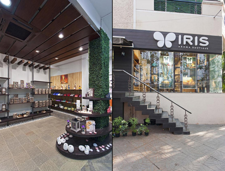
STORE FRONT DESIGN
The store Front design was worked as concept of a Gazebo or a home overlooking the garden. The Entire façade treatment is done in a way using wood wenge coloured external grade paper mesh cladding to give the desired exterior wooden look. The railing also in cast iron railing like of a home garden railing, with a huge glass façade in view of a open large window opening into the garden. The signage is laser cut acrylic box letters with LED back lighting to give the store the desired punch on the street. The canopy of the store entry is again treated with wood and glass to give the required feel of a skylight gazebo or canopy of the house.

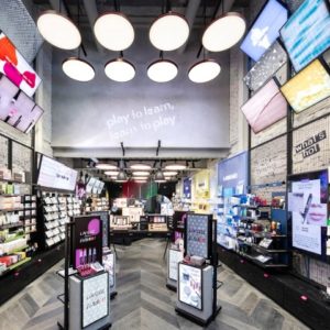
STORE INTERIOR DESIGN
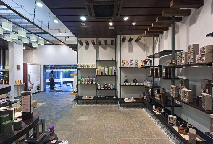
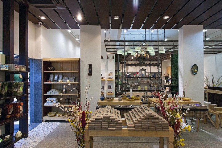
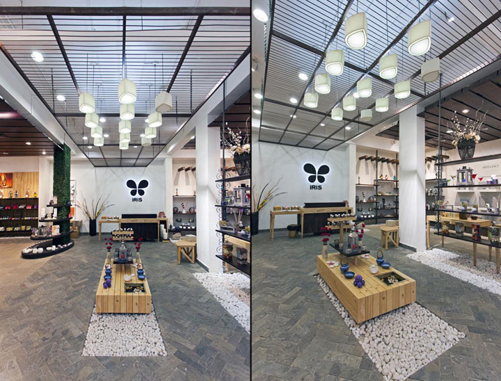
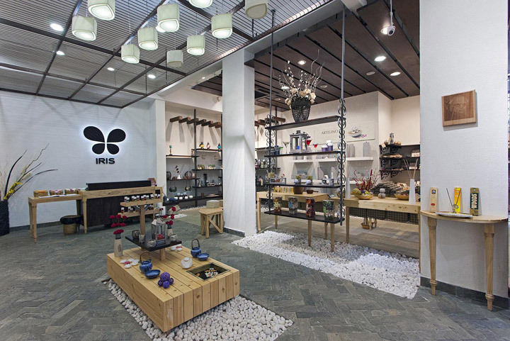
Though the threshold commands a panoramic view of the entire store, the central pathway with herringbone patterned tiles divides the store into three zones visually. One contained in itself while the other two resides on the left and right of it. As soon as one enters the store he is greeted by the bold wooden brand logo against the white wall while various supporting elements unique in character from other points of attraction. These elements are used to demarcate zone and thus categories of merchandise.

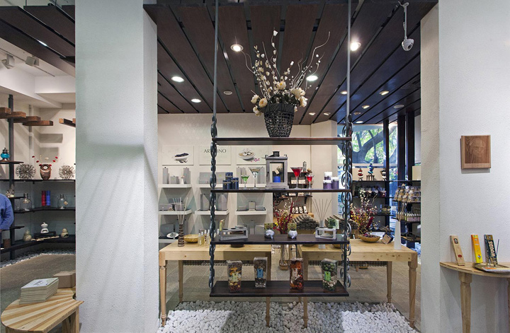
The cash counter is strategically placed in the center of the store to assure surveillance of the entire area. It couples as a greeting desk for the customers as well. The walls on either side of the entrance describe the brand history and product types in details with a new arrival gondola at the center exhibiting the new launches of the season. Queues of glass bottles containing aroma globules are kept on two tier shelves which from a part of this gondola. So one can purchase the aroma of his choice once he is well informed about all of them!

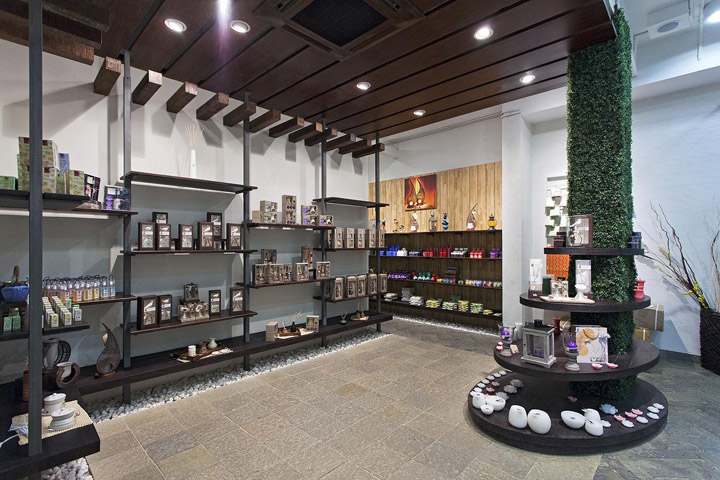
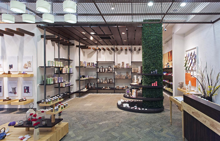
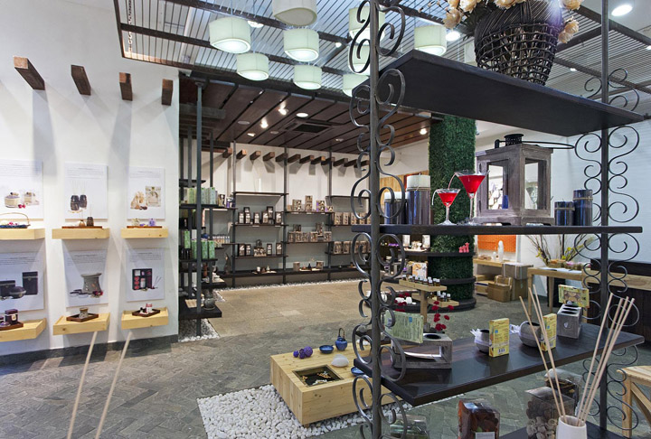
The one that makes a strong statement of its presence is the Aroma Tree. It houses the candles against the backdrop of green creepers. And then there is the suspended shelf from the ceiling with old style cast iron embellishment on the metal uprights showcasing a range of lifestyle products.

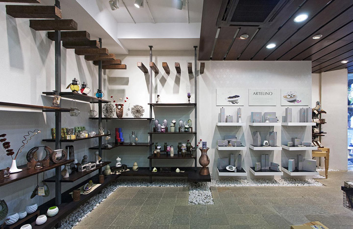
The left zone is dedicated for candles and accessories highlighted by the aroma tree and the right by the suspended shelf for lifestyle products. An attraction of the store is ‘make your own potpourris’ which allows one to create a mix of potpourris from a myriad of choices and spray them with the chosen aroma. Several white shelves with black glass top is placed in neat grid format amidst all the raw and rustic finishes to showcase the products from the luxury range.

Rest of the store has dark wood shelves supported with rustic finished metal uprights. A low height shelf runs along most of the store. The open concepts (products for trail) are placed on them. With pebbles below; the idea was to imitate picking up things from the ground in your garden. Since it is low height one has to bend to bend to take the product in hand turning the idea into action.

Adorned with natural materials, the palette is restricted to mostly browns and white. The furniture is made of pine wood, rubber wood and polished veneer. Inspired by outdoor furniture the character is drawn by the contrast of light and dark wood in the same unit. The walls are finished with exterior wall finishes since all the effort was to translate the idea of an outdoor within the indoors. The rustic finish metal members add another texture to the store. Several petals inspired from the iris logo drops through the rusted metal frame on the ceiling as pendant lights. Rest of the ceiling remains either exposed or covered with wooden slats.

INNOVATIVE USE OF MATERIAL & FINISHES
The store design emphasizes more on usage of natural material and a part of the material being recycled material. Usage of Herring bone natural slate flooring, re-cycled rough wood dark tinted, polished pine wood from packaging crates used for platforms and wall panels.

Wrought Iron brackets from old stores, Mild steel verticals in raw steel finish all blend together to give a Earthy yet contemporary feel with conscious on “Green & Natural” Pebbles used around the store with rough feel flooring to create the exterior pathway feel Hyphened by the artificial creepers on the column adds to the garden flavor. All products of Iris being natural products, the store material usage dwells from the same idea and elaborates with the garden theme to achieve the look.

LIGHTING
In line with the overall store base essence of being eco-friendly and natural, the lighting was also planned to conserve energy and also re-inforce the Green philosophy.
Majority of the ambient lighting of the store is with CFL lights, with accent lighting from LED lights. The store also has a strong sense of play of drama through lighting with bright accent lighting to high light products and merchandise and relatively lower general lighting.

Further accent lighting through LED strip lights and also LED small focus lights below shelves high lights the products and also creates the required Aura around the product based on the zoning of the product. The store also has punctuated light pendants in the shape of the petal of a flower which are custom designed and developed with handmade paper fabric.

VISUAL MERCHANDISING, GRAPHICS & DISPLAY
The store design encompasses VM as an integral part of merchandise display and presentation. The product itself being VM sensitive for convincing the customer, high Importance is given to Visual Merchandising of the products with required micro ambiance and props. The visual and graphic language is kept very minimal and more an automatic Expression of the product though natural language. On shelf graphics and communication is with reference to the characteristics of the product and the end use which is more on a one on one communication.
Designed by 4D


Add to collection