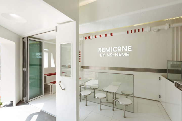
Remicone Ice-cream flagship branding by YNL Design, Seoul – Korea
posted by retail design blog on 2014-06-01
Add to collection

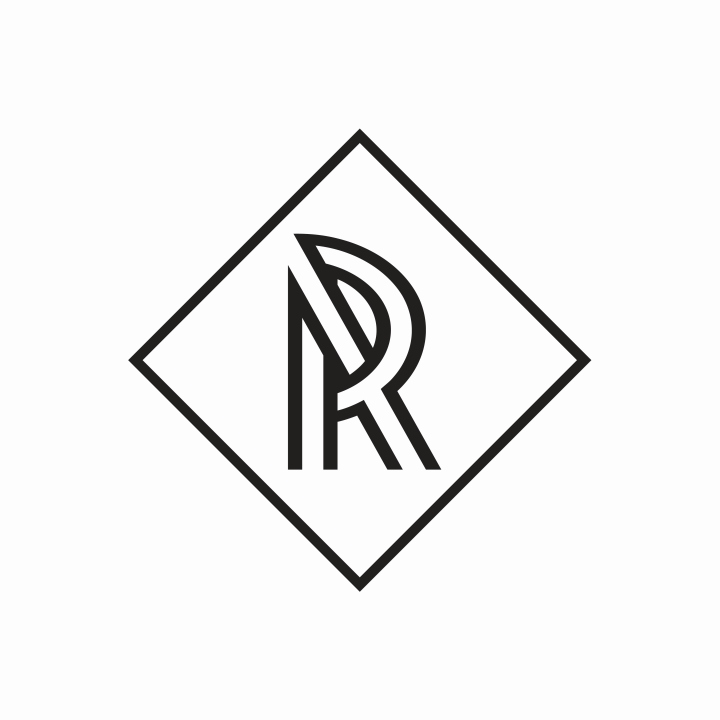
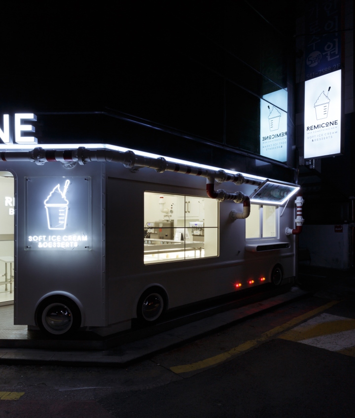
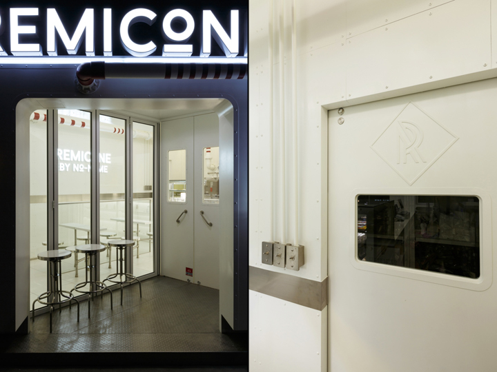
The main logo for Remicone was designed to resemble a soft ice-cream cone being created out of a remicon truck. The main typeface is also symbolically designed to makes the audience think of a laboratory. Remicone’s logo portrays the café’s unique technique of using laboratory-inspired items like beakers and droppers to serve its ice-cream to the customers.

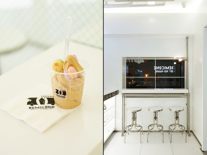
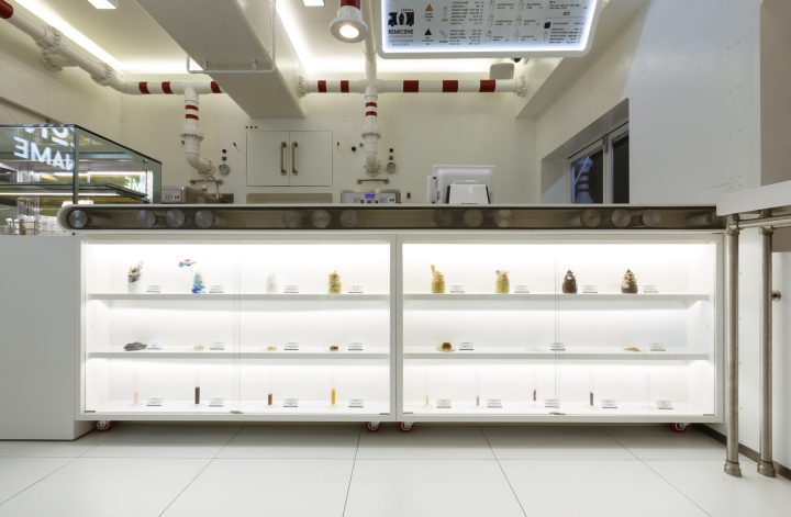
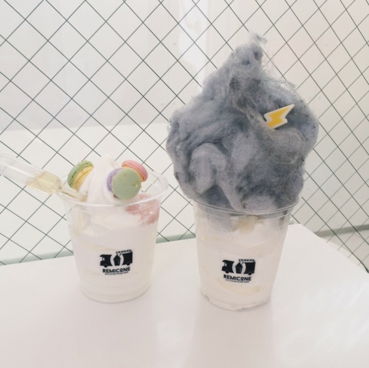
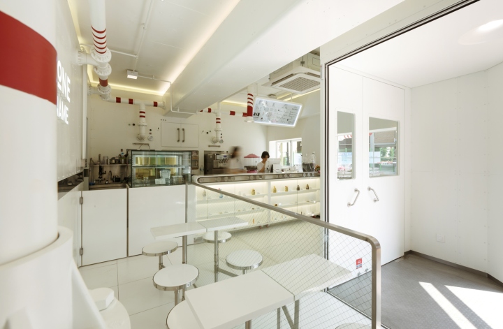
The concept used for Remicone’s brand identity is a laboratory in a truck that makes soft ice-creams. The take-out ice-cream cups that resemble beakers, the droppers used to put syrup into the ice-cream, and laboratory-inspired containers used to store the toppings for the ice-cream are all brand elements that are designed to provide a unique, fun experience to the café’s customers. To emphasize the brand image of Remicone, specially-designed label stickers are placed on all the droppers, containers and package boxes used in the café.

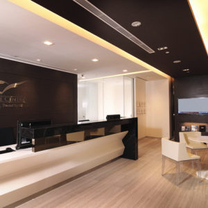
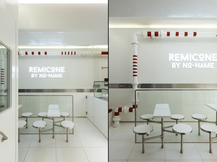
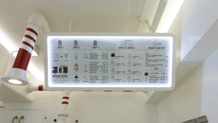
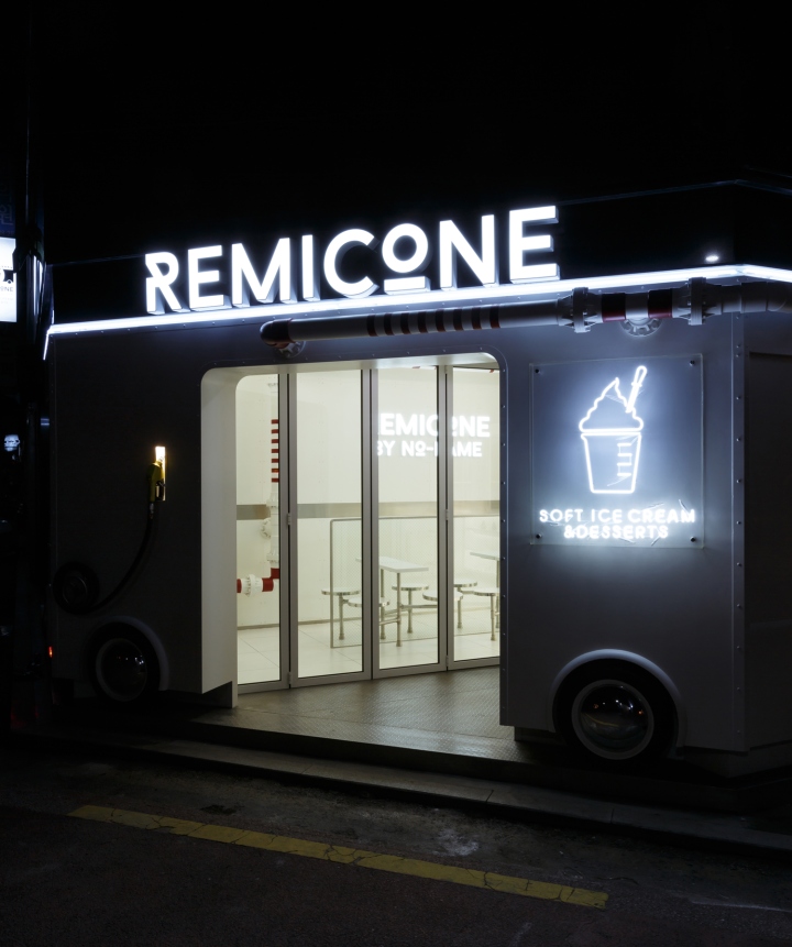
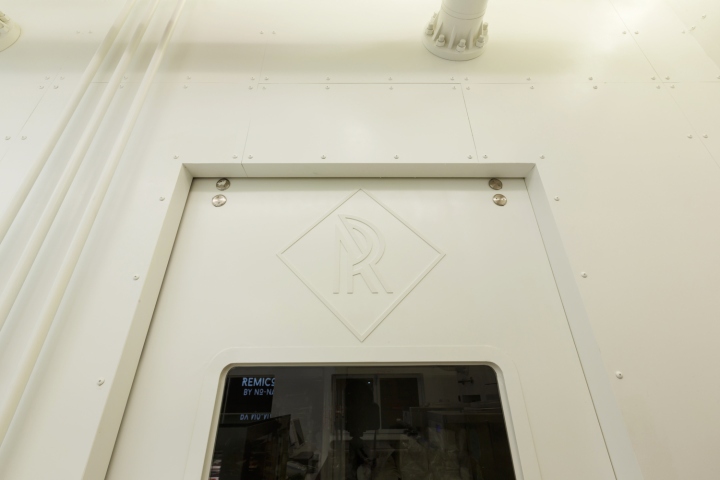
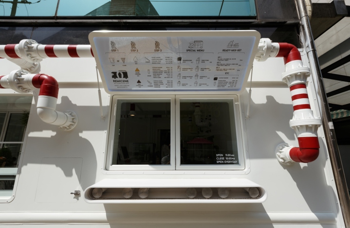
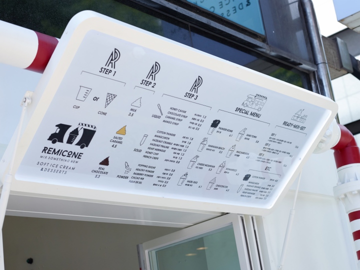
The alphabet ‘R’ of Remicone, which is the symbol for the café’s brand, is engraved on the door of the café. Also, the main sign of the café is boldly illuminated so that it can be easily spotted by the customers. As for the menu, each type of ice-cream that the café serves is illustrated as an icon on the menu list so that the customers can easily recognize the menu that they would like to order.
Brand Identity Design by: YNL Design
Designer: Liz Yoona Lee
Interior Design by: Betwin Space
Branding Direction by: No-name


Add to collection