Add to collection


Global retail design agency Sheridan&Co reveals its latest work in creating the brand identity and retail strategy for ETHOS – a new boutique ‘hybrid fitness’ studio centred on yoga. After a period of studying Indian philosophy, Sanskrit, and biotechnology at the University of Cambridge, founders Jennifer Hersch and Dr Theo Koutroukides became inspired to create a studio space that facilitated calming yet challenging physical and meditative workouts as well as provided a comfortable pit stop for relaxation and nourishment. Its flagship Cambridge studio, which opened in 2013, is a culmination of this vision and has since become a popular destination with locals from all walks of life.

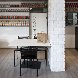
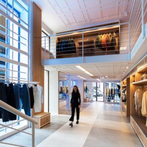
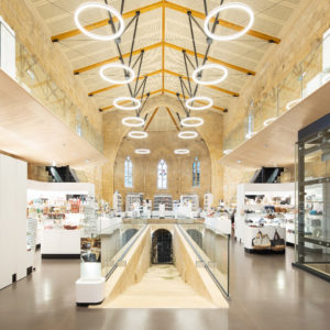
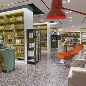
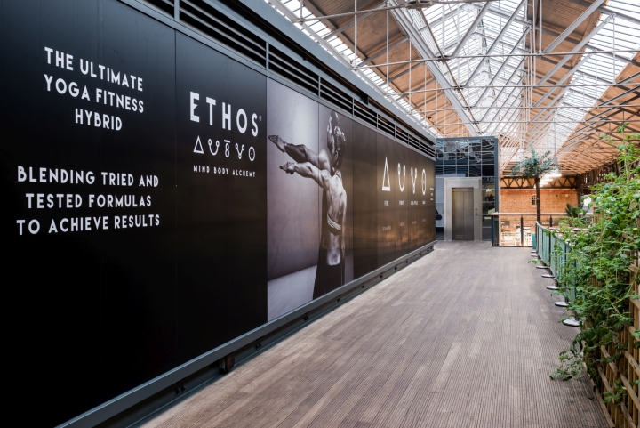
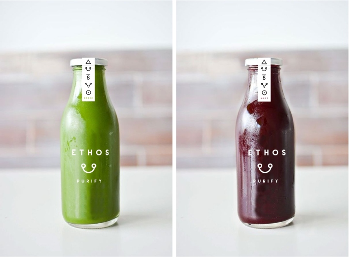
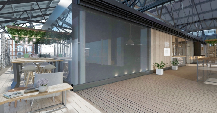
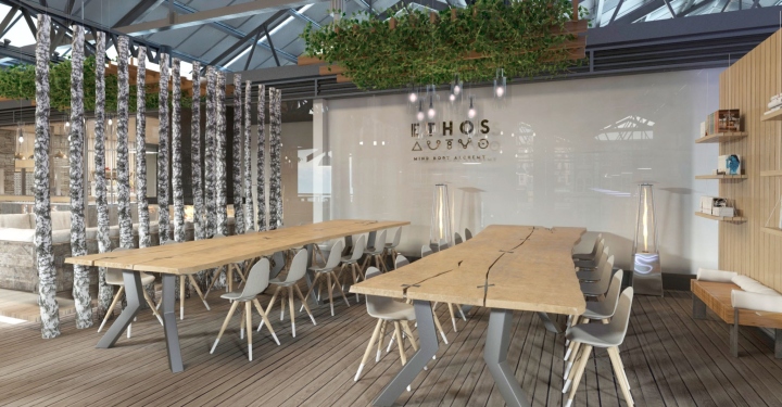
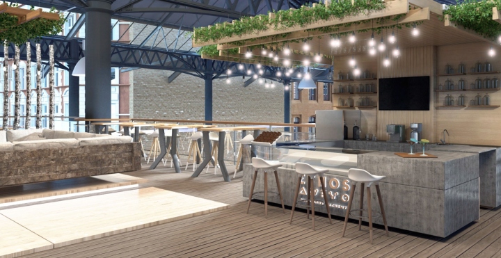
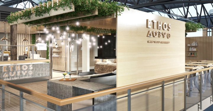
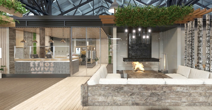
Sheridan&Co was tasked with developing the brand identity and retail strategy for ETHOS’ new London studio, expected to open in the City’s vibrant Spitalfields Market in 2016. The job included determining the look and feel of the brand mark and website as well as creating packaging and label design concepts for ETHOS’ own range of fresh juices and soups as well as other marketing collateral. The agency were also charged with devising a retail strategy, determining the entire customer experience and creating full interior design concepts including a reception and retail concession to showcase ETHOS’ own line of sportswear alongside other designer apparel, and a food bar area.

ETHOS sought a visual solution that was serene and stripped back, and resonated the brand’s passion and philosophy for achieving and maintaining physical and spiritual balance: a “Mind Body Alchemy”. As part of the creative process, Sheridan&Co delved deep into the brand’s current market position, analysed its competitor landscape and identified trends within the burgeoning boutique fitness scene to devise a strategy that strongly defined ETHOS’ core point of difference.
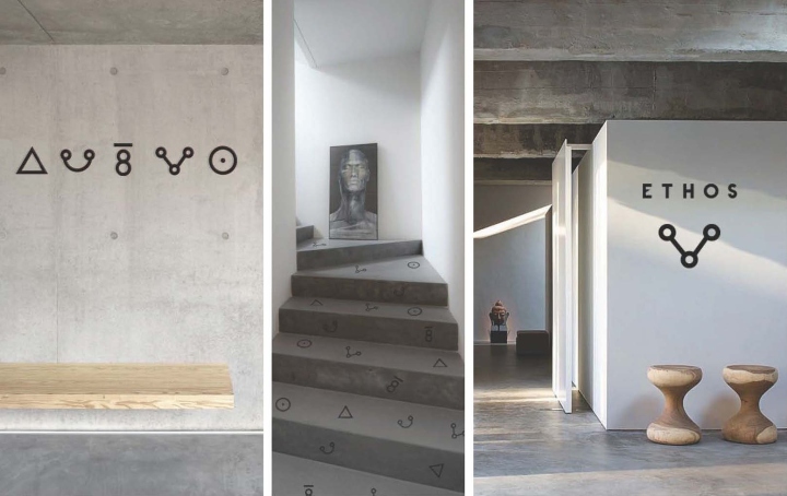
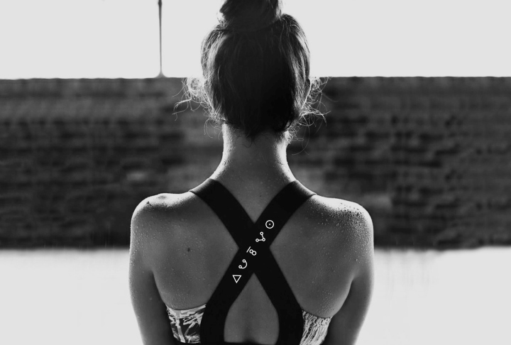
Given the founders’ academic background in science and philosophy, the team identified an opportunity to capture this deep-rooted love and respect for physiological and spiritual knowledge using ancient iconography and symbols that also echoed the age-old discipline of yoga.

Michael Sheridan, founder and chairman of Sheridan&Co commented: “Our initial challenge was to create a brand identity and multifaceted formula that would simply reflect ETHOS’ complex offering – which includes Bikram, Yoga, TRX, Barre, HITT and cycling classes, as well as a FitLab and café bar. The next test was to strike a balance in creating a look and feel that reflected the founders’ passion for yoga and science but also promoted healthy balance with a social space designed for people to hang out. ETHOS is a brand that respects self-discipline but also wanted concepts that reflected a friendly, inviting and accommodating culture.”
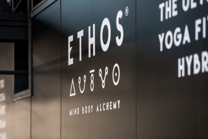
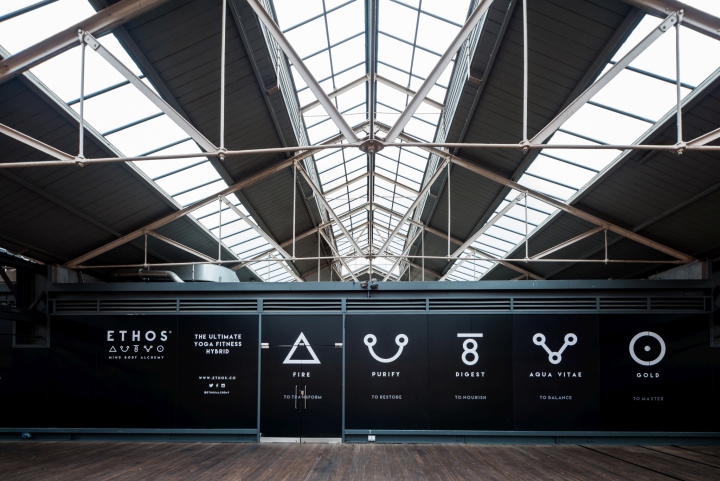
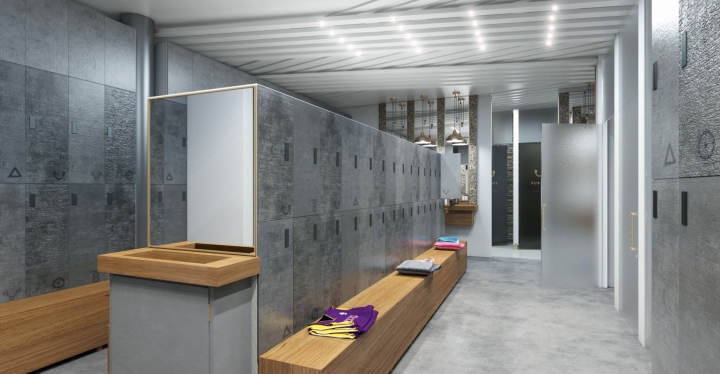
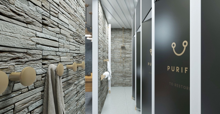
The font used for the brand mark is clean, bold and modern, with the middle stroke on the ‘E’ of ‘ETHOS’ angled in such a way that it seems to echo the typography of ancient hieroglyphics. The five symbols beneath ‘ETHOS’, which put context to the logo design, derive from physician and writer CJS Thompson’s book The Mystery and Romance of Alchemy and Pharmacy (1897). Here, “Fire”, “To Purify”, “To Digest”, “Aqua Vita” and “Gold” have been specially selected to define ETHOS’ service offering. Fire denotes transformation through sweat; Purify indicates the importance of hydration and restoring the body to a restful state; Digest highlights the importance of nourishing both body and mind; Aqua Vitae denotes the importance of balance and Gold reflects the inner drive and motivation to perform and succeed.

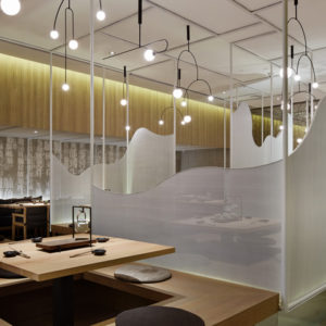
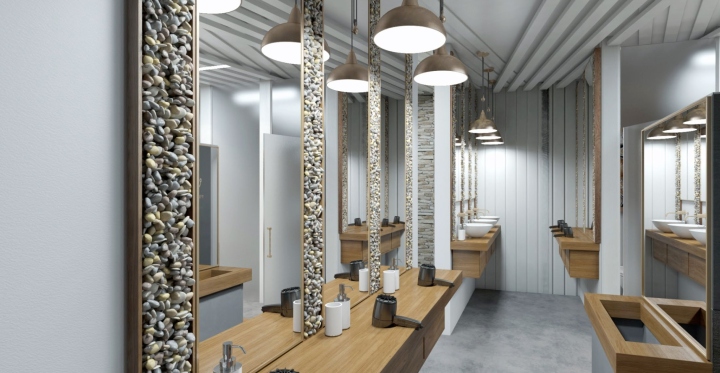
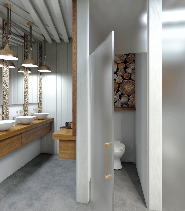
ETHOS’ slogan, “Mind Body Alchemy”, was derived from this line of thinking to further underscore the brand’s narrative and offering – not just yoga but an ‘ultimate yoga’ fitness hybrid that promotes physical and spiritual balance and nourishment. The visual language has been applied to core touch points in the interior, with the retail design concepts using a neutral and warm colour palette of parchment, brushed gold, stone, wood and white, as well as monochrome to exude an ambience of simplicity and natural, positive energy.
For the design and development of the retail concepts, Sheridan&Co then created three interior concepts that strove to apply this thinking into the physical environment; the final design is a hybrid of all three which harnesses the serene and natural woody aesthetics of a ski lodge, Scandi-retreat and tree house den. A muted background is offset by accents of vibrant green delivered by the multiple planters on display, while visual interest is created by juxtaposing textures from different natural materials. The overall effect is stripped-back, tactile and honest design, very much in keeping with the brand’s philosophy and service offering. Meanwhile, accents of the five core elements that make up Ethos are manifested on major touchpoints – from the changing room locker doors to the shower cubicles.

Michael Sheridan commented: “The new rise in boutique fitness studios are radically changing our experience of fitness forever. Individual, luxury and design-led, they have become lifestyle destinations in their own right. What makes ETHOS so exciting is that it is creating a place intent on physically and mentally balancing the body, not just from the services it offers but also in the carefully considered design of its environment. For us, it’s been a hugely fulfilling process to bring their philosophy, brand essence and vision to life. It reminds us about the importance of detail and the powerful impact this has on the customer journey.”


Add to collection