

Bar Deco, Washington D.C.’s latest restaurant/bar and rooftop destination, was designed by architecture/design firm CORE. CORE worked with owner/restauranteur Noe Landini to create a dynamic 4-level, 8,000 SF bar/dining and rooftop experience inspired by the Bulletin Building’s historic art deco façade and former use as a printing press facility. Bar Deco is located at 717 6th Street, NW. From the first walk through with the client, CORE knew Bar Deco would have a stripped-down aesthetic to highlight the good bones of the historic structure and offer a raw-but-dynamic dining and bar experience. The vertical stacking of the restaurant functions on four floors offered a unique challenge, but CORE was able to balance the flow of patrons to the dining, bar and rooftop levels while fusing art deco and industrial themes throughout the space.
When guests approach Bar Deco, they will notice the original exterior façade, custom industrial signage that coordinates with the interior design, and a new mural on the alley side of the building by artist Kelly Towles. Guests entering the ground floor will see the display kitchen and a double-height glazed-brick wall that hides the stairs to the second floor dining space. Neon signage directs them to the proper floor and enlivens the entry. CORE retrofitted the ground floor with a commercial kitchen. The new elevator and relocated staircase punch through all four floors.
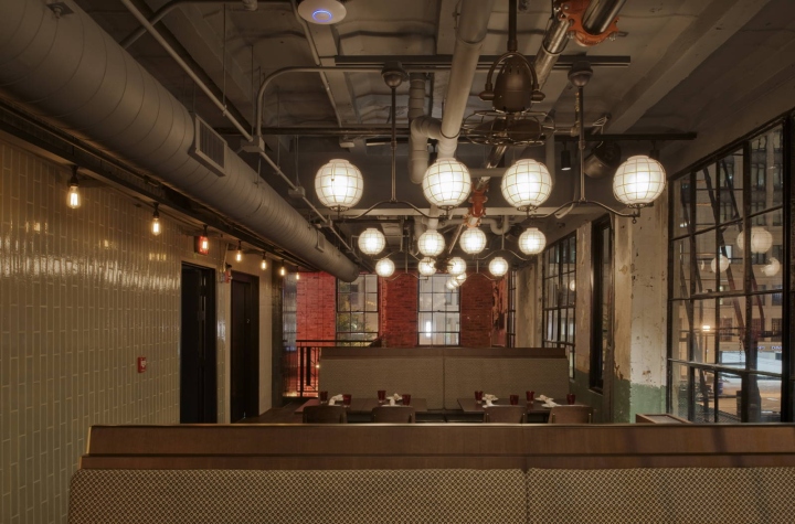
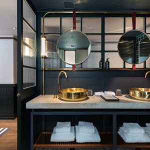
Since the elevator and stairs are a striking new structure within the space, CORE differentiated them from the existing structure by cladding them in three colors of glazed brick (a dark metallic green, cream, and industrial green) installed in a vertical running-bond pattern to emphasize the structure’s verticality. For the rest of the color scheme, CORE used black and white, brass, oil-rubbed bronze, and industrial green as a punch of color. CORE combined a stripped-down aesthetic – of exposed concrete, plaster, lath, and aged brick – with art deco and industrial motifs through the use of pattern and materials, including a variety of metals to tie into the industrial theme. Many of the fixtures and furniture are more connected to the industrial theme, whereas wall covering, fabrics and other finishes incorporate deco patterns. This aesthetic combined well with Landini’s continued commitment to creating restaurant concepts that integrate with the architecture in which they are built.
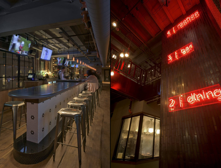
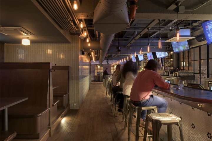
On the ground floor, guests will notice custom-designed walnut millwork host stand with art deco detailing, custom firewood storage and looking up, a custom metal railing at the second floor with industrial pendant lights to give the space scale. The second floor dining area has long rich-wood banquettes, booths, and a communal table. On the third floor, the 50-foot long zinc clad bar hugs a wall of windows that would typically house the back bar. Locating suspended liquor storage at existing beams and integrating all storage and refrigeration in low millwork pieces leave the windows unobstructed. The front of the bar is accented with black and white flower hexagonal mosaic tile. Even the bathrooms on all three floors have Deco-inspired, handmade scalloped wall tiles and large-scale hexagonal floor tiles.
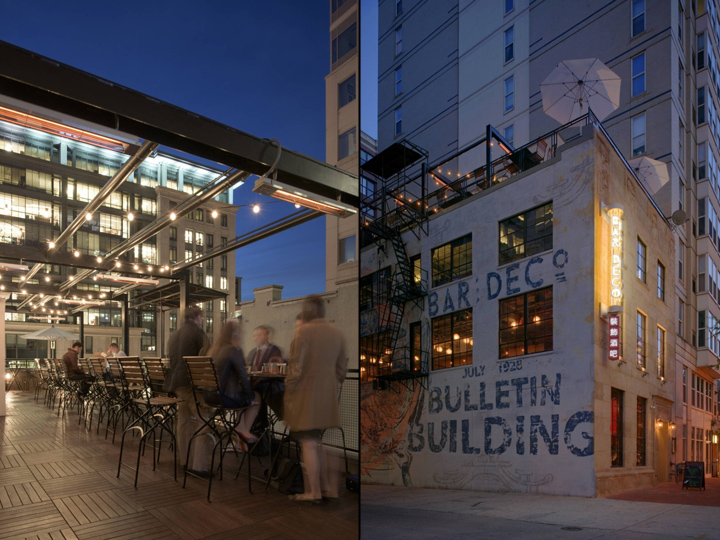
To the greatest extent possible, CORE salvaged the existing structure on the roof and minimized the amount of new construction in order to maximize the roof deck space. The rooftop has a new ipe wood deck and a custom metal pergola with heaters, misters, and a canopy shade. Subtly-lit plantings line the perimeter to create an airy and comfortable space no matter the season.
Photographer: Ron Ngiam


Add to collection
