
Yizheng Experience Center by United Design Practice, Pujiang County – China
posted by retail design blog on 2017-03-25
Add to collection

Yizheng Stationery is a market leader in children’s eraser in China. This experience centre, though grounded in this category, is not targeted at children. This is part of a broader B2B communications brand building framework. As manufacturers in China transit from OEM, ODM to being brand owners, the founders need to embark on the often unfamiliar process of brand building. This process of building their brands from scratch is an onerous task, and with so much to do, knowing where to start, and subsequent project phasing is key. Here we decided to embark on B2B communications first, before tackling B2C touchpoints. It is more direct, and cost effective, without taking too much time tackling market segmentation and product line architecture issues. Especially important for small medium enterprises (SMEs), is for the brand consultants to deliver in as quick a time frame as possible a solid response and ROI for the inception phase. Only then will the SME be confident enough to embark on the next phase in the long process of brand building.
This experience centre is situated in the factory, it is meant to be part of an entire sales journey. As such, the spatial layout and circulation is meant to enhance this experiential journey. Upon arrival, they past through the lobby, enter the experience centre and turn left into conference area. Here they rest, freshen up take a drink, and watch the brand video. Thereafter, they leave to visit the factory, to see for themselves the level of automation and production sophistication. Re-entering the space, they turn right, passing into the concept tunnel, and into the retail mockup area. It is important for business partners to understand the diversity of their product range. The journey continues into the experience zone and back to the conference room where the client will address further questions and conclude the business discussion. In this phase, we left the logo largely untouched. Our aim is to bring the brand to life, making it relevant to both their partners and consumers eventually.
Corporate brand experience centres targeted at business partners traditionally has many exhibition boards with lengthy paragraphs just talking about their manufacturing prowess and production capabilities. Truthfully, this type of execution puts people to sleep, and what it does is deliver messaging on a very crude level. Our approach therefore is to deliver a visual spectacle; impress, intrigue and they will want to know more. In terms of brand communications, we ground the overall concept on the user level. In this age category, even if the child is the end user, the parent is the gatekeeper. The former typically only cares about whether how attractive the product is, the latter however, are the ones we are targeting in terms of messaging. We all have good and bad memories from our childhood. But as we grow older, the bad ones tend to fade, leaving the good ones. This is the empowering message that we wish to convey to the parents and for them to tell their children. Everything has two sides to it. If we manage to overcome the short term difficulty, the reward is often life long. Once we overcome the unfamilarity of making friends, the resulting friendship could last a lifetime.
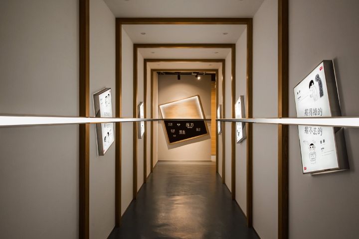
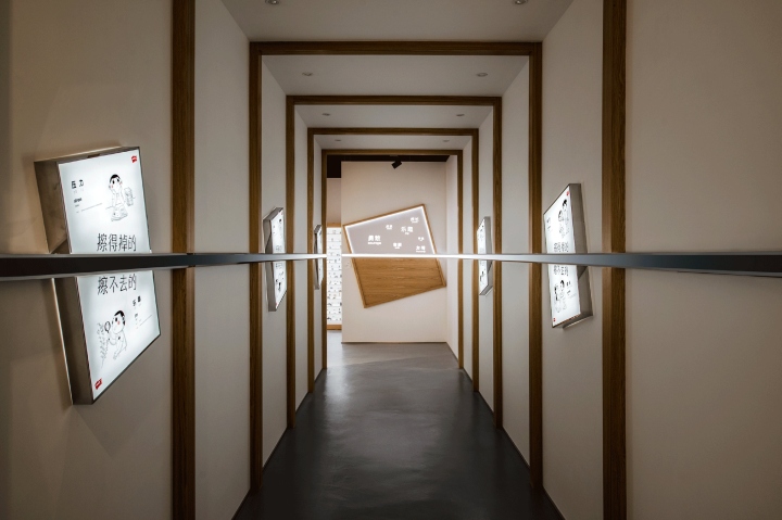
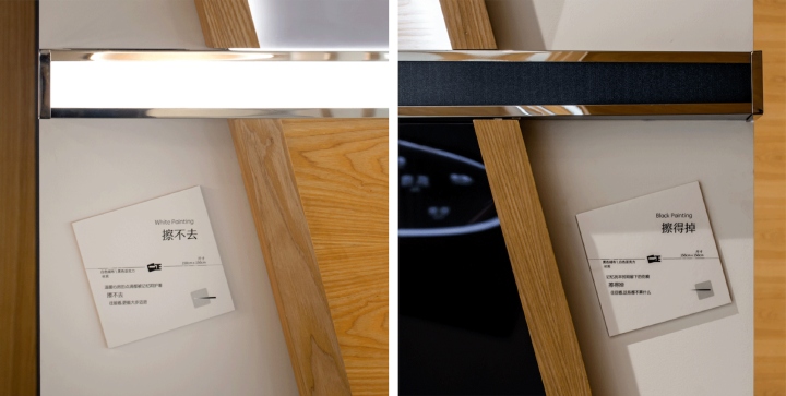
From this concept, we developed five posters. Spatially, the tunnel is not only a transitional space. The 5 key posters are placed along the tunnel walls at a 15 degree angle (consistent with the incline in the logo). A line that shifts from black to shining white cuts the posters in half, emphasizing the two sides of the same story. This line is the spatial embodiment of the idea of what is erased away and what is not. Turning the corner the line ends at opposite sides of the tunnel, cutting across a black painting and a white painting. Looking forward and backward in the tunnel is like looking into the future and back at the past. With the right encouragement, we walk towards the white painting, and see the growth we have attained, only to turn back to realise we have overcome these obstacles that are on the black painting. Many manufacturers likes to talk about how great they are. This is not only unconvincing, it is a sign of low self-esteem and lack of confidence, much like a person you meet who likes to brag.
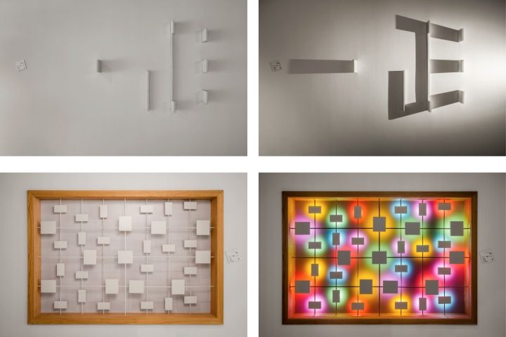
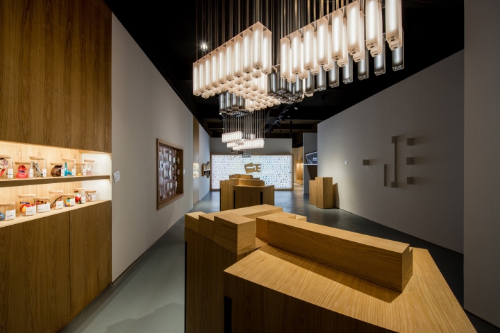
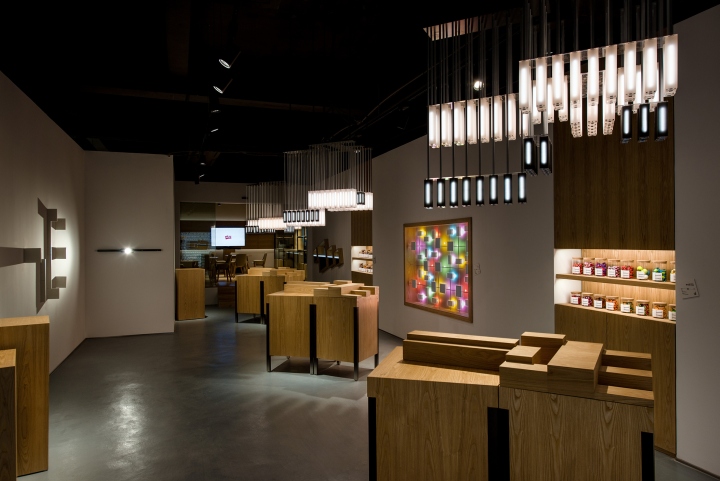
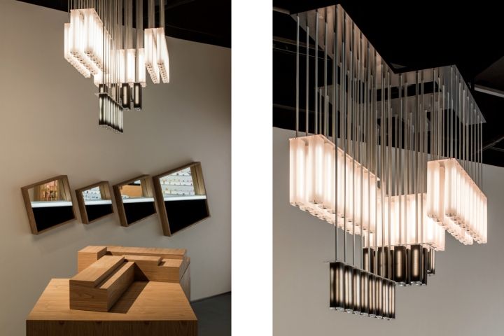
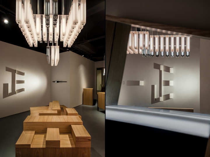
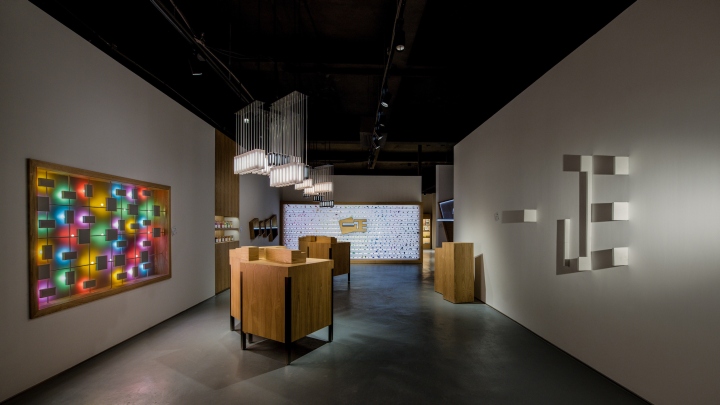
In initial discussions with the client, we reached the alignment that we will not talk, but actually demonstrate with real actions. The retail mockup area shows impressive product range. The acrylic wall displays an overwhelming numbers of erasers of all shapes and colours. How then do we demonstrate brand innovation, creativity, and constant pursuit of excellence? This is where we came up with delightful solutions. We installed two rubber light installations. One is a play on shadow, another on colour. White rubber blocks protrude from the wall in seemingly random fashion, only when the light is turned on do the Yizheng chinese characters come into being. In the second we used light reflected off coloured rubber blocks to compose a painting with light. Both are dramatized by the before after effect in the storytelling with light. Besides the light play, we wanted to make something surprising for which rubber is suited for yet seldom considered. We experimented with making rubber light fixtures, and after numerous prototyping rounds, they turned out amazingly well. It took a while to get the right mix of both rigidity and translucency in the white and black rubber tubes.
We made 3 sets of these rubber chandeliers, and they are configured differently elevation wise. But from a bottom looking up, it spells the chinese characters of Yizheng, being a mirror image of the wooden blocks on the podium below. Here, we want to showcase the fact that Yizheng products uses food quality colouring and scent additives. Safety is especially important to parents. We placed the erasers in jars, and for the guests to open them and smell. This adds a level of interactivity without the message being too in your face. In our consumer interviews, we found that Yizheng erasers were not just functional, really they are like companions to the children. We set up here a rotating exhibit, for parents to share the items that made an emotional connection with their children. And on the labels, we printed the names of parents and kids, as well as the story behind the exhibit. Each exhibit is a time capsule, a snapshot in time, left here on loan.
Design: United Design Practice
Photography: Shawn Koh


Add to collection