
EE’s new Showcase stores designed by Quinine offer immersive customer experience. Retail experience consultancy Quinine began working with EE, the UK’s biggest mobile operator, in November 2016 with a brief to create a number of stores that would ‘showcase’ the best service, the best network and products on offer from EE and BT (EE became part of the BT Group in 2016), extending the reach beyond traditional mobile into the multi quad-play market. London based Quinine set out to design stores that would marry human behaviour with the brand and the physical environment to give a multi-layered and dynamic experience.

The result; premium stores that welcome customers in, inviting them to get involved with the latest technology and network innovations. As well as exploring the latest mobile handsets, customers get to try live products such Google Home, Apple Watch, EE Live TV and Samsung’s VR headsets. “We based the store concept around an aesthetic called “show time”, a theatrical design language, which uses a large scale and proportion with dramatic lighting for all product displays and service experiences. At the same time we were keen not to make it appear ‘hard-edged’ and too technological.

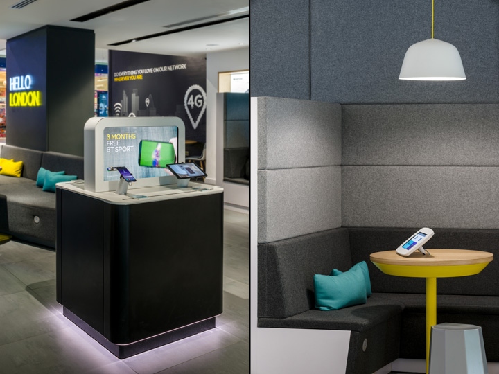
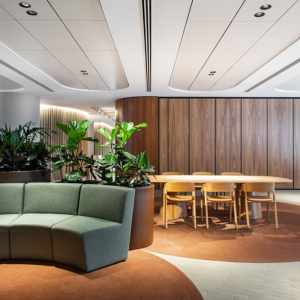
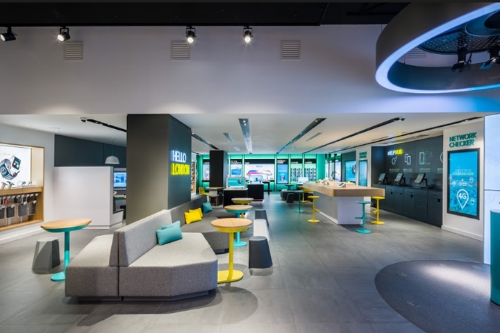
We softened the space by adding more raw and human elements and introduced a conversational tone of voice.” Ian Johnston, founder of Quinine said on designing the stores. The store experience is designed around the ‘cathedral’ principle; with high ceilings that wow customers and create immediate intrigue at the front area of the store, whilst lowered ceilings at the centre act as a more ‘intimate’ space, suitable for face-to-face consultative conversations. Once inside, customers are greeted with EE’s new showcase stage, a multi-functional display space suitable for a variety of physical and digital experiences.

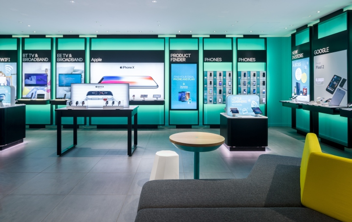
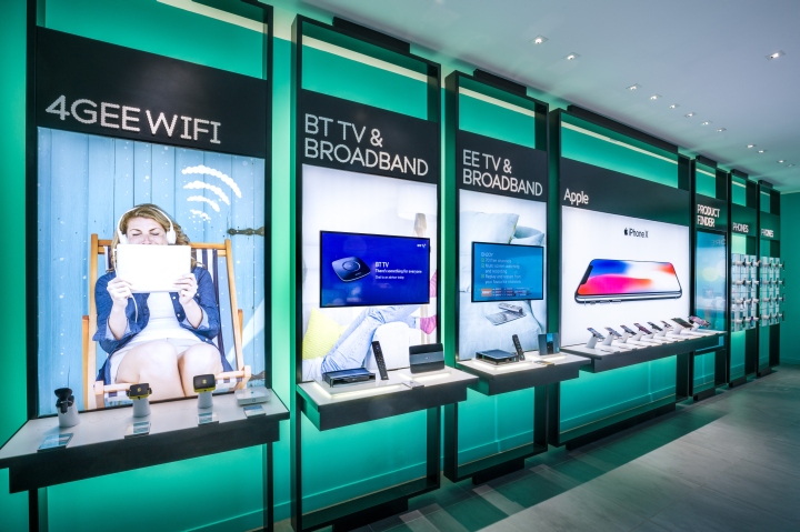
With the aim to involve customers, dedicated EE staff use the large digital screens and display props to engage with customers, encouraging them to get involved. The plan is that these installations will change out every three to six weeks, keeping the store fresh and the content current and relevant. The London stores launched with a gesture-controlled dance experience, where customer and staff movements appear on the digital backdrop, to promote 6-months of apple music for free. The Nottingham store launched with an iPhone 8 event. In order to increase customer dwell time and provide more opportunities to browse new products and services, the traditional devices (mobile handsets and tablets) were relocated to the back of the store.

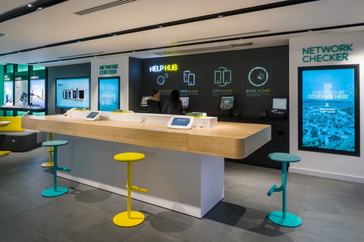
An illuminated wall and dramatic oversized product displays maintain the focus and lure customers to browse, select and compare. As a result of a new mobile POS system, which allows customers and staff to transact anywhere in store, Quinine removed the traditional service desk. The new design provides a variety of service touch points for different kinds of customer commitment and postures. With a dedicated Help Hub, service was placed at the heart of the store experience. An innovative use of digital projections located behind the Help Hub, shows animated icons that tell service stories.

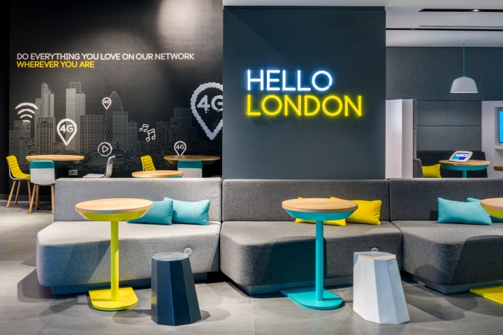
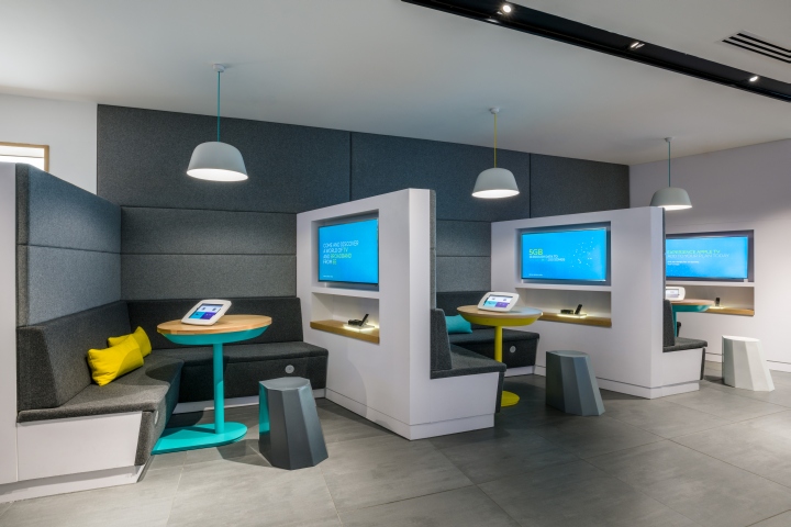
It’s a more integrated digital layer that moves beyond screen-based interactions, and successfully aligns with the EE brand. Throughout the stores Quinine introduced a simple palette of materials to create a warm, familiar but dynamic modern feel. European white oak and felt-like fabrics for upholstered seating were used to indicate service areas. While metal, powder coated in the brand colours (aqua and yellow), pop and lift a subtle palette of grey, black and white walls. Dynamic signage throughout helps customers to navigate and adds a light, fresh and friendly tone to the store.

A brand wall features a local hand drawn sketch of the City with icons to underline the network capabilities, directly connecting the store to the local community. “For a store experience to be successful it must work for the business, the brand, the customers and the staff”, said Johnston, adding “we ensured that we included elements throughout the store journey that encourage involvement and facilitate a comfortable, relaxing face-to-face experience for both customers and staff. We wanted to ‘democratise’ technology, so customers could feel at ease and inspired by what’s on offer”.
Design: Quinine
Photography: Gareth Gardner
