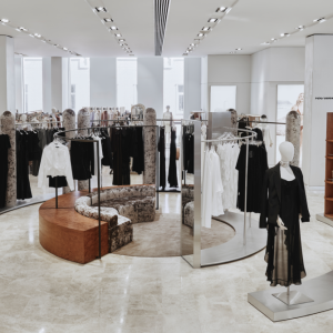
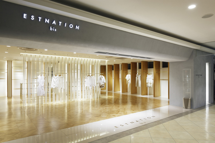

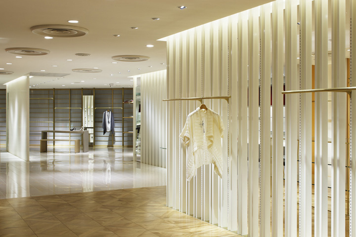
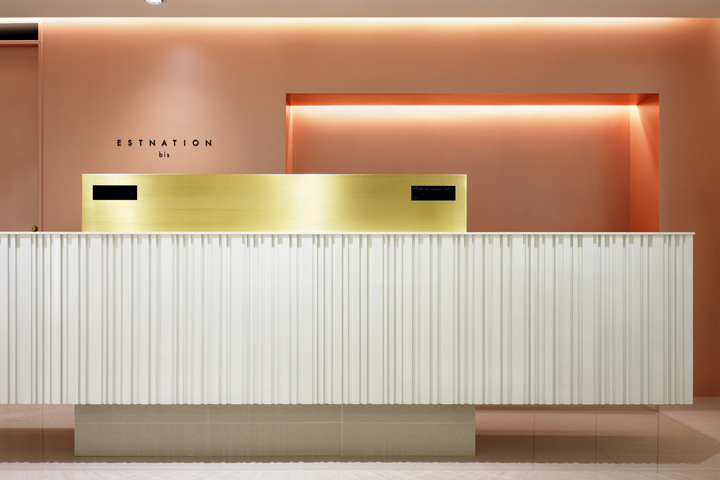
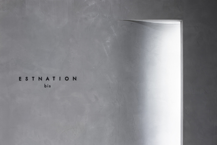
ESTNATION is named under two reasons. One is from “East Nation” because ESTNATION attempts to extend to the world from Japan. Another is from “EN” which means destiny in Japanese. As they sell the western clothes, the store space needs to embody something relating to the east country, Japan. The vertical lines are more seen than the horizontal lines in Japanese culture, that is why the vertical design is used for the store.
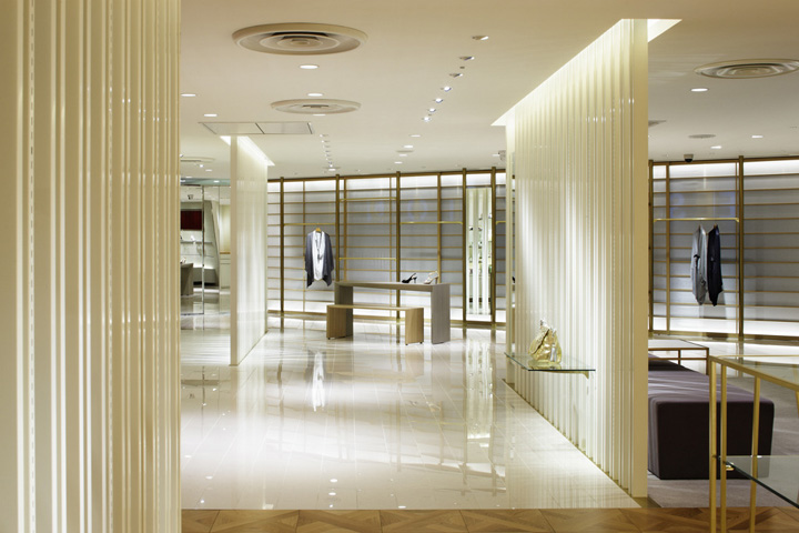
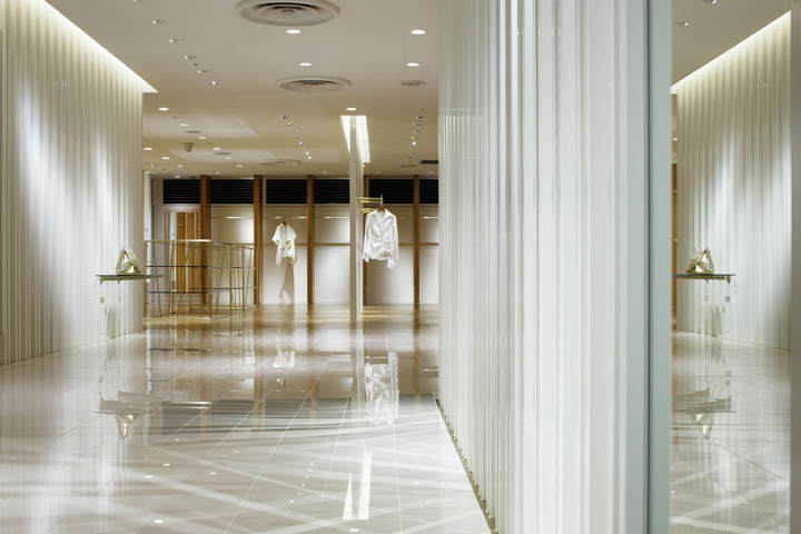
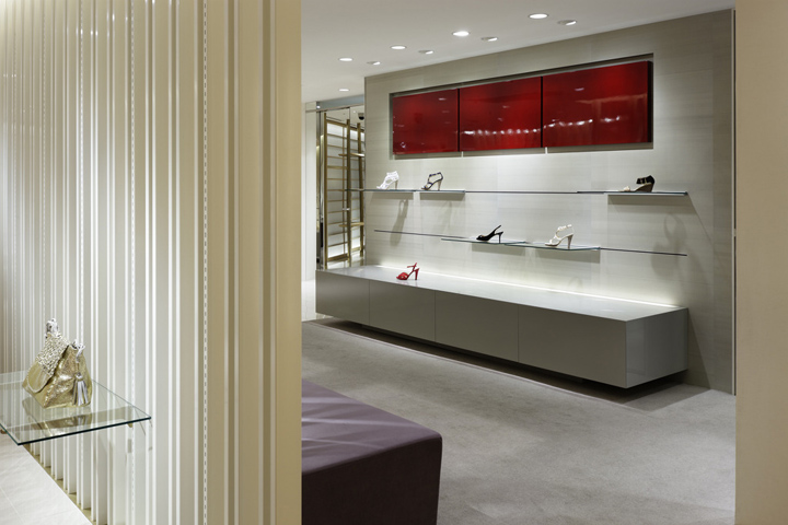
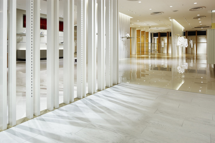
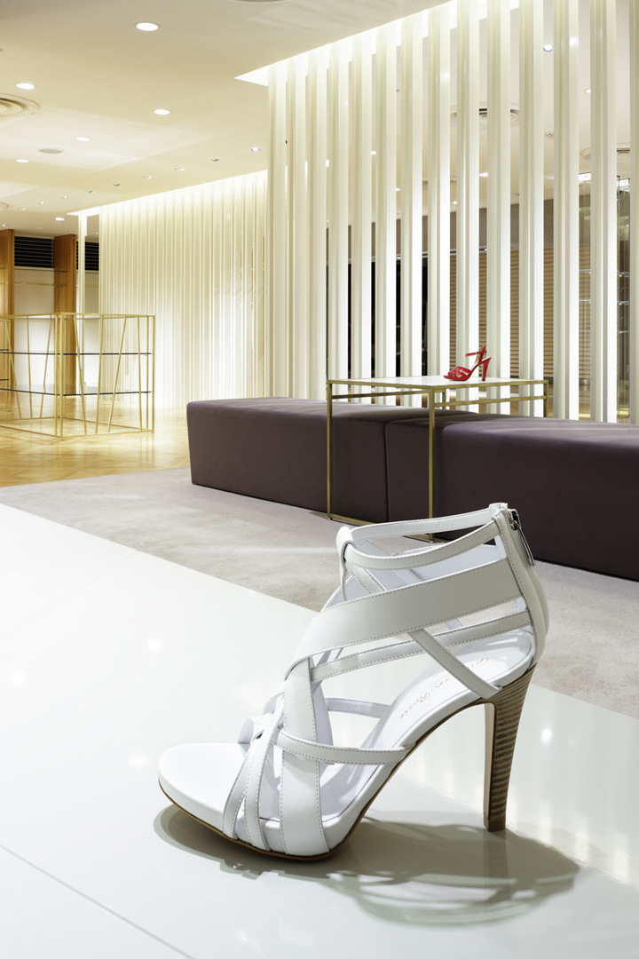
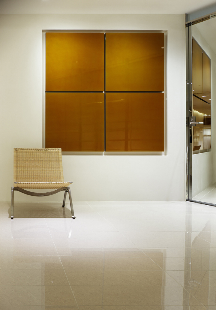
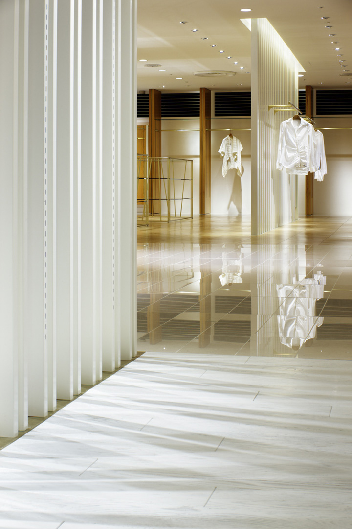
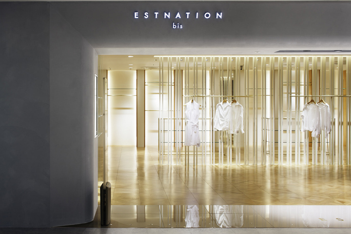
The key design is the white stick-partitions that vaguely divide the whole space. As the location and environment of the store is not said perfect because of the low ceiling and deep shape. The stick-partitions help to show customers the whole of interior even from the entrance. If they were wall partitions, the store would be very close and narrow so that the store might lose customers. They relief customers also works as a guide for them. Beside, the wood material and the indirect lighting are used for the entrance area to show a warmness to welcome the customers. The lacquered rectangular panels as one of the decorations and the shoji paper on the wall flash across our mind as Japanese. It is attempted to create the west and east mixed atmosphere.
Designed by Moment Design


Add to collection
