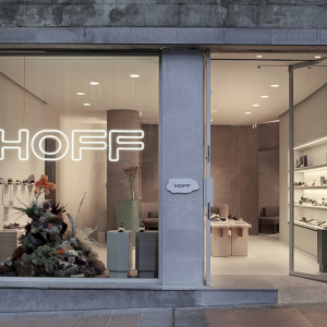
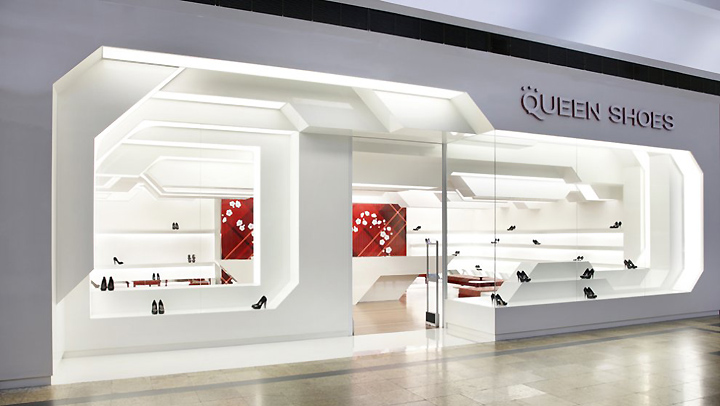

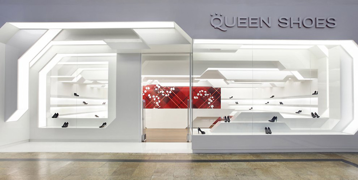
Pure white. White paint is the new kind of colour closely linked with the futuristic world. This is a completely personalized project jumping back to the architect’s youth references, from the Star Wars imperial soldiers wearing unblemished white, from Superman’s Fortress of Solitude – a crystal castle in the heart of the North Pole – to the masterpiece of 2001: A Space Odyssey, an iconic reference. These references were intentionally mixed up to create the concept of this shoe shop in Londrina, Brazil.

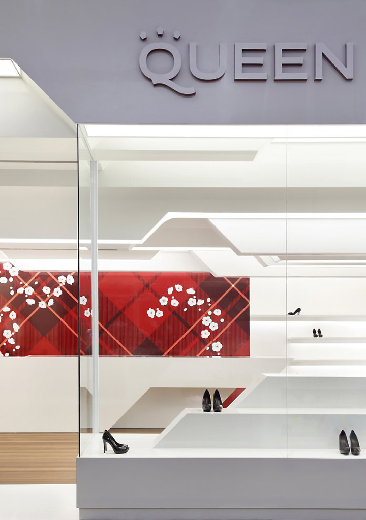
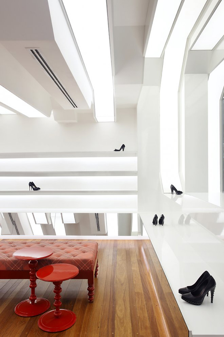
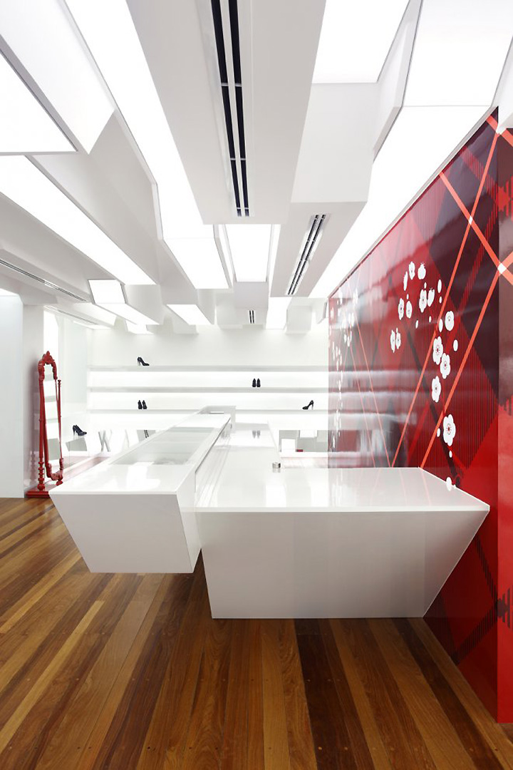
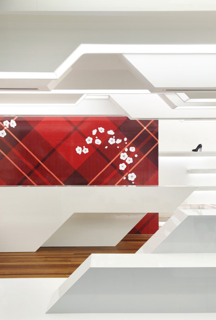
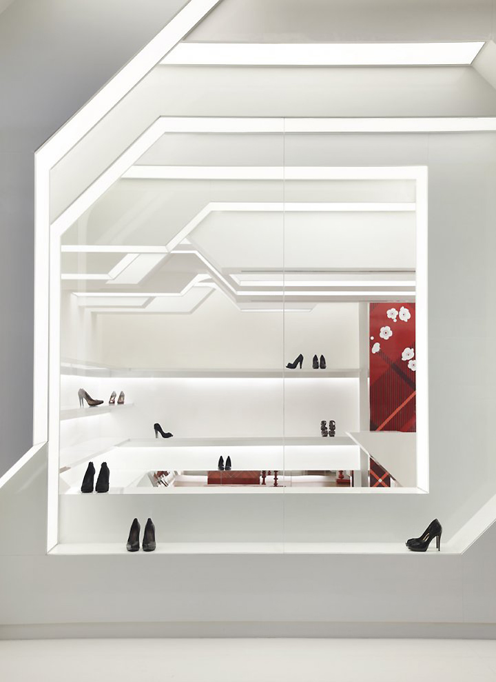
The shop’s outer-space expressiveness results from a geometric movement which stems from eighteen 42cm wide white segments which compose the walls and ceiling. The shop fade is the first segment and it introduces itself as a solid structure sculpted in order to create the entrances. The following segments obey the same movement pattern, each one of them sculpted to build the shop interior.
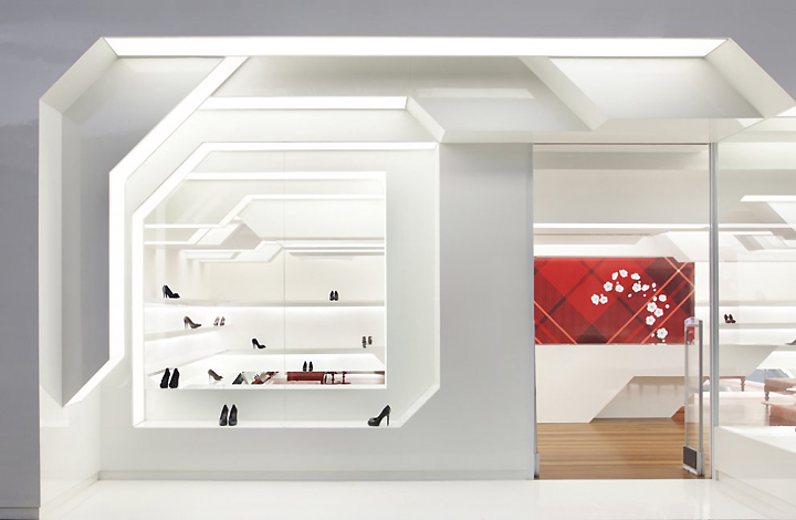
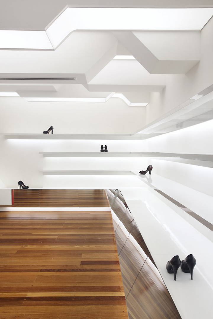
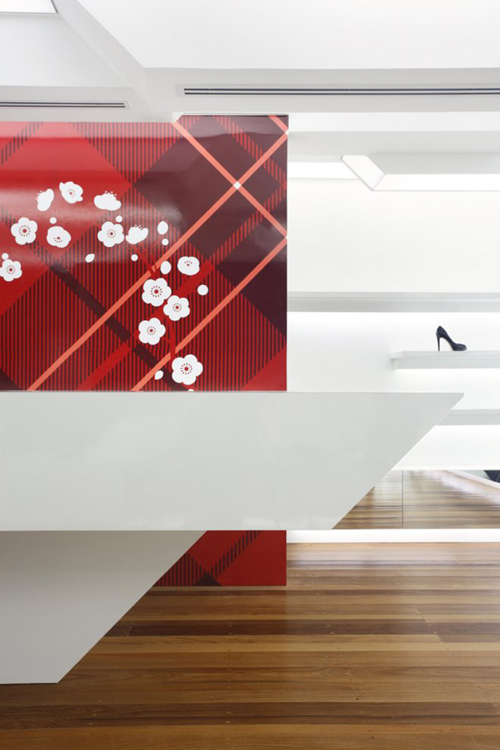
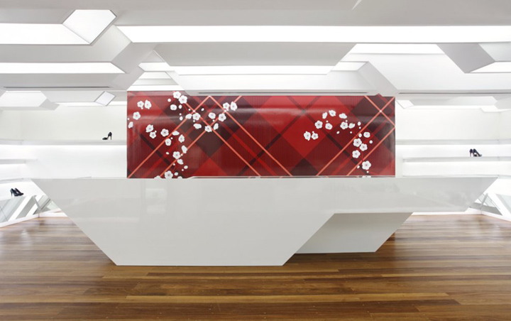
The cashier’s counter follows the segment patterns and comes to life as a detached sculpture right in the centre of the shop. Behind the counter, a panel hides a staircase which leads to a small storage room and a mezzanine. The uneven batten floor warms the visual of the shop atmosphere highlighting the geometry of the segments. The ceiling is about 2.40m to 3m high inside the shop due to the segments visual aspect in the ceiling.
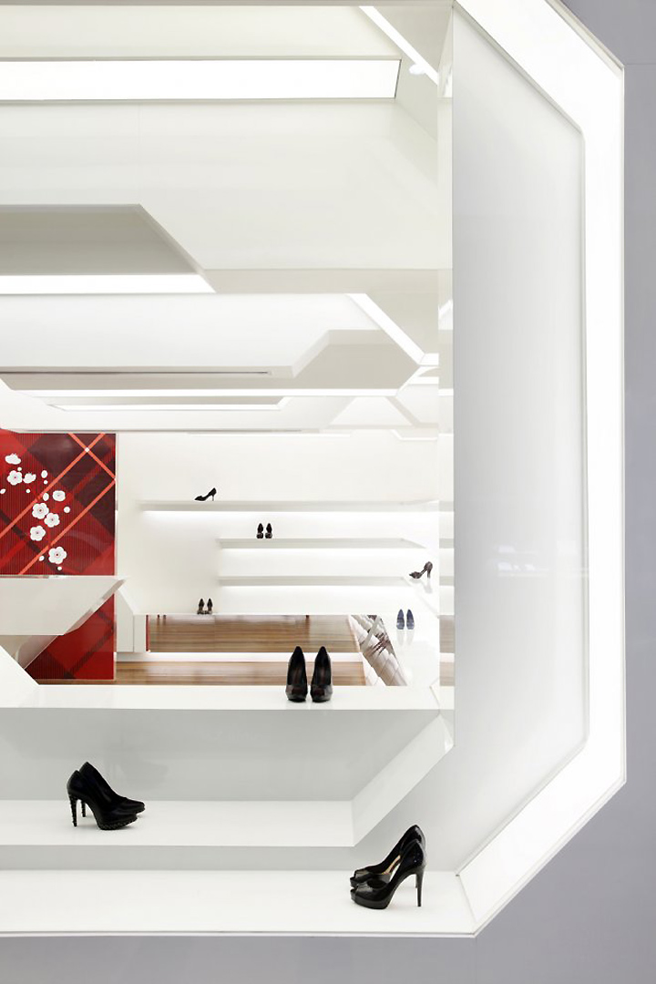
Constructive system and sustainability. The client asked us to observe the shopping centre policy which states that the shops have to be renovated every five years. Therefore, we chose to use wallboards, which is a light and resistant material and facilitates future architecture changes. The wallboard thermo-acoustics coupled with the volume in the ceiling and the walls resulted in a functional acoustics environment.

The lighting technical project determined the set-up of polyurethane tensioned screens on some of the segment faces, spreading the light equally. Only T5 light bulbs were used as they offer lighting efficiency with low-energy consumption with an added bonus of producing less heat. Compared to the same shop before the redecoration, there was a significant overall economy of approximately 70%, once the use of air-conditioning was reduced because less heat is produced by the new lighting project. The outcome is an almost shade less environment with efficient light.
Designed by Guilherme Torres

http://www.architizer.com/en_us/projects/view/queen-shoes/12845/


Add to collection

