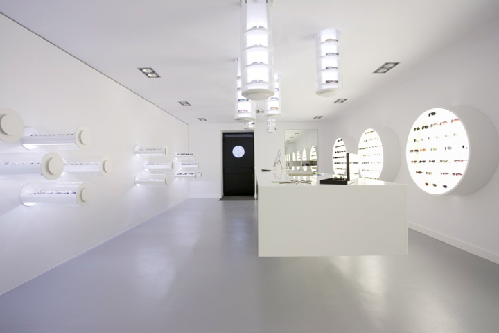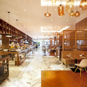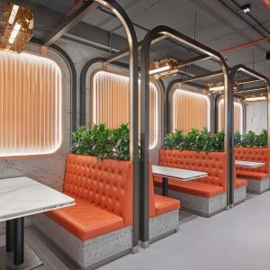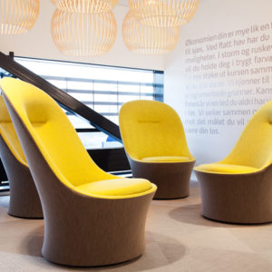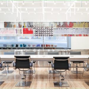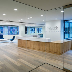
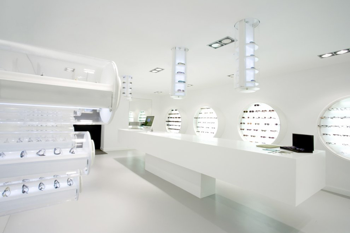

The freudenhaus eyeglasses follow an idea of the simplicity and high quality of materials. A timeless essenz from clear lines, simple forms and high-quality materials. The interior decoration of the eyeglass shop reflects the mark example in convincing form. A concept was developed that above all arouses interest and curiosity of the quite young target group. At the same time by reduction and pureness of the design the eyeglasses move into the center of interest.

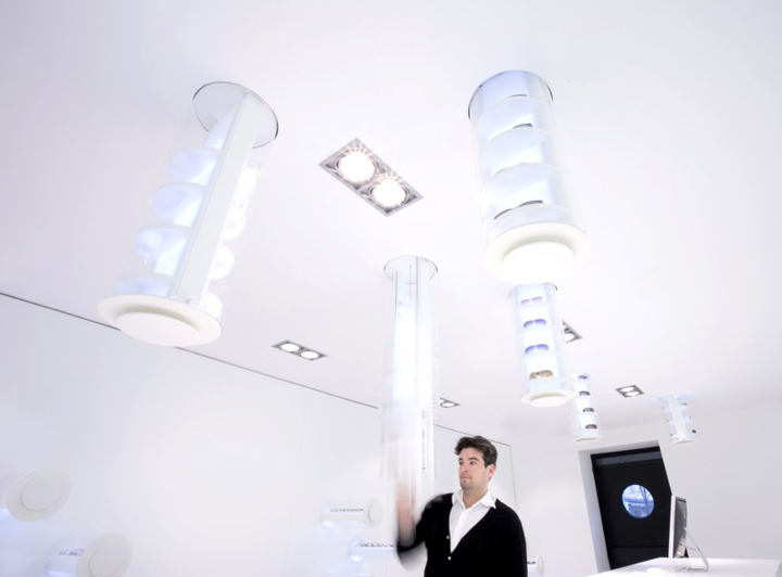
The unorthodox disguised shop windows, whose round porthole cutouts are taped with videos of the current eyeglass collections, hide themselves to what the clients find as special presentation techniques behind the large metal door. If one got inlet after short ringing, the bright and clear design surprises at first sight. The white frontdesk floats as space sculpture in the center. From the ceiling and walls extendable glasstubes rise up in which the eyeglasses are presented.

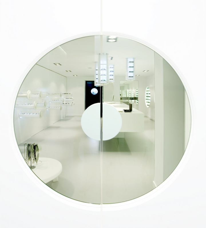
Spacehigh reflected surfaces in the showroom let the small hitting a corner shop work and grow in space. If one finally regards the separation doors at the end of the area, one recognizes, how the forms of the Corporate architecture were taken up subtly here: A swinging door, which resembles an oversize pupil with its round glass cutout and the centrically set semicircular grasps.
Designed by Aigner Architecture


http://www.architizer.com/en_us/projects/view/freudenhaus-eyewear-store/27904/
