
“The product has to be the protagonist of the shop” is the utterance most frequently repeated to me by my clients. In this case the product should be the main object of the design thoughts and “how” it is displayed is the final goal of the design. Instead I believe an exposing place is primarily composed by the human beings who relate themselves with that very space and see that specific product. An exposing place without visitors or clients has no meaning. I believe that the major thoughts on design have to address to people.
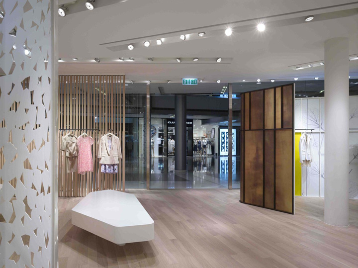
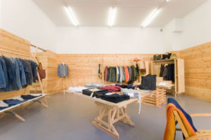
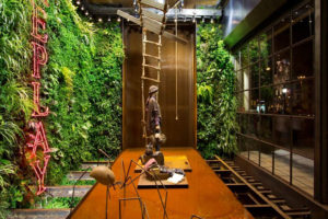
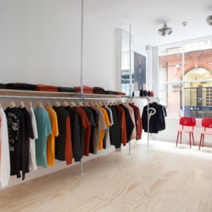
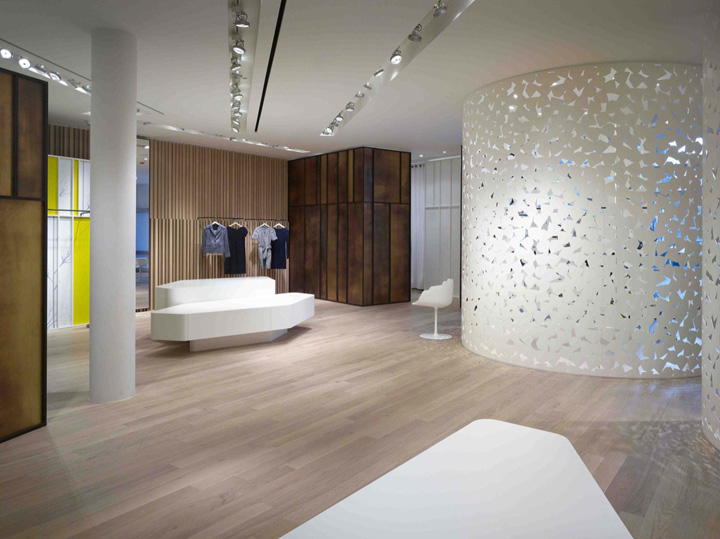
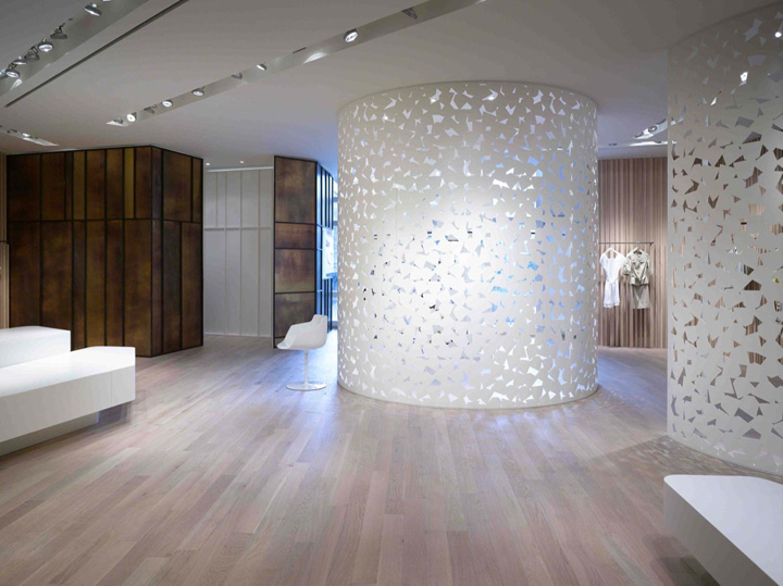
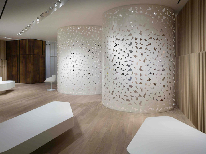
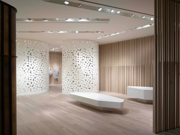
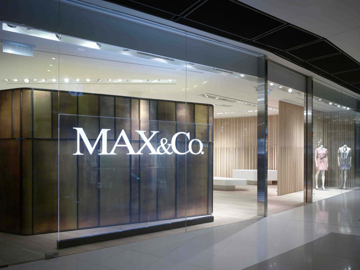
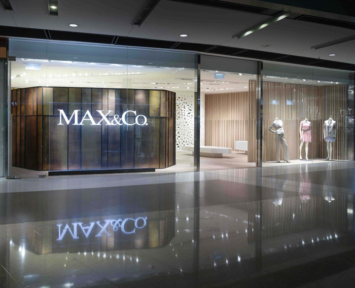
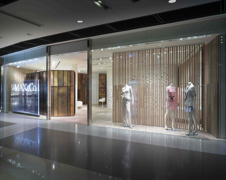
Following this concept we designed a space where the product is not visible from the outside but people is attracted by visual stimuluses and suggestions. The space is prepared with volumes that are pure geometrical shapes, cylindrical with casual textures but also apparently casual shapes closed with geometric severity.
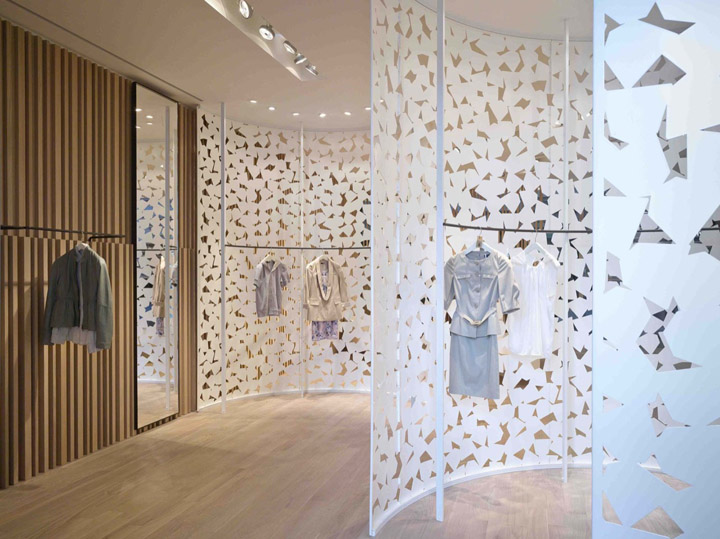
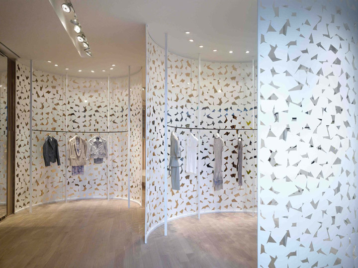
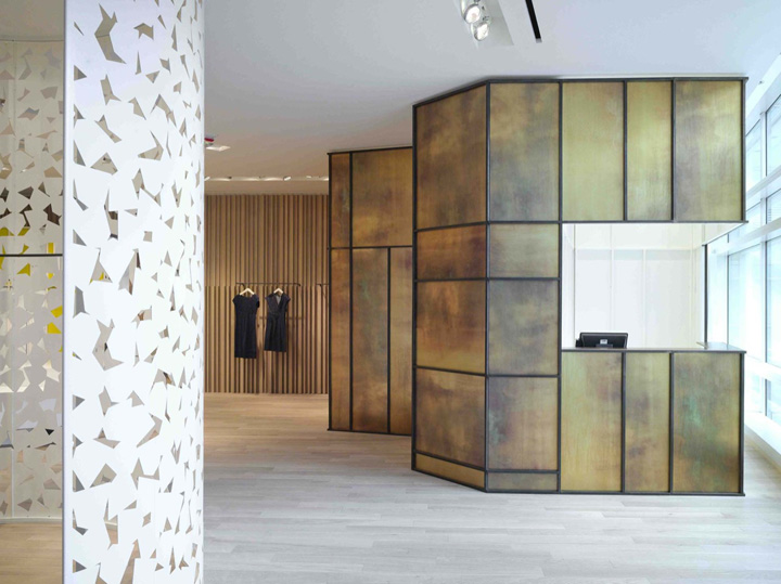
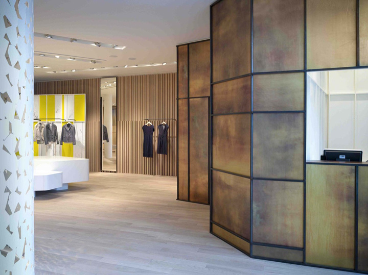
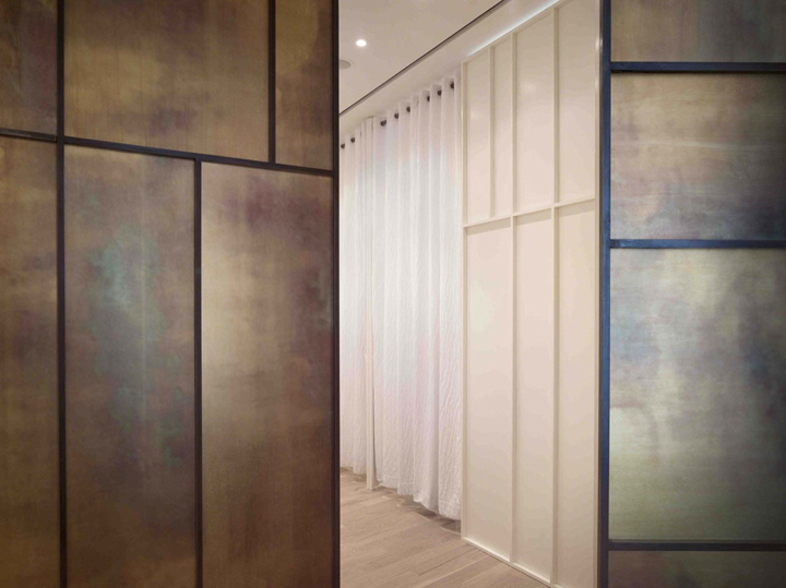
We designed big metal volumes resembling a white a light embroiderer and volumes following the concept of shell with the exterior made of burnished brass and the inside painted white. This space, furnished with volumes, creates a fluid ambiance which allows the flow of both light and people, in dialogue with both the inside and the outside of the mall, towards the city.
On the walls the wood covering repeats itself in vertical lines and shadows that we can think as infinitive. Only people can active this space following fluid paths which foresee pauses in limited areas dedicated to the dream, which is the cloth.
Photographer: Virgile Simon Bertrand
Designed by Duccio Grassi Architects
http://www.archdaily.com/169475/max-co-duccio-grassi-architects/


Add to collection
