

The branding of this tiny jewelry store in Madrid started with an idea and a store name. The idea was to open a jewelry store that would become a trend- setter in the wider world of fashion, and the store name, OhmyGOd, was simply the phrase, “oh my God” that customers would exclaim upon seeing the space and the stunning jewelry on display. In other words — the wow factor. Both the idea and the name were put to designer Carlos Aires of MArkeTInG-JAzz by Cinthya Nicolás, project developer and third generation jeweler. Aires and the Nicolás family worked together, and the extraordinary results are shown here.

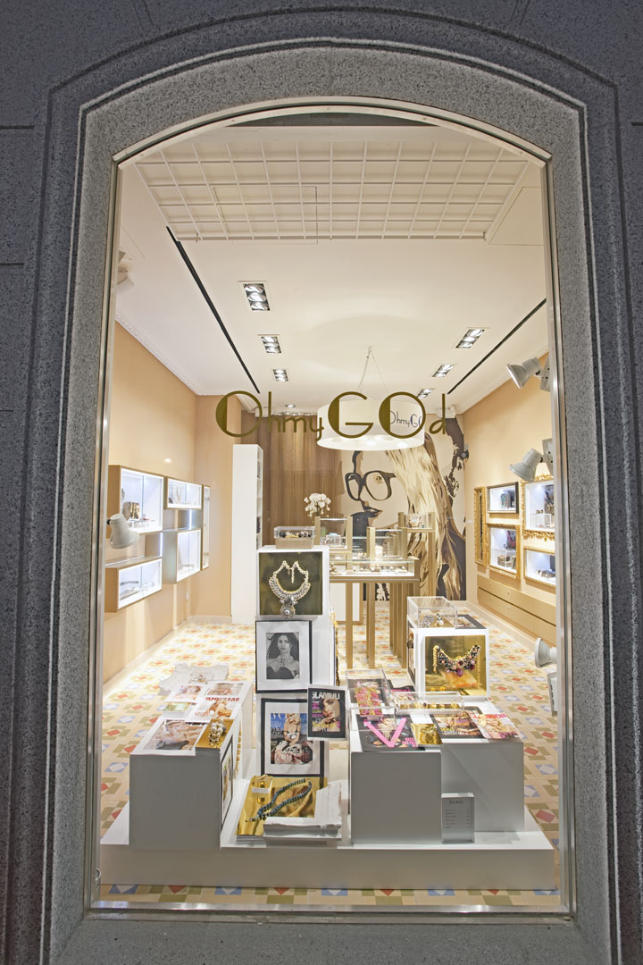
From the start of the project everyone understood that to create a trend-setting shop, attention must be paid not only to the design of the space, but also to supply and demand — the merchandise had to be fabulous and the customers had to be treated like royalty when they were in the store. The concept behind the store name was used as a guide when making design and product-purchasing decisions: If the first impression was “oh my God” then the choice was considered sound. One of the first decisions concerned the shop window. It had to be large and open, taking the shop out onto the street and allowing the space to be seen in its entirety from the sidewalk. Other key elements in the design were the striking, custom-designed floor covering and the bright color of the walls. Both had to not only get attention from the street but also become associated in customers’ minds with the store brand.

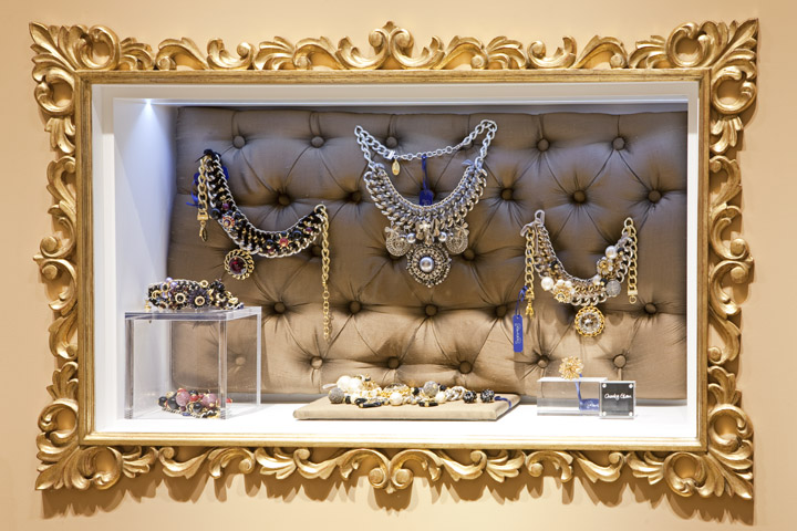
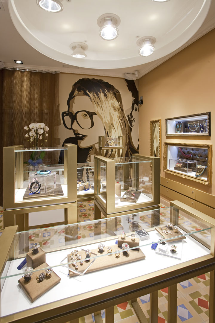
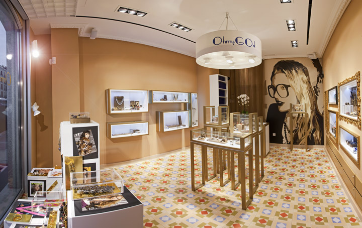
Display cases on the right- and left-hand walls differ from each other in style and the sort of items they display. On the left-hand wall, modern display cases display the newest items, while the ornate in- set cases on the right hold the most valuable pieces. Presiding over the cash/wrap and adding her per- sonality to the space is a large picture of Patricia Nicolás, the store’s creative director.

OppOsite page: The entire space can be taken in at a glance. A custom lighting fixture above the central display reminds customers as to where they are. tOp left: The front window allows passersby a clear view of the store and showcases. In addition to jewelry, fashion magazines that feature items for sale in the store are on display. abOve right: The central display area consists of display tables of different heights. abOve left: Ornate frames give the inset display cases on the right-hand wall the look of old-master paintings. These cases hold the most valuable items.

Store size: 34 m2 (366 sq. ft.)
Design: MARKETING-JAZZ, Madrid
Creative Director and Furniture Design: Carlos Aires
Photography: Luis Sanchez de Pedro aires
MARKETING-JAZZ creative store design
Huelva 16, Bloque 2, Estudio 54
28100 Alcobendas, Madrid Spain
T: + 34 91 484 02 30
www.marketing-jazz.com
info@marketing-jazz.com
