
Brief
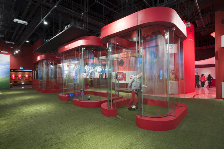
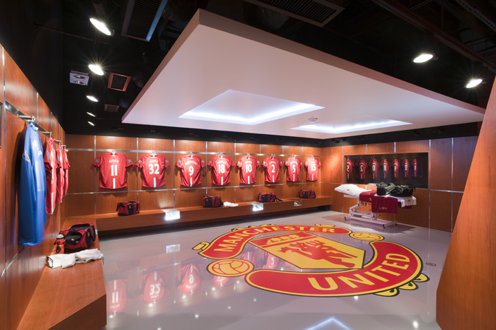
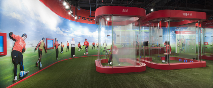
From this research, a brief began to define itself and a rental approach was decided upon. Take an expensive area on the main retail level and then a larger (but much cheaper in terms of rent) area on the level above and draw customers in at the lower retail level, feed them up to the experience and return them through the retail. Hence, the Manchester United Mega store was built on Level 3 of The Venetian Cotai (6,000 square feet) and the Manchester United Experience (11,000 square feet) will be built directly above it on Level 5. This is partially to do with the correct size for the Mega store and Experience, but most importantly to ensure that downstairs and upstairs dovetail together in terms of circulation for maximum ease and retail benefit.
Design
The principal circulation decisions were as follows:
1. a single entry point into the Mega store with access to the Experience from inside the Mega store
2. circulation at Mega store level that takes you around the store and brings you back to the POS for payment prior to exiting
3. Experience ticket sales within the store and connected to the POS area for simplicity
4. controlled vertical circulation up to the Experience from the store once the visitor has bought a ticket
5. circulation at Experience level that allows a logical return to the rear of the Mega store level once the Experience has been completed so that the visitor can make retail purchases and exit
6. one ‘down only’ escalator is to be installed as a way of avoiding short circuiting of vertical circulation
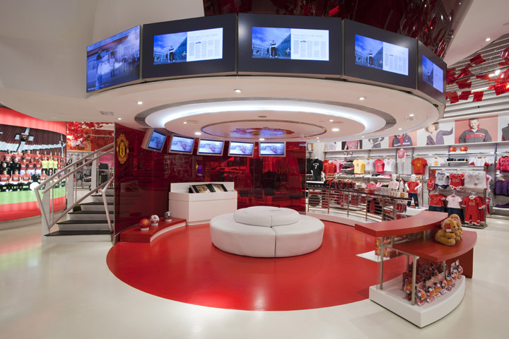
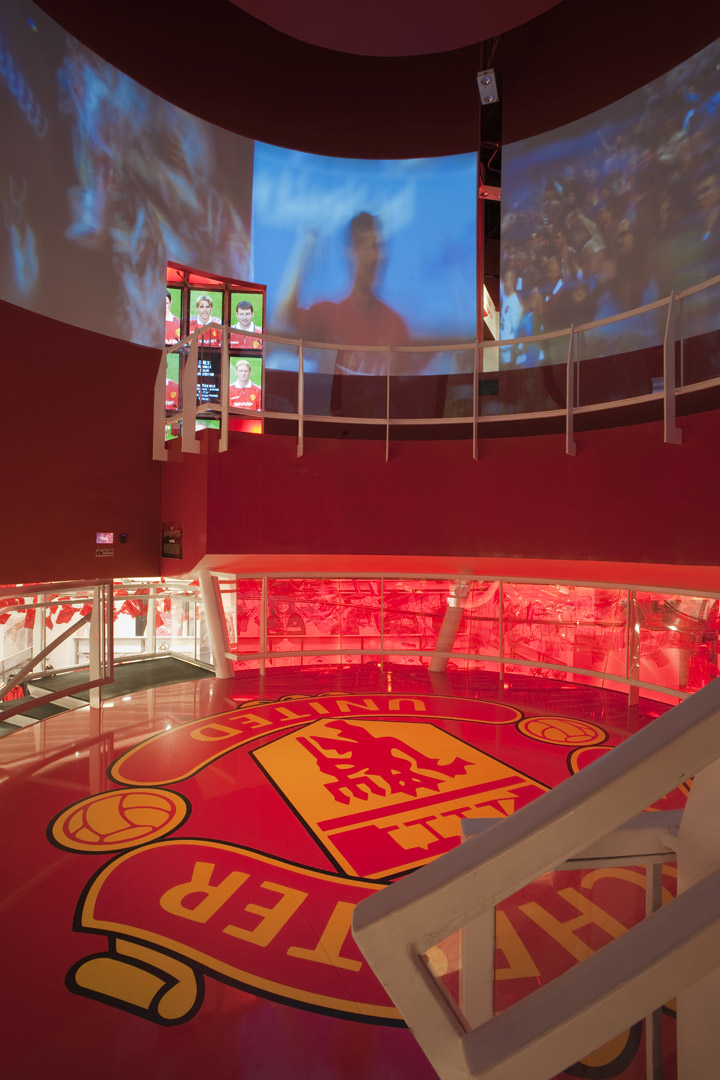
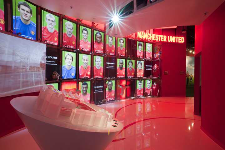
Due to high ceiling heights, it was possible for a circular hole to be cut in the Experience floor and a circular mezzanine level to be built between the Mega store and Experience in the centre of the store. The Opus – a gigantic limited edition Manchester United book – will be displayed under this mezzanine and there will be retail and video images around to entice the shopper to visit the interactive area upstairs.
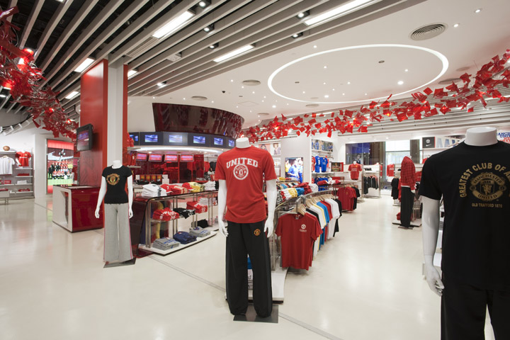
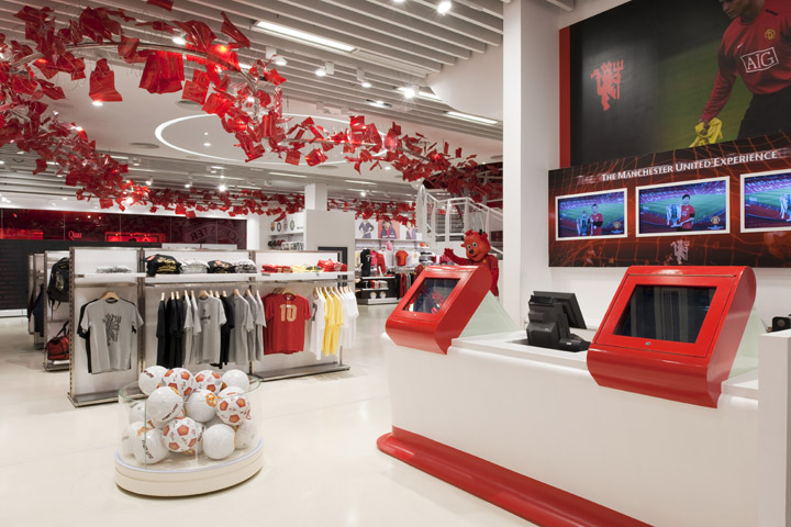
The layout and concept for the retail store was designed to be clean, simple and flexible. A curved custom low shelving unit was designed for the front area of the store and then the Nike retail system furniture was used for the remainder of the display areas. Floor units are kept to a datum to allow an uninterrupted view to the back of the store. The wall units were capped at 2400mm with easily interchangeable super-graphics of players and other promotional images.

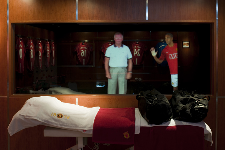
Eye-level advertising, team group shots, video images of players and mannequins were all designed to be life size for continuity and so that the customer could pose with their favourite players. Names of team players throughout the history of the club are used on walls as backdrops to the retail bays.
The POS area has a similar curved shape and is sculpted in white Corian. Shirt printing is also carried out here and tickets for the interactive museum are on sale. Similar to the Old Trafford mega store, a red tinted image of old Trafford is used across the back wall. The colour scheme uses with the red and white of MUFC with a white floor and white ceiling. A “Red Devil” tail was custom designed to hang from the ceiling on invisible fixings. This tail would guide customers around the store and back to the POS and exit but also use the available ceiling height and be an exciting team related visual element.
The exterior is treated with a red concave hexagonal formwork with one large highlevel club crest and The Manchester United Experience lightbox. The long elevation is naturally broken down into three parts by the generic columns of The Venetian. One allows a traditional look through with window mannequins, the second has a large red 3M club logo image with some player graphics and the middle section has an LED backlit football display to allow full height wall display units on the interior.
The entrance is open and inviting, allowing a rich view into the store. A single training pod was introduced to the left of the entrance to allow customers to get an impression of what is available upstairs and also to create dynamisms within the shop front. The entrance is shared for the Mega store and Experience. It is a general retail belief that shoppers turn to their right upon entering a store. Therefore the shopper will navigate the store anti-clockwise and arrive at the POS and replica shirt area, pay for their goods and exit.
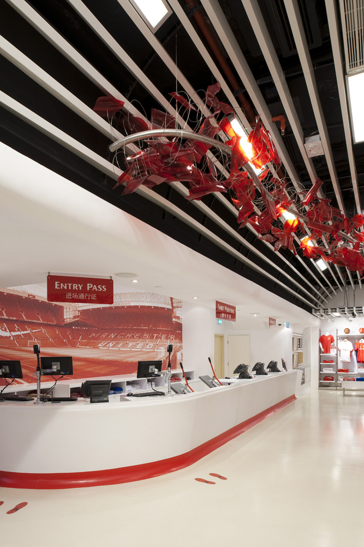
The POS area also sells tickets for the Experience. They can then exit the Mega store or go around the Mega store with the rest of the shoppers as described above, before paying and exiting. The cylindrical semi-translucent mezzanine level was seen as a holding space and appetizer for the Experience above. As a transition area from the retail floor to the exhibition floor the Rotunda must be capable of providing:
1. A welcome and very brief introduction to the exhibition
2. A teaser for things to come
3. A visual link from ground to first floor and enticer
4. Brand enhancement
However, we must be careful that the Rotunda has a differentiated function from the Club intro to follow – it must not steal the thunder from the things to come. Once the pre-show has finished, visitors will take a further set of steps up to the Experience. They will then go around the Experience in a clockwise fashion and return to the Mega store floor by escalator, arriving towards the rear of the store. They will then pass through the Mega store, shopping if they wish, before paying for any selected goods and exiting the store.

Award: IC Award International interior Design 2009
Gold Award @ Exhibition Category
Project Information
Lead Architect and Interior Designer: HEAD Architecture and Design Limited
Project Director: Mike Atkin
Project Team Leader: Max Cheung
Location: Level 3 and Level 5, Grand Canal Shoppes, Venetian Macao
Photographer: Graham Uden
https://www.facebook.com/HEADarchitecture



Add to collection
