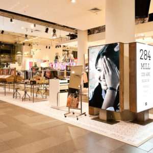
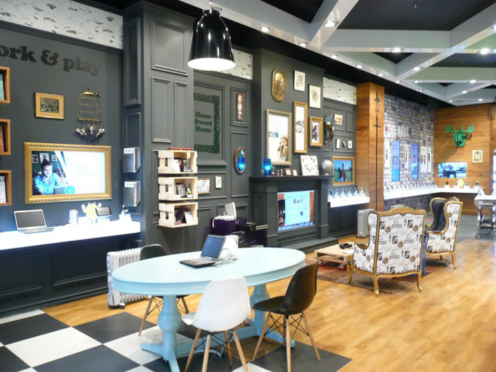

Telecom’s new concept store, a 145m2 space under their new head office, was developed in a strong collaboration of Telecom New Zealand Ltd, retail interior design company Gascoigne Associates and brand experience design company Designworks.

Brief
Telecom’s new store concept brief was to engage with its customers in a fun way while promoting a full range of products and services. Telecom’s marketing strap line defines the brief: “Our products and services in your world”.
Objective
To encourage its customers to actively discover solutions that suits their needs, more like browsing the internet than a traditional “hard sell” retail experience. A hands-on environment, where customers can play with laptops, check their Facebook page on the hottest phone or learn how home connections would work for them.
Idea
To provide a retail space that ‘empowers people to try’ and which amplifies the joy of ‘user discovery’ by creating a hands-on learning experience where trying turns into buying and brand strategy into a powerful brand experience. Make it less about Telecom’s products, technology and networks, and more about its customers and New Zealanders doing what inspires them. The concept store reflects Telecom’s ongoing programme of transformation to put customers at the heart of the company’s thinking and decision-making.
Solution
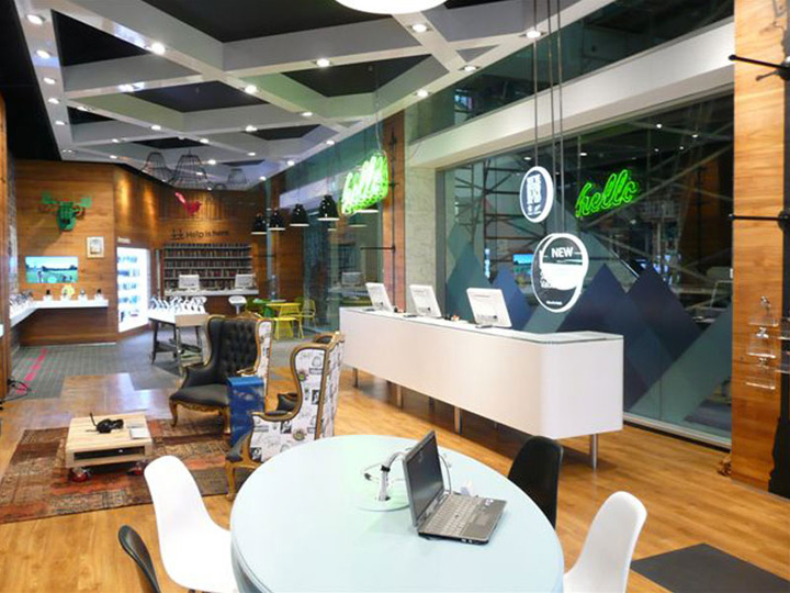
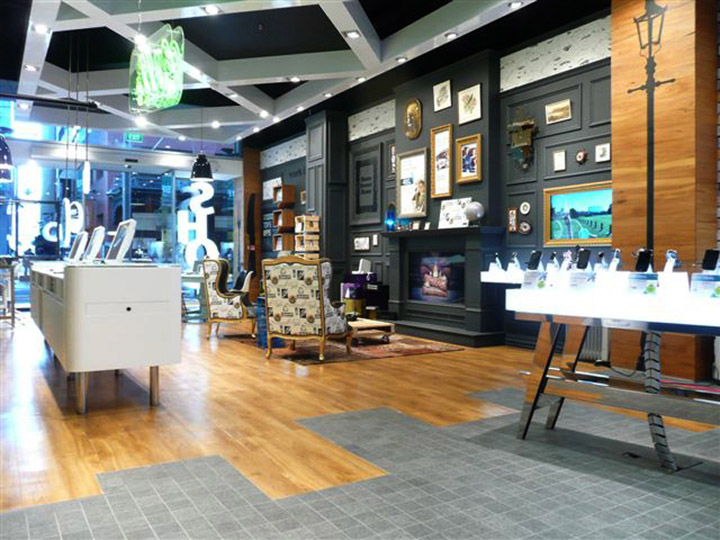
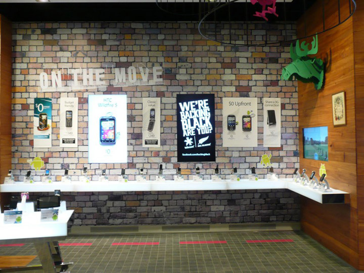
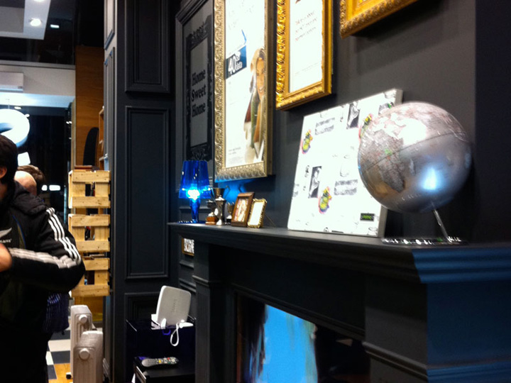
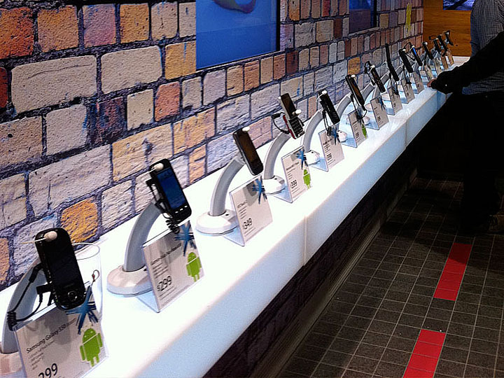
The store has been divided into five unique spaces that reflect the different environments in which customers use technology ‘Home-Sweet-Home’, ‘Work and Play’, ‘On the Move’, ‘Let’s Talk’, and ‘Help is Here’. The ‘Help is Here’ wall area features recycled native New Zealand timber chosen to bring warmth and texture to this service area to make it inviting and non-intimidating. The rear wall uses a brick print (real brick was too heavy for the floor slab) for the outdoor ‘On the Move’ area.
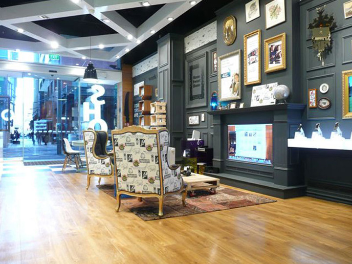
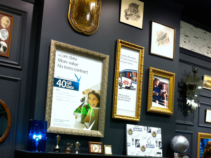
This area features messaging along with non-brand images displayed like posters as might be found pasted to walls in an alley. A mixture of memorabilia, framed messaging and selected ‘found’ objects are used to provide warmth and interest to this ‘Home-Sweet-Home’ area.
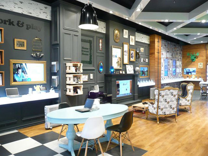
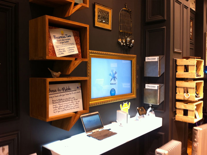
The walls themselves have had decorative timber mouldings applied and then been finished in blackboard paint, which allows some casual and easily changed messaging to be added. Most of the ‘found’ items, the brick wall, cuckoo clock and fireplace (featuring an LCD screen showing ‘flames’ or digital presentations) are custom made. The wing back chairs have been hand painted by New Zealand artist ‘Misery’ (aka Tanja Jade).
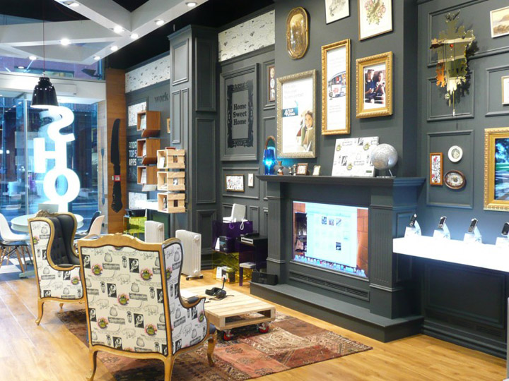
New Zealand designed furniture by Simon James Design and Wellington-based Artikel together with artwork by Christchurch artist John Coley is featured along with eclectic international pieces ranging from Kartell to classic Eames chairs. The flooring is a mixture of exposed aggregate concrete, ‘timber look’ vinyl plank, which was chosen for its durability and basalt stone was selected to represent the outdoor area.
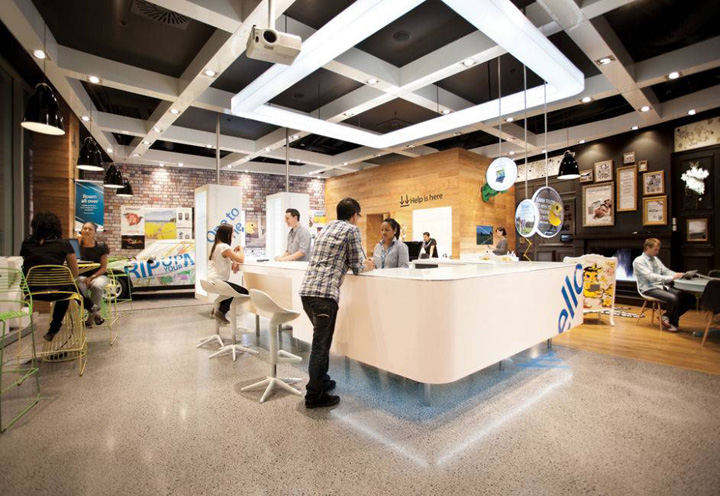
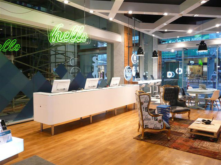
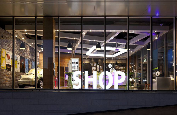
Retail point-of-sale has also been overhauled with a non-traditional approach, messaging is integrated into the store environment on touch-screens, blackboards, picture frames, postcards, screensavers and water bottles. The store has few traditional signs or posters but instead uses digital LCD screens. Traditional branding is conspicuously absent; the biggest sign in the window just says ‘Shop’. The counter is partly illuminated by an opal acrylic ‘Halo’ which is lit with L.E.D. for energy efficiency, long lamp-life and to minimise heat.
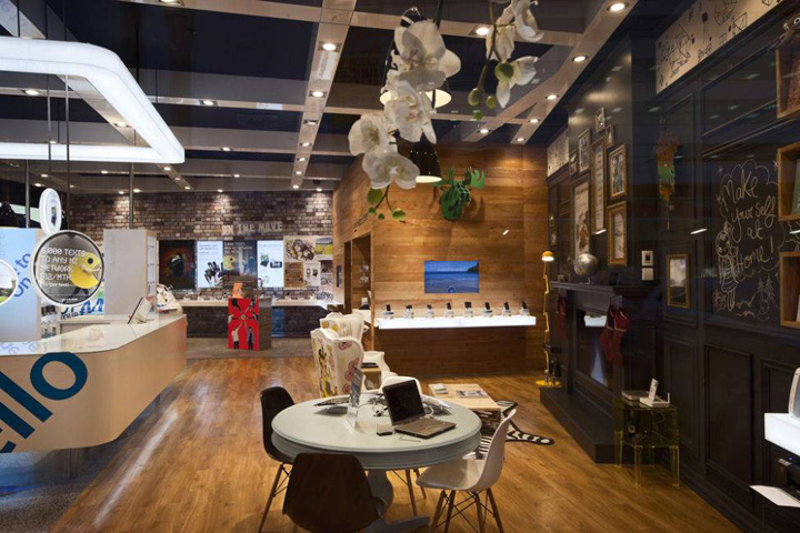
The ceiling itself was painted black to make it disappear and to emphasise the custom-made white A.C.M. (aluminium composite material) lighting grid which is suspended at an angle to the store to break the rectangular shape of the space. At night, computer-controlled theatrical lighting create a light show to attract passers-by.
The space itself was technically challenging with a smaller than ideal floor plate, an unchangeable shop front and an extremely tight time frame. The project proved to be a true showcase of ‘the power of positive partnership’.

http://www.worldarchitecturenews.com/interiors/index.php?fuseaction=project.projectview&ctid=4&prid=17636
http://gascoigne.co.nz
http://www.designworks.co.nz


Add to collection
