
What was the scope of work?
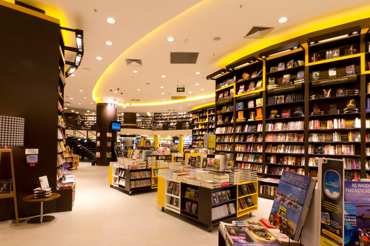
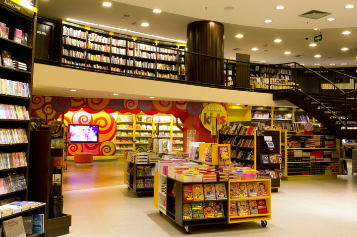
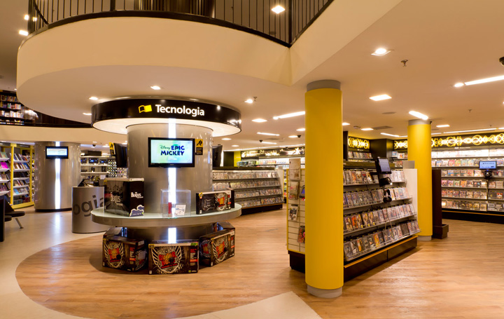
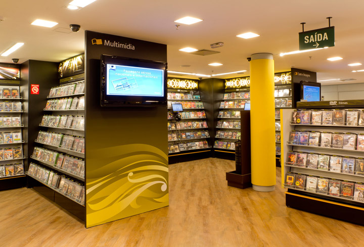
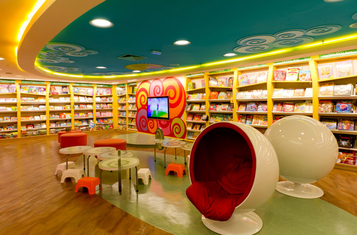
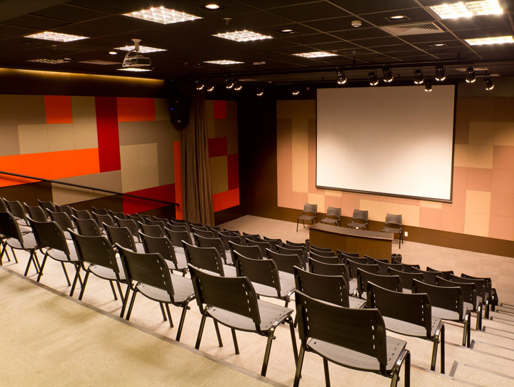
To develop in 14.000 sq ft. distributed in one and a half floors one sole store environment that would integrate the company’s best seller department (books) with the related ones (stationery; CD + DVD’s; high end electronics), creating one space devoted to the customers enlighten and fun. There is a thematic kids area on the ground level and a mezzanine that encompass a more quiet space for professional literature and a multipurpose theater, included to declare to the client that the space is much more than just a big box.
What were the project goals and objectives?
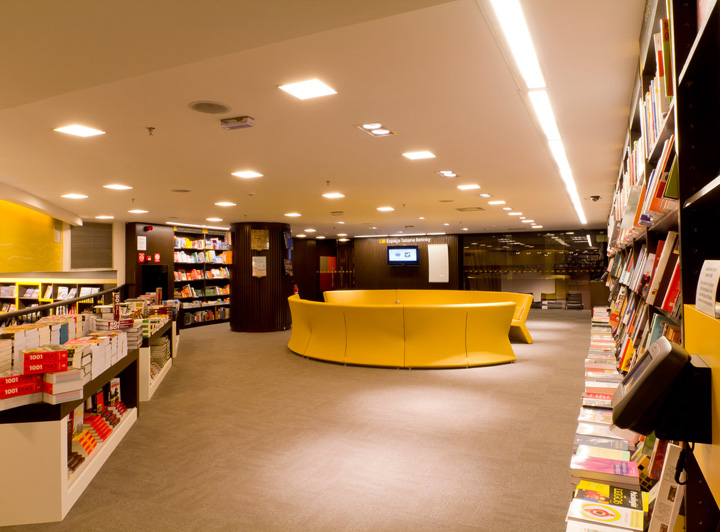
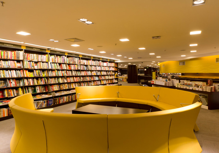
To show to the customer the commitment of Saraiva on offering a delighting shopping experience that merges a massive array of cultural and fun oriented products with their client’s comfort. That is granted by the presence of special lighting, music, different seating areas around the store, a Starbuks café inside the store, a ticket booth, a large and central help desk, oversized cash units, a multipurpose theater, etc.
Describe the intended customer journey?
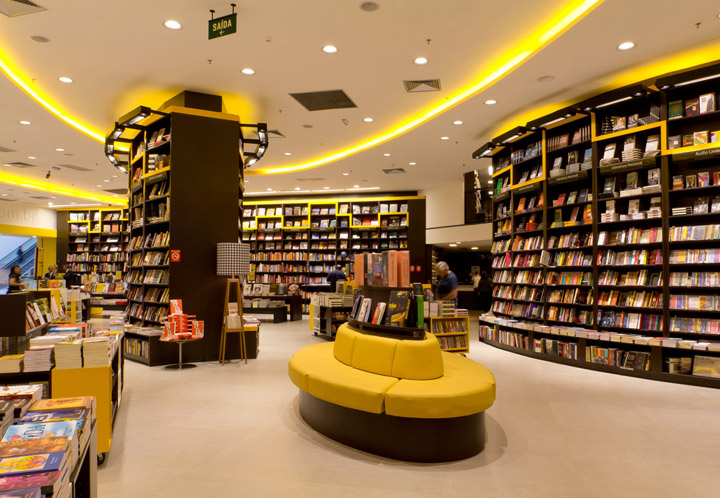
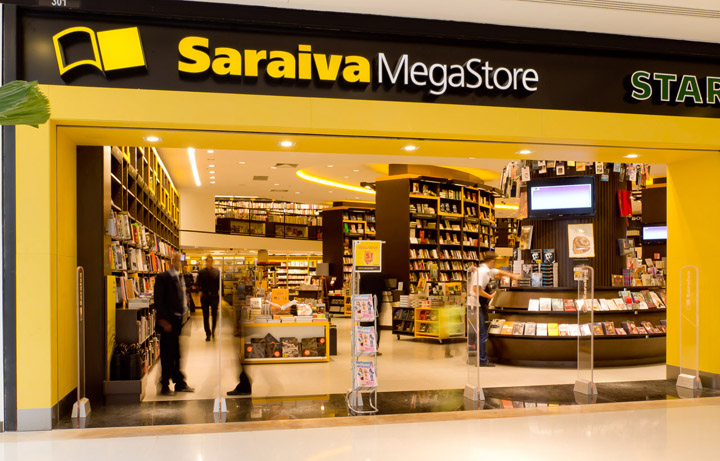
The shoppers are invited in by a huge selection of books, well organized and displayed, with a clear signing system, aside of a Starbucks store in store and a vision of the secondary departments. The gigantic floor to double height ceiling eye shaped shelves are strategic located in order to display as many books as possible, with the less visual interference, guiding the clientele trough the space into the stairs and to the departments located on the back side of the store. CD’s, DVD’s and children’s are positioned on a low ceiling area, providing a sense of protection for worried parents and music and movies lover’s.
Circulation / Store planning
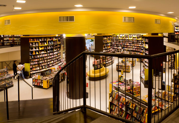
The store occupies a tricky area, whit a narrow entrance that leads into an uneven “L” shaped hall. In order to avoid a situation were we would end up with a dead area on the left end of the store, that actually represents more than 50% of the area, we carefully placed three huge gondolas, filled with books from floor to the double ceiling height, oriented in a way that the store traffic would be guided into there. We also placed the stairs that take us to the mezzanine in that position, ensuring that the important departments that are place in the vicinities will be viewed, visited and shopped by the guests.
Overall Lighting
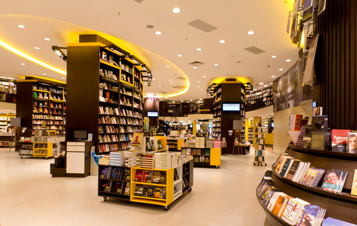
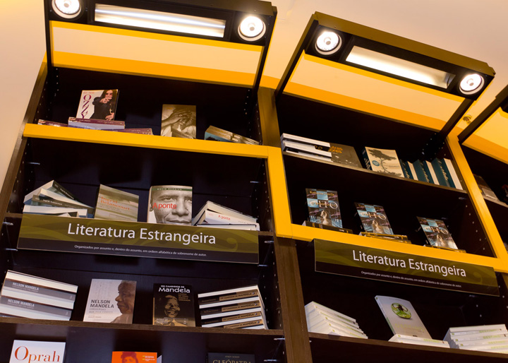
We had different challenges on this project, the biggest being how to equal the lighting level throughout the store, not only on the double height versus single height ceiling but on the vertical length of the floor to ceiling gondolas. That led us into developing a special fixture that hangs from the high end of the gondolas, projecting a controlled beam. We also wanted to colour the ceiling, enhancing the elliptical shapes with the yellow tone of the logo and to spread around the store decorative lighting fixtures on the cash units and associated with special seating areas. These details were very important on the overall look & feel, ensuring a warm and cozy space, balancing the otherwise over commercial appearance that such an heavy merchandise store risks to cast.
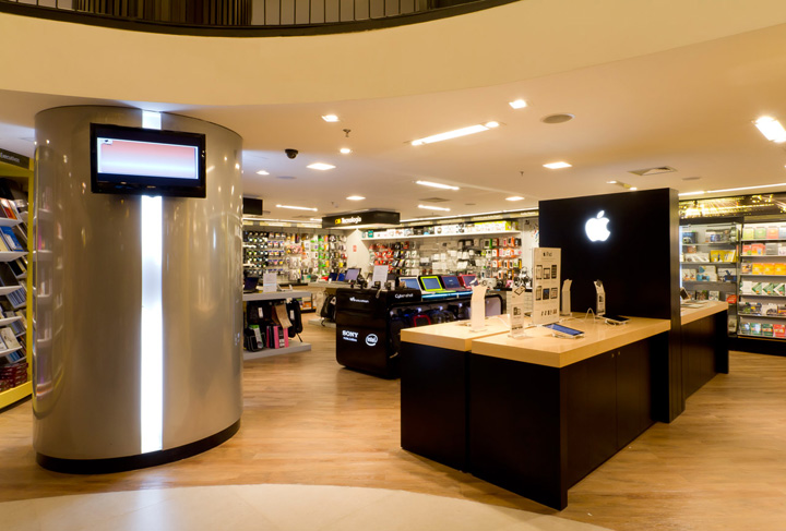
Finishes
Having in mind that the proposal was to have a democratic space, oriented to customers that like to buy books, cd’s, dvd’s, etc. for the joy and enlighten of it, the store had to be bright and fun. Therefore we decided to create a ribbon that would frame most of the fixtures and areas with the bright yellow color of the logo. The yellow is also the color of some fixtures, colums and seat covers on the book department and plays solo on the kids and stationery area. As a finish of most of the gondolas and book shelves, we decided for a dark wood, a noble material that contrasts with the vivid color of the majority of the book covers. A white porcelain floor was specified for the ground level, vinyl wood planks for the kid’s area and carpet for the mezzanine.
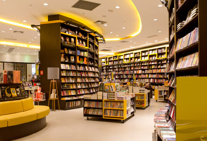
Way finding / Graphics / Communication
At Saraiva, graphics play a very important role. Way finding and Communication are integrated with fixtures and architecture, and a decorative graphic line tops all the walls on the mezzanine area. At kids, the fixtures were custom designed, as well as all the entrance, ceiling and interactive. Phrases praising literature are also transformed in a wall background for special areas. All that contribute to create a more emotional atmosphere, reinforces the brand image and projects a sense of professionalism, order and consideration for the customer’s scarce shopping time.
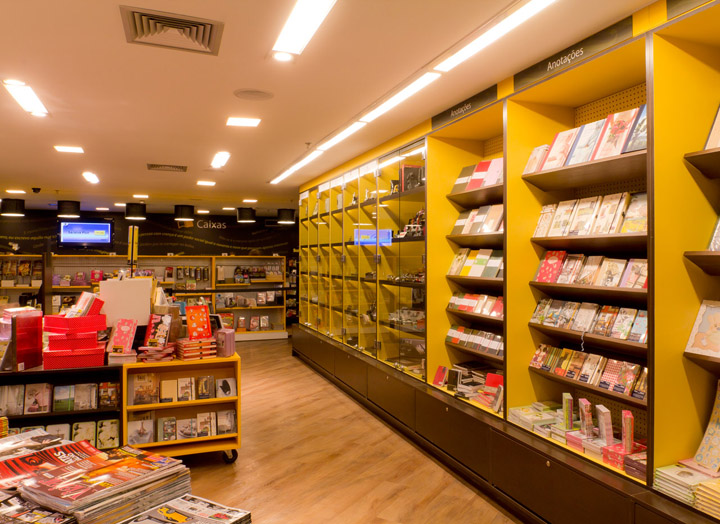
Visual Merchandising
Mass merchandising shall not be an excuse for a dull and dry atmosphere. At Saraiva we had an extra care on how to display the books, trying hard to create a number of different alternatives. We have the possibility of a tilted or flat shelf, were we can lay the books horizontal or vertical, with a cover view or a side view. Aside from that, at the waist height we have a larger shelf, almost a table, that allows to merchandise open books, piled books, accessories, etc. Power tables also play a major role on the merchandising system, and even the seating side tables collaborate on the display.
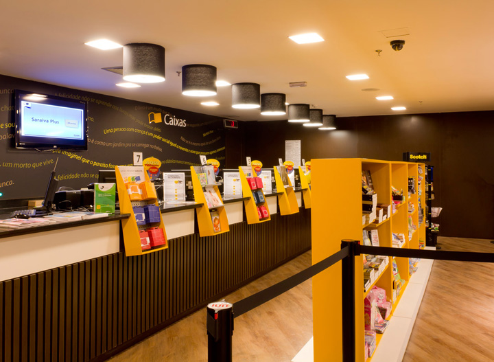
Design / Brand Concept
Aside from being the largest and the most traditional bookstore chain in Brazil, Saraiva is also a modern and technological multi channel company, with it’s very successful and profitable website. The company was also visionary in introducing in the store a Kids area and other areas and departments related to fun, culture and education. It is also important to understand that Saraiva is very proud to be democratic, offering the widest selection of books for clients of the most different tastes and education level. These are the main brand drivers that are incorporated on the store, visual merchandising and graphic design.
Merchandising Fixturing
The fixturing program privileges productivity with comfort for a client that will spend some time shopping the store, looking for novelty or some very specific issue. Every fixture is integrated to a signing / way finding system that is spread all over the store, working as a link to the brand.
www.falzonialveslima.com.br
www.blogdafal.com.br


Add to collection
