
To transform this seventies era, modern heritage building (formerly a National Bank) into a new space dedicated to contemporary fashion, the first step taken by the architects was to simplify the overall structure, which had been subjected over the years to a series of additions and renovations.

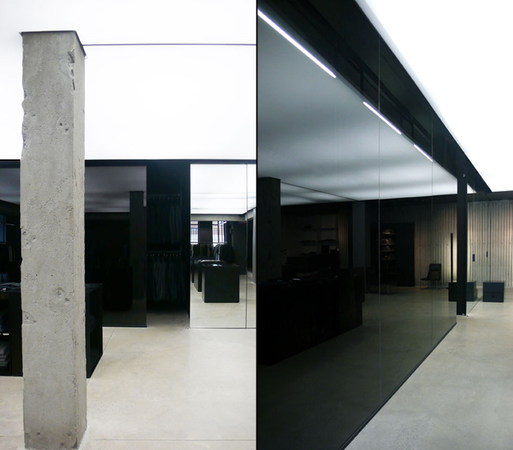
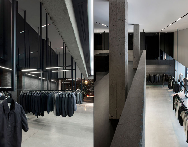
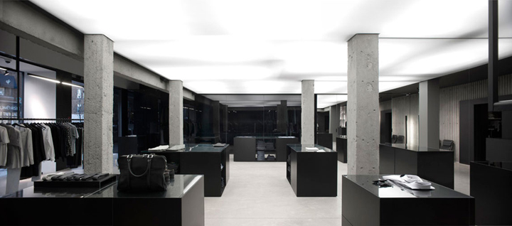
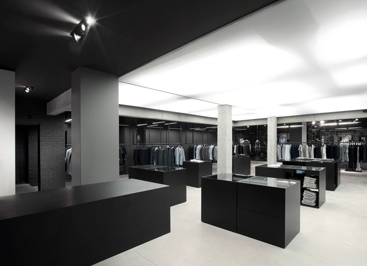
The building’s interior was thus stripped to its original brutalist structure, which revealed itself to be surprisingly striking. The sculpted, corrugated concrete of the vault and mezzanine, the structural supports, and the original exterior brick together became the mineral shell from which the project took shape.

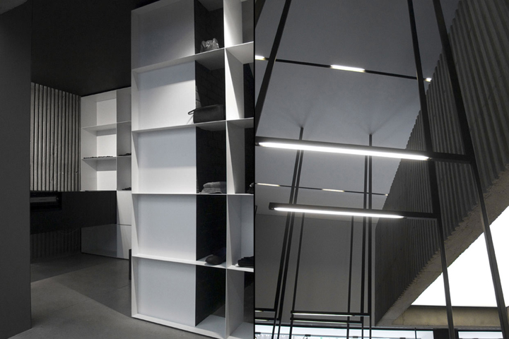
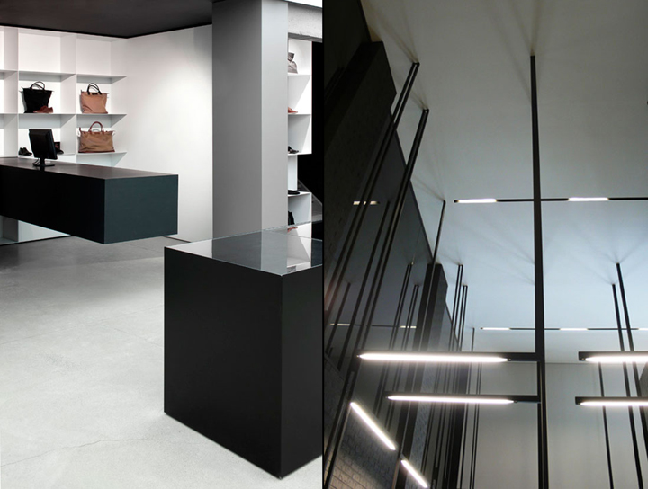
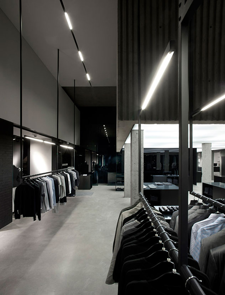
The ensemble of the new elements, such as smoked glass, mirrors, and movable display elements (of painted aluminum and rubber) work in counterpoint to the building’s original structure. The luminous ceiling stretches to fit the form of the mezzanine; the ceiling therefore illuminates the zone of the movable display cases, and contrasts with the clothing racks, which function as linear lighting for the space, suspended from the second floor ceiling like stalactites.

The original curving staircase dramatizes the moment one reaches the second floor, where we find Michel Brisson’s office and the V.I.P. room. Various service spaces are also located on the second floor, toward the south portion of the building.

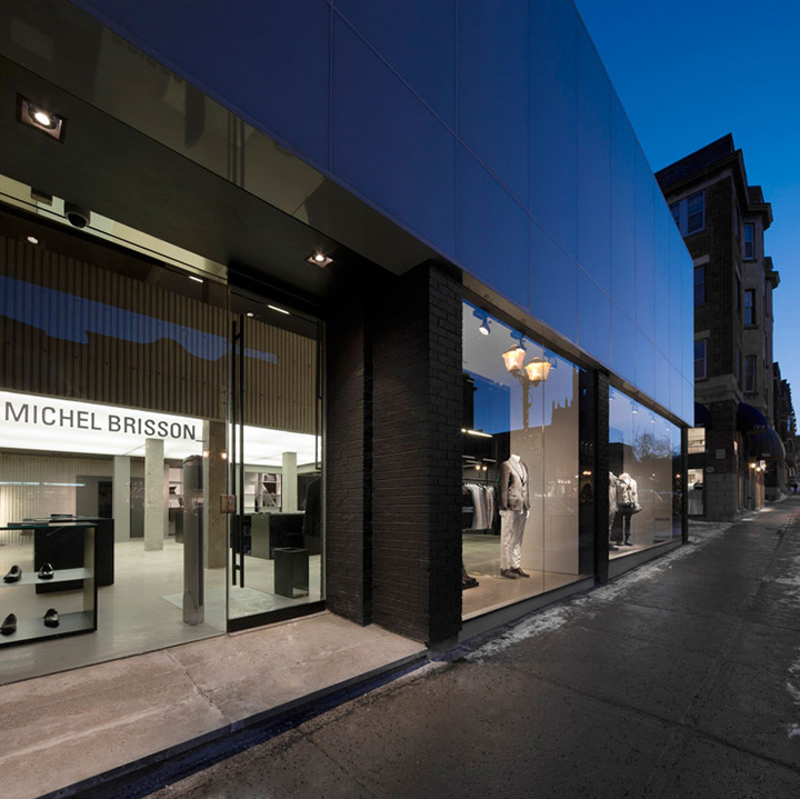
The bank’s windows are pushed close to the street, creating two urban rooms (used for mannequin display) that connect the interior space with Laurier Street, and letting in ample natural light for both the ground and second floors. The expansive surfaces of black glass multiply the space along the store’s east-west axis, adding to the overall impression of space and size, and contrasting once more with the feeling given by the original setting.

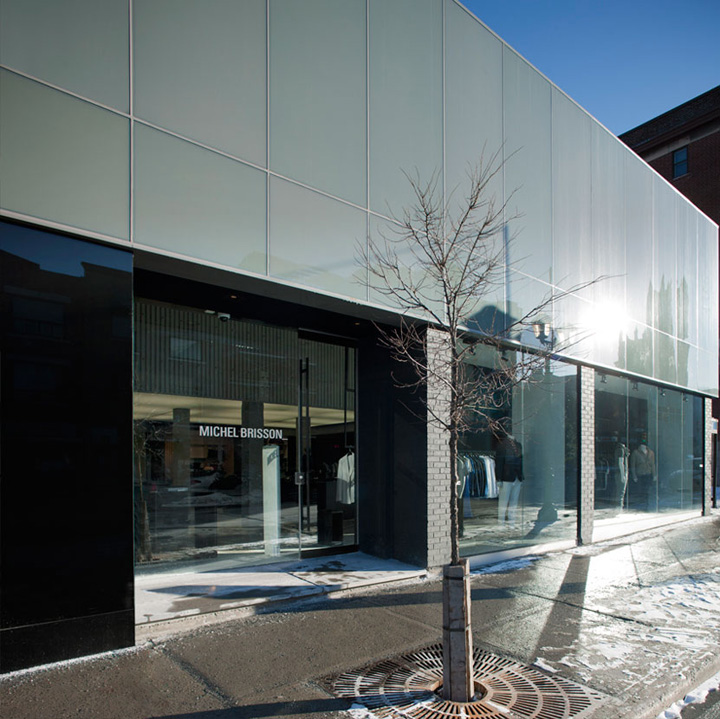
The concept for the facade of the Michel Brisson_ Boutique is based both on the desire to reveal the modern character of the original building, but also on preserving the urban continuity of Laurier Street West, which is comprised of upscale boutiques, salons, and restaurants.
For most of the buildings along Laurier Street West, a commercial base can be identified by the shop windows at ground level, and a volumetric band (of between one to three storeys) is usually found above the first floor. Since the verticality of the building’s original brick pillars interrupts the visual continuity of the ground floor, it became important for the new project to retrace a strong visual link with the rest of the context.

The new design considered this aspect as well as the marked material change often found between the shop window base and the volumetric band at the top of the surrounding buildings. Therefore, to reinforce this idea of the shop window continuing along the streetscape, the choice of transparent glass for the street level windows was made, while an opaque glass for the horizontal band above achieves the desired visual link with upper portions of the neighbouring architecture, but simultaneously retains a vital link with the volumetric qualities of the historic bank building.

The opalescent surface above the first floor reflects the activity outside and the lights of the city, and constantly appears to change tones and colours throughout the course of the day. The simple shop windows add an elegance and lightness to the heavy structure of the original building.

The main entrance is slightly recessed, framed by a dark, inset glass volume, assuring physical protection for clients from the elements. Moreover, the graphic design used for the building address (1074 Laurier West) reflects the brand image of Michel Brisson_. The project, therefore, has been carefully designed to respect the continuity of the streetscape, while recognizing the need to highlight the unique value of this contemporary, yet historic space which has found its place at the heart of the neighbourhood.
Photography by Marc Cramer
Designed by Saucier + Perrotte Architectes
http://www.architypesource.com/projects/678-boutique-michel-brisson
