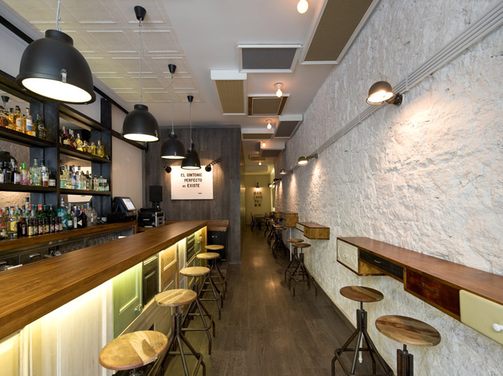

We’ve had a great time with this project: we’ve made door collages, invented one legged furniture, put part of the floor on the wall, made doors look like cupboards and hung paintings on the wall. Nevertheless, Bobby Gin looks pretty Normal. The idea was to create the most memorable result possible within a very limited budget. We ended up with a radical organization of the space using alternative resources: a) strategic placement of wood paneling and materials; b) customized furniture and c) extreme care in all the details that help create the bar’s signature atmosphere.

The strong front door frames a richly textured interior: the bar covered in a collage of old doors, furniture designed from recycled drawers, the mirror that dominates the left-hand side, the stone wall painted white on the right.

The vertical paneling in the central module in tinted oak fades into the floors to blur the edges of the hallway. This way, with help from the retro, homey furniture, the dark, narrow hallway becomes a cozy place to stand and chat. A fun cupboard hides the inevitable presence of the door to the bathroom in the main room, while maintaining aesthetical coherence with the other elements that make up the space.

Frames made from molding, also salvaged, allow us to camouflage the soundproofing system on the ceiling… and, in the same line, a long etcetera of resources to make the most of the space in an atmosphere that is both surprising and cozy.
Designed by Normal


http://www.behance.net/gallery/Bobby-Gin-Cocktail-Bar/2121610
http://www.designboom.com/weblog/cat/30/view/19132/bobby-gin-cocktail-bar.html


Add to collection


