Get an unrestricted access to all the blog and those extraodinary functions that can help your business grow in a continuously changing industry.

Register & subscribe to a premium membership! Register
Subscribe for 9.9 EUR/month Subscribe now
Subscribe special price for 99 EUR/year Subscribe now
Close
Select categories
Select cities

Warning: Attempt to read property "user_firstname" on bool in /home/mobilia/public_html/retaildesignblog.net/wp-content/themes/rds-2023/first_menu.php on line 29

Warning: Attempt to read property "user_lastname" on bool in /home/mobilia/public_html/retaildesignblog.net/wp-content/themes/rds-2023/first_menu.php on line 29

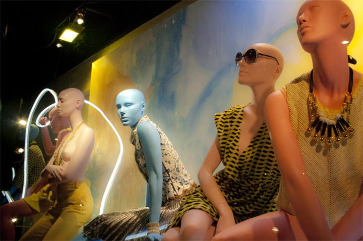
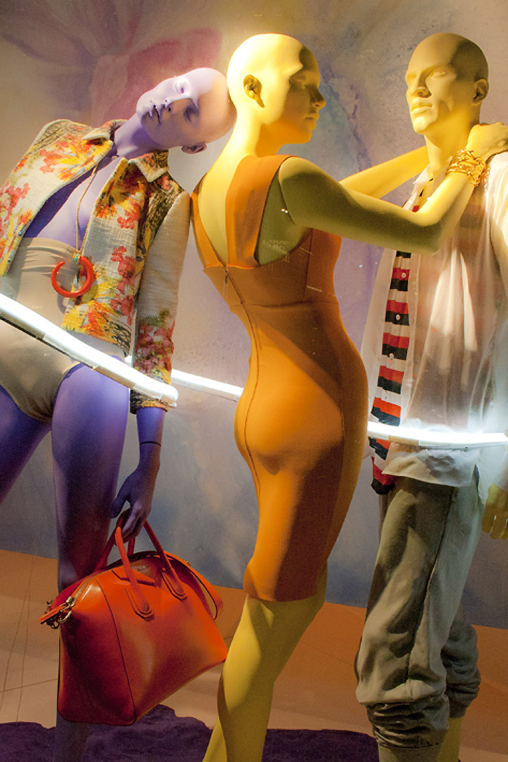
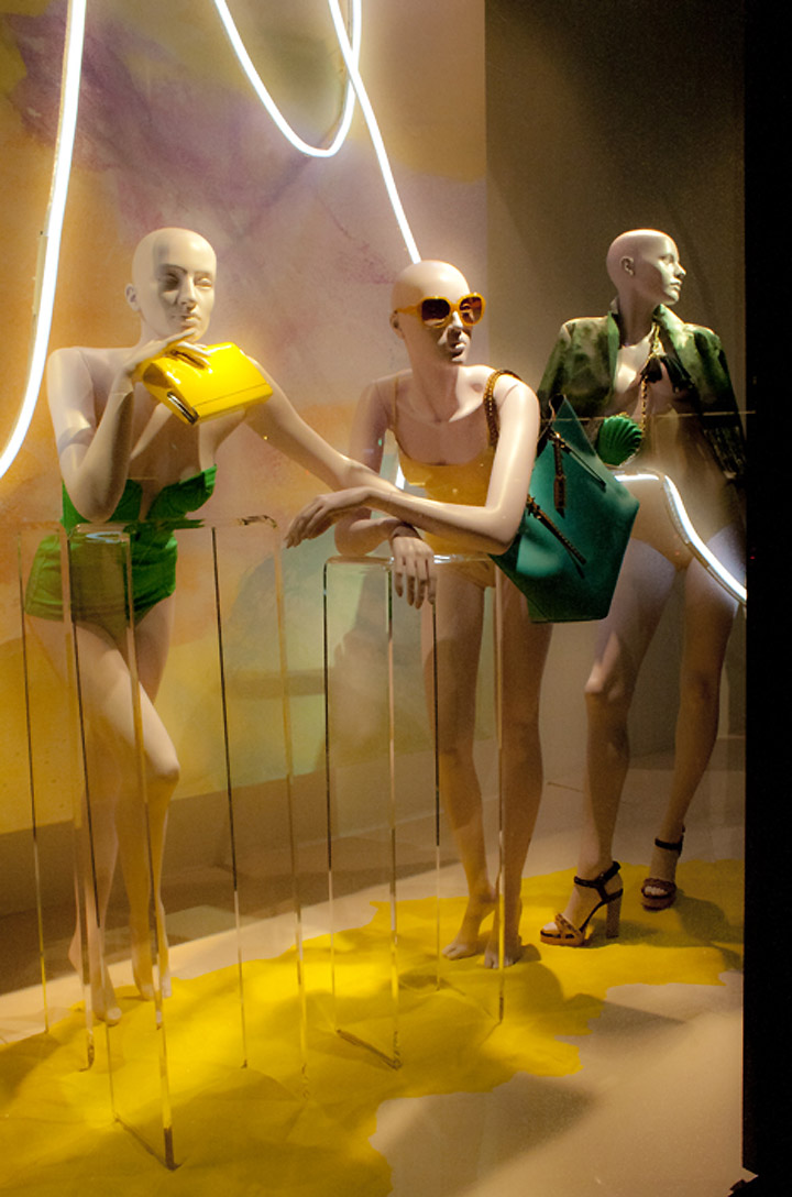
Swimwear in contrasting brights meets pastel sets and mannequins in these Harvey Nichols’ 2012 resort windows. The painterly effect on the background creates a dreamy mood and I especially like the fluorescent lighting effects. The use of colour is the main talking point for me: purples and yellows create great contrast, whereas the pastels are calming and make the brights stand out.

Thanks Kaisa! Visit her site here.

http://thewindowdisplayblog.com/2012/02/20/harvey-nics-resort/

Add to collectionAdd to collection