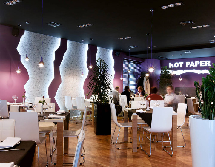
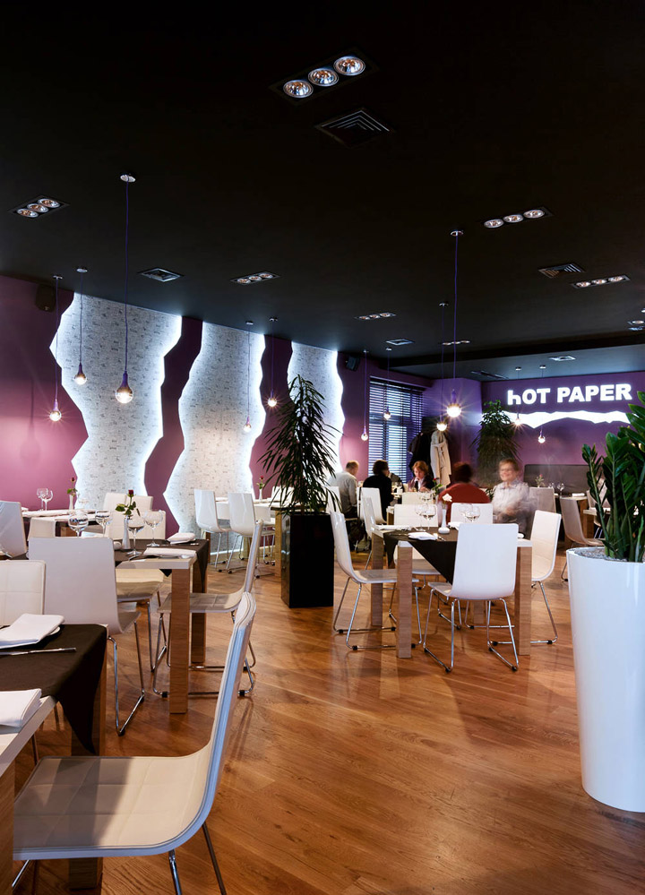
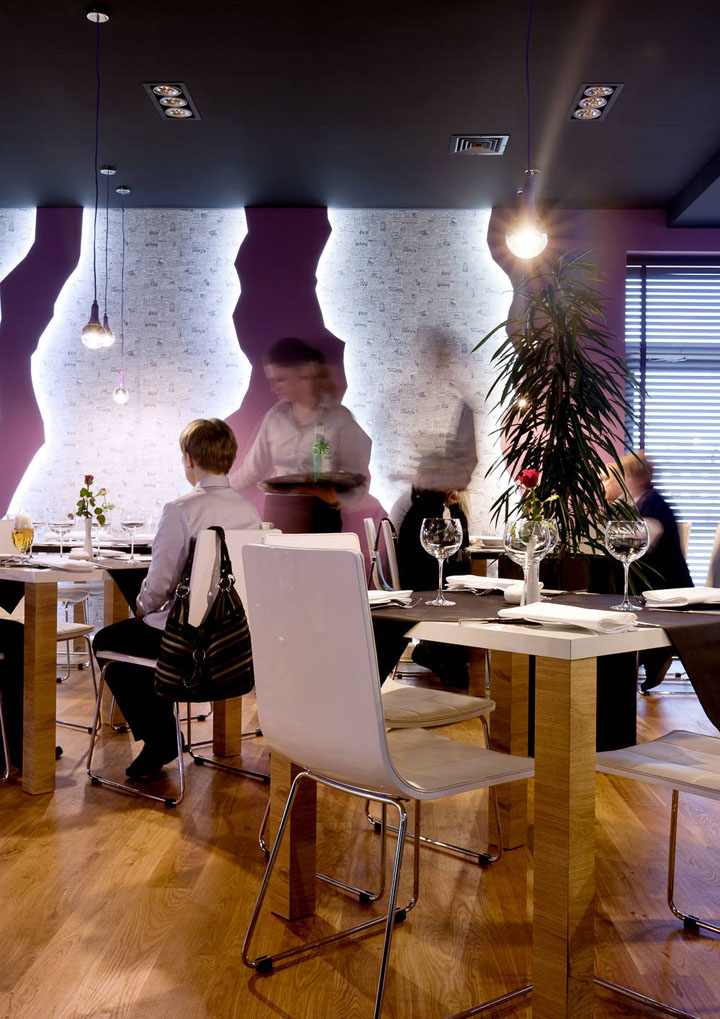
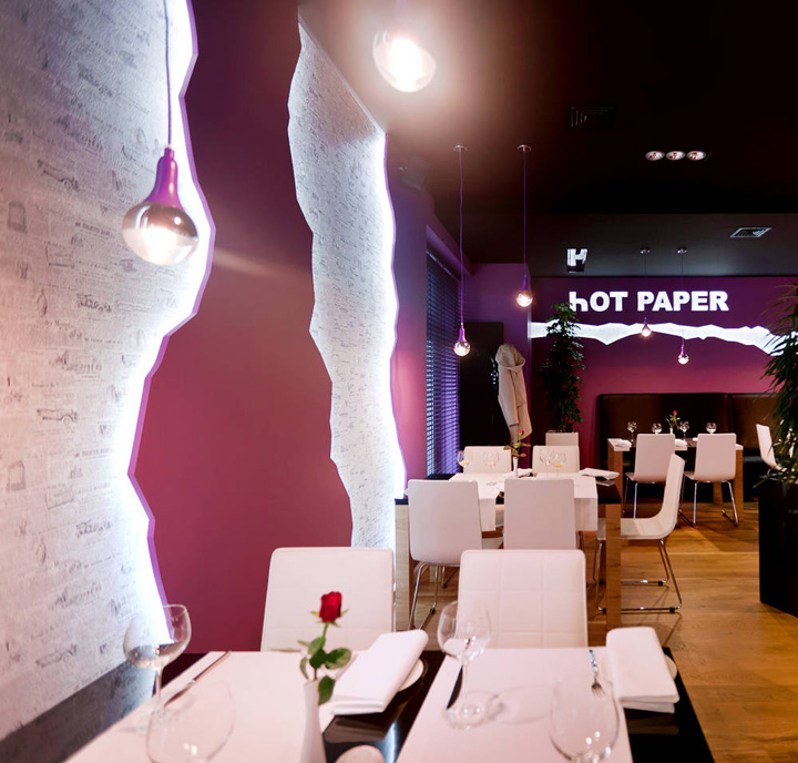
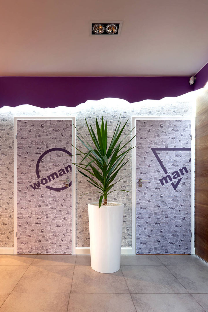
The restaurant design included not only interiors, but also the name of the restaurant, logo and elevation, that is comprehensive image setting. The leading element is a newspaper motif, which appears both in the restaurant name and in the interior itself – in the form of a wallpaper as well as “torn” walls and furniture. The guests of the restaurant were supposed to be surprised with the name thereof, not knowing what to expect – hot news or meals from a hot newspaper.

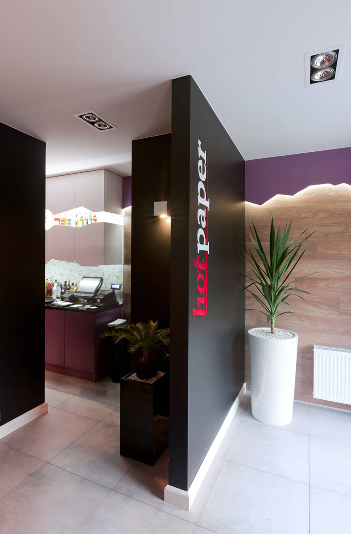
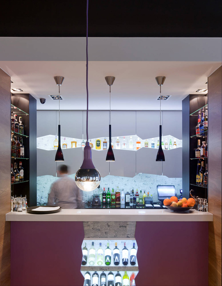
The dining room surface area is only 98m2, so it was necessary to suitably separate the bar from the vestibule without wasting surface and observing particular rules of ergonomics. We left the tables non-isolated deliberately, so that the element of torn walls was visible from everywhere, but in order to give the interior more life, we added several large flowers.
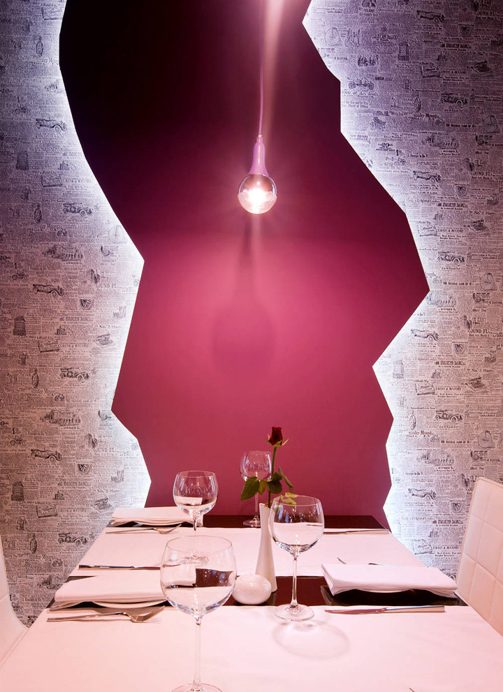
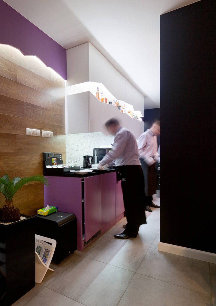
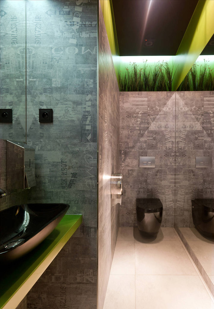
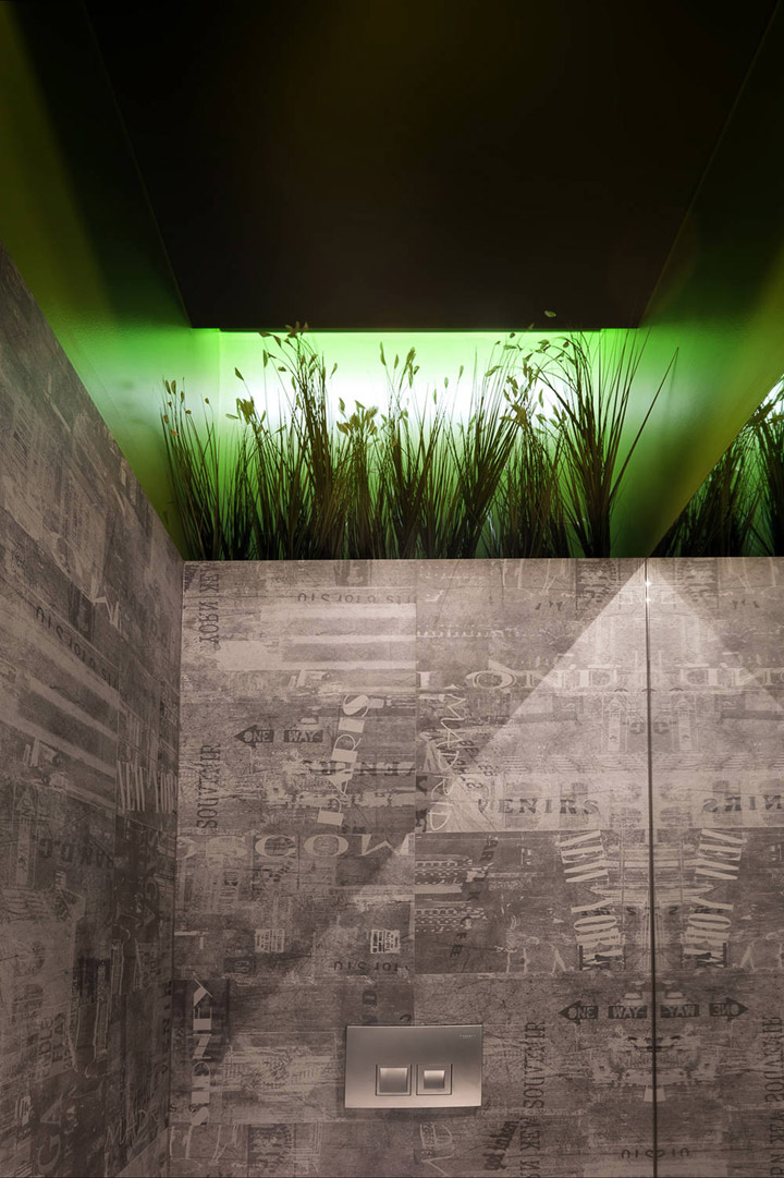
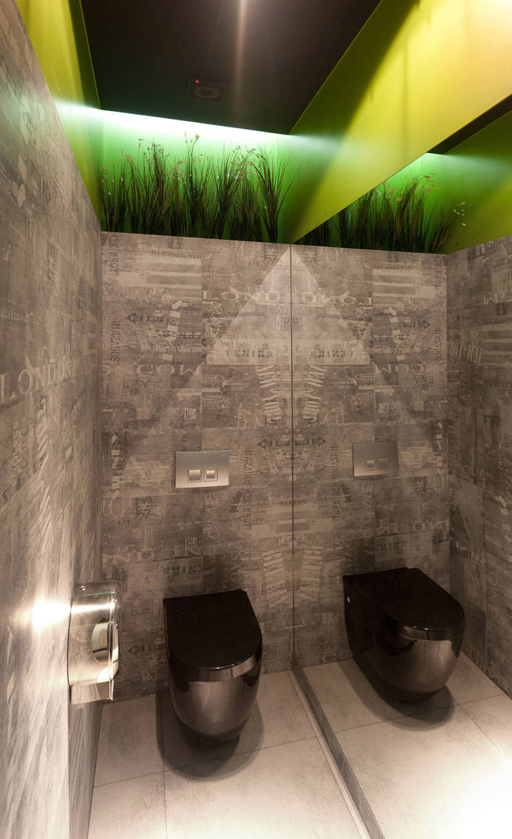
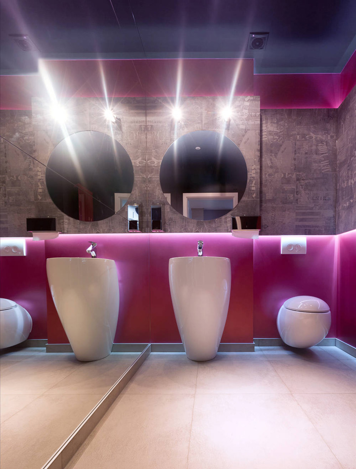
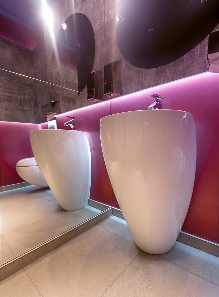
In the design of the dining room, we applied mainly 5 materials – natural oak wood, wallpaper with newspaper motive, grey milked rock tiles, as well as black and violet. We also went with abundant illumination which – particularly after nightfall – emphasizes the jagged wall contours. In the restrooms, there is not only the newspaper itself, but also milled rock tiles with printed names of cities.
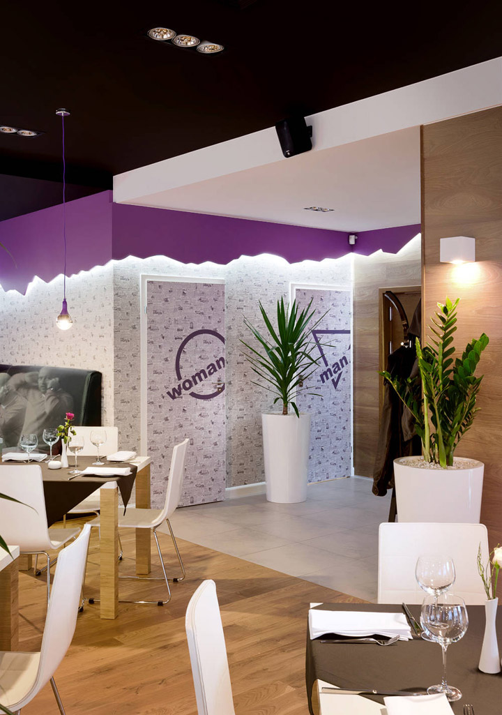
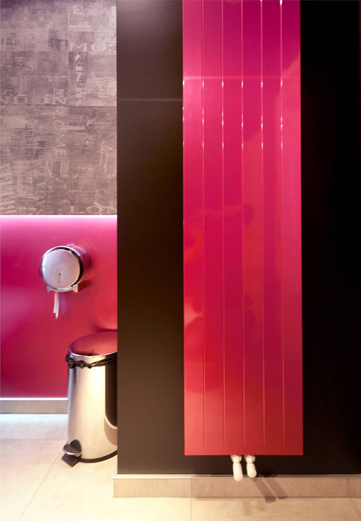
An interesting point are records which can be heard in the restrooms, featuring lessons of foreign words and phrases. Apart from black, we supplemented the grey milled rock tiles with vivid colours – punk in the ladies’ restroom and lime green in the men’s restroom. These colours occur on walls in the form of a permanent, smooth plaster, and on vertical decorative heaters.
Designed by Wamhouse
Photographs: Mariusz Warsinski (Wamhouse)

http://www.archdaily.com/214605/hot-paper-wamhouse/


Add to collection
