PHARMACIES! Blue Goose pharmacy by Red Design Group, Melbourne
posted by retail design blog on 2012-04-04
Add to collection
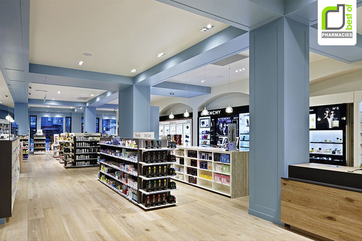

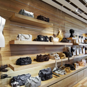
With years of experience in pharmacy operation, Ross Taylor approached us with the Blue Goose brand name and an exciting concept for an upmarket, boutique style pharmacy, aimed at a more discerning and style conscious customer base. In the spirit of the European apothecary, the pharmacy would deliver personalized prescriptions, alongside the very best in natural medicine and organic health care. It would also showcase prestige cosmetic brands like Chanel, Kenzo and Givenchy.

Red Design Group Creative Director, Colin Bell, says his solution for Blue Goose, is a modern take on the classic sensibilities of a stylish 1950’s department store. Clear open shopfronts, high ceilings and visual merchandising draw customers into the light and airy retail space.

Oversized limed timber doors set the scene, that you are entering something different here and balances with the grey blue wall colour referencing the ‘plumage morph’ of the snow goose when it changes from the ‘Blue Goose’ to its whiter mature form. Limed oak timber flooring wrapping onto counters, marble bench tops, high quality finishes and an unsurpassed attention to detail, complete the design. Red Design Group Graphic Designer, Brent Riddell, designed the distinctive Blue Goose brand mark and collateral.

The doors of the Blue Goose flagship store, located at Vogue Plaza in the Chapel Street precinct, opened just prior to Christmas 2010, capturing the imagination of customers and the pharmacy industry, for its creative and innovative store design.

Add to collection