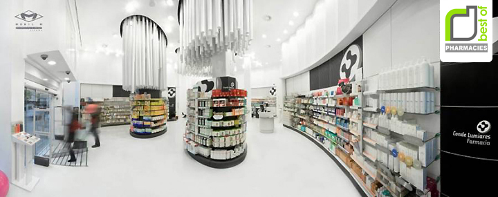

Conde Lumiares Pharmacy is another pharmacy which applied the understanding of modernity towards its interior design. But this wasn’t a modern interior back then until Mobil M suddenly conjures this place up. Doesn’t really strike the bell does it? It was not always so unless you knew what it was before. The old place had a false ceiling running the whole space, absence of light, and the interior captivated more of a death sentence rather than curing atmosphere. It’s very likely impossible to believe that now this pharmacy had space problems.

This spacious pharmacy interior interior design was quite a transformation. The gain in height has drawn an unparalleled designed. The architect was clear that if the ceiling is maintained at such a distance, there was a risk that the client will feel unprotected. So, they devised a system of suspended cylinders of different lengths varying from 2 to 4 meters in size to central shelves.

The 256 tubes hanging from the ceiling vents are without doubt the most outstanding feature of the interior design project. Customers can barely hide their amazement face. Some say that the customer service part has been designed for a personal attention benefit and yes I agree. But upon agreeing that it has been designed in such manner, It came over my mind about safety of the customer service as there’s no boundary to be found between them, and this is potentially could attract such potential crime acts.


http://www.decodir.com/2010/04/new-modern-pharmacy-interior-design-conde-lumiares-by-mobil-m/
http://www.mobil-m.es/
Add to collection
