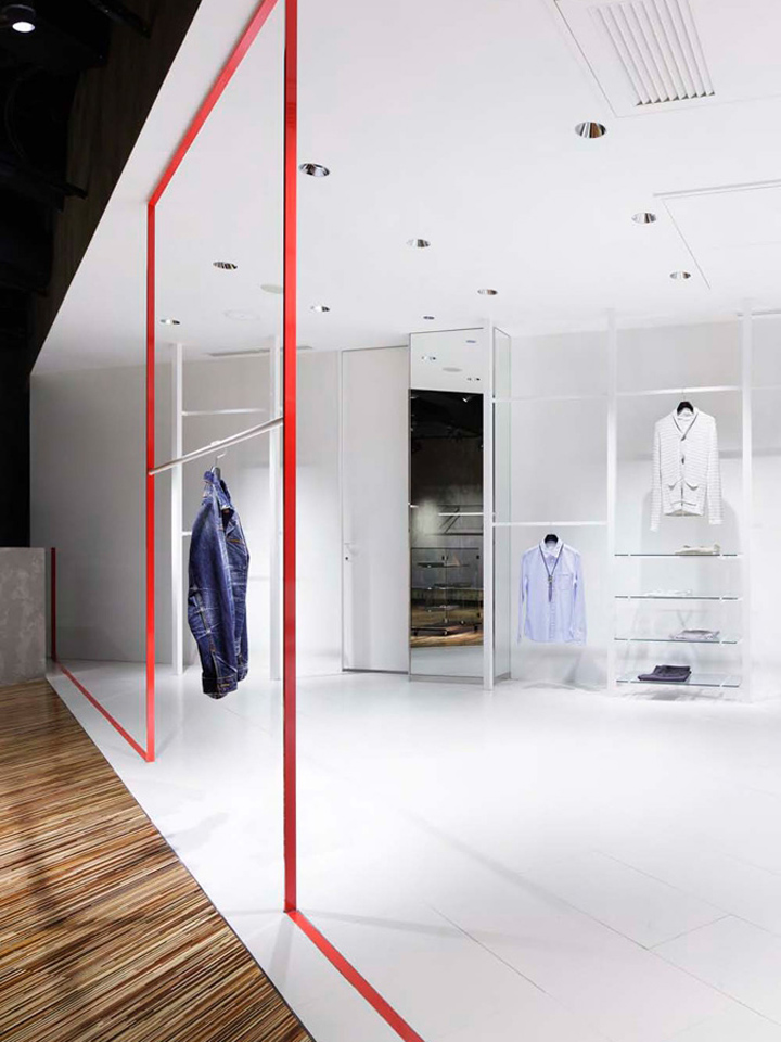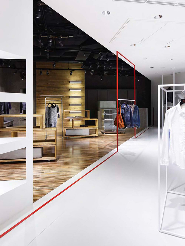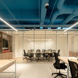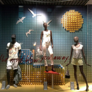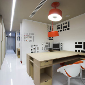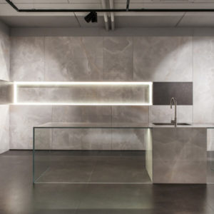
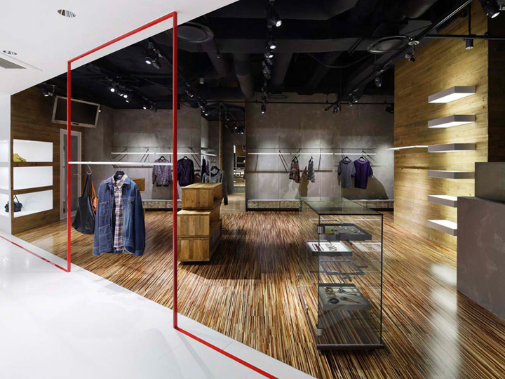

A clothing store in Yokohama, Japan, ‘creates a rhythm for shopping.’ And A is located within a shopping mall and is divided into two sections: the white entranceway and a darker section at the rear. According to designers Hisaaki Hirawata and Tomohiro Watabe of Tokyo-based firm MOMENT, this colour division entices visitors to enter the space, then draws their attention further inside.

‘We are interested in the power of white, which has no individuality,’ they say. ‘We additionally did not construct any interruptions around the façade and keep the entrance as wide as possible so customers feel no hesitation to enter the shop.’ Once inside, visitors travel deeper into the space that’s divided by red lines. The darkest section of the store encourages a more relaxed, slower pace of shopping.


http://www.frameweb.com/news/and-a-yokohama-shop

