
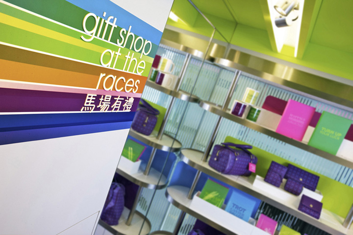
For the ‘Gift Shop at the Races,’ Marc & Chantal created a total design solution that included an end-to-end branding exercise and a customer-centric experience system for both the Happy Valley and Sha Tin racecourses. The Hong Kong Jockey Club (HKJC), a non-profit organisation providing sporting, betting entertainment and horse racing, is one of the oldest institutions in the city, and one of the largest racing organisations in the world.
A look back: Horse racing in Hong Kong commenced in 1841 with the arrival of the British, who immediately drained a malarial swamp to form a racetrack in Happy Valley. In its earliest days, this “Sport of Kings” had a regal atmosphere to match the magnificence of the animals. From presidents to playboys, moguls and movie stars- all around the world, and especially in Hong Kong, a day at the racecourse was laden with men in jackets and ties, and ladies in fancy dress. But like many traditions, after several generations, the sport began to loose its appeal, and with increased technology and betting depots scattered around town, the fashionable ritual of physically going to the racecourse slowly began fade.
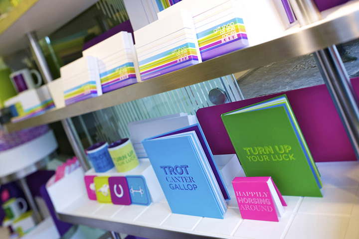
So on a mission to re-ignite the tradition of attending the races, the HKJC looked to Marc & Chantal to transform their current gift-counter into a retail experience, which echoes the energy and excitement of the races, and ultimately attract the younger generations to continue to attend the races. From creating an engaging environment, solving operational challenges and creating seamlessness between the actual racing event and the items sold in the shop, the ultimate challenge for Marc & Chantal Design was to create a brand which would speak directly to the next generation of race-goers.
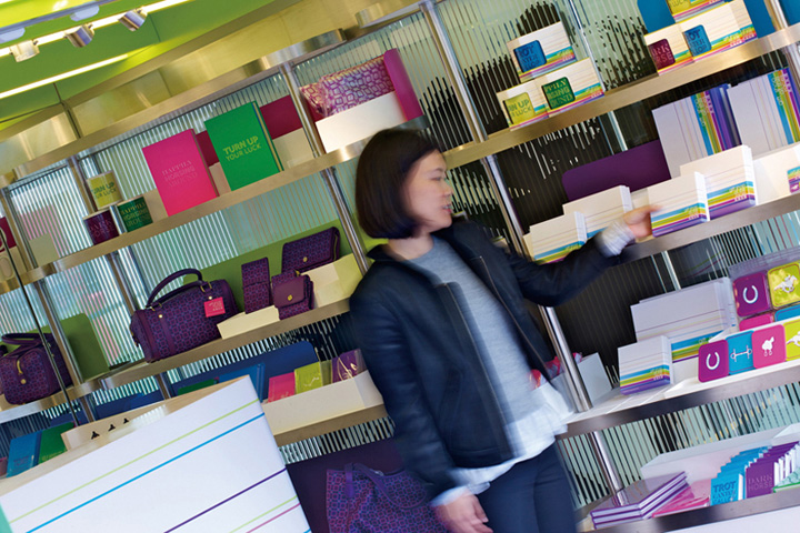
Betting ballots in hand, the team at Marc & Chantal Design made several trips to both Happy Valley and Sha Tin, and braved the crowds at the several betting stations around the city, to really dive into the emotional design process. What does a night at the races feel like? The team at Marc & Chantal described a Wednesday night in Happy Valley as a pulsating, exciting and energetic experience. From the power and speed of the horses, the playful hues of the jockey’s racing silks to the fun-loving after-work crowd, enjoying the electric urban skyline and alfresco atmosphere – the foundation of the design was rooted in the high-spiritedness of the horse races.
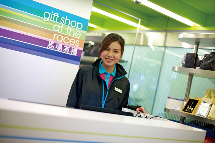
Starting with the brand definition, the team defined the target customer profile which encompassed a younger demographic of race-goers who represented a mix of westerners, Hong Kong locals and tourists. From there, the team of writers, designers and managers worked to create a unique positioning, DNA, promise and mission statement which would provide a strong foundation for the team of designers – both interior and graphic, to work together to develop a seamless brand experience.
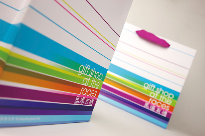
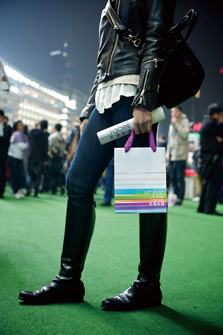
The team worked hand-in-hand with the HKJC to develop the very young-at-heart brand experience, which encompassed everything from the logo, naming, product development, shop interior and design of mobile retail kiosks, shop fixtures, and packaging.
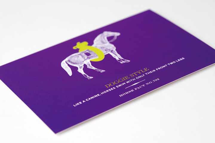
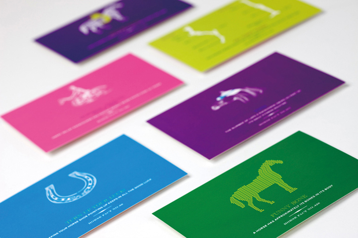
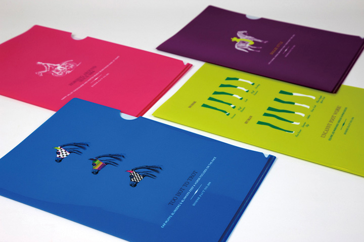
“Actually, we laughed a lot during this project!” Giggles copywriter, Jessica Collins as she describes the series of ‘witty lines’ and ‘fun facts.’ “We had to research all of these little-known facts, and many of them we found so quirky and idiosyncratic, that we had to find a way to incorporate them into our design.”
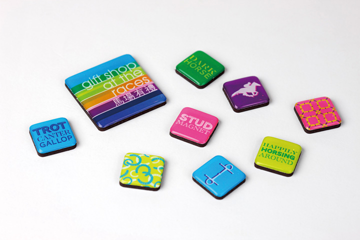
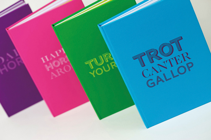
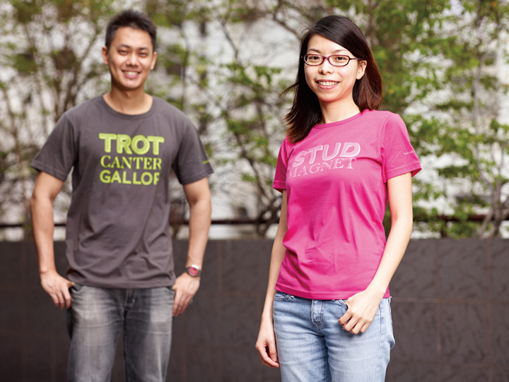
The HKJC team also found the wit and irony of the fun-facts charming, thus approached the team at Marc & Chantal to produce a line of products, which the Jockey Club named “Happy Racing.” ‘Turn up Your Luck,’ ‘Dark Horse’ and ‘Happily Horsing Around’ are a few of the witty lines that the team developed for products such as coffee mugs, tees and fridge magnets. “Did you know that like a canine, horses swim with only their front two legs?” Says Design Director, Gahyee Tsui with a grin.
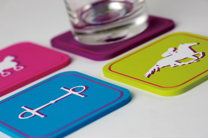
“The collection of products consists of imagery which relate to horses and racing. We wanted to have fun with it, so we’ve taken iconic symbols such as saddles, bit and horse shoes, and paired them with bold new colours and quirky typography in a light hearted way,” continues Gahyee.
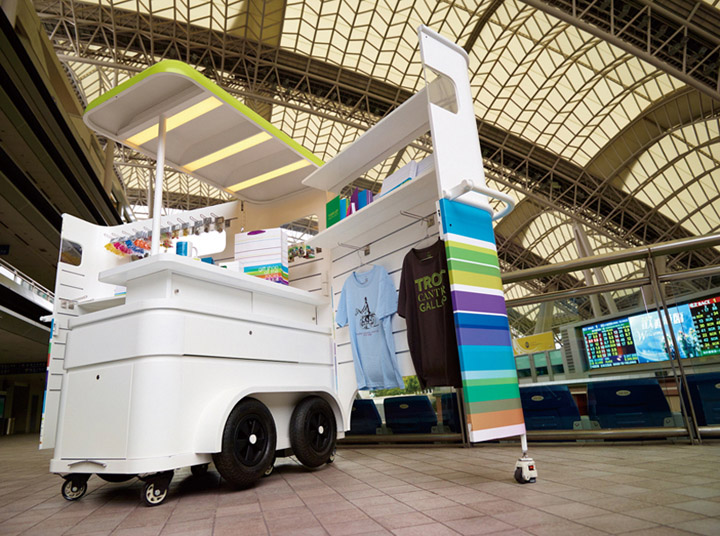
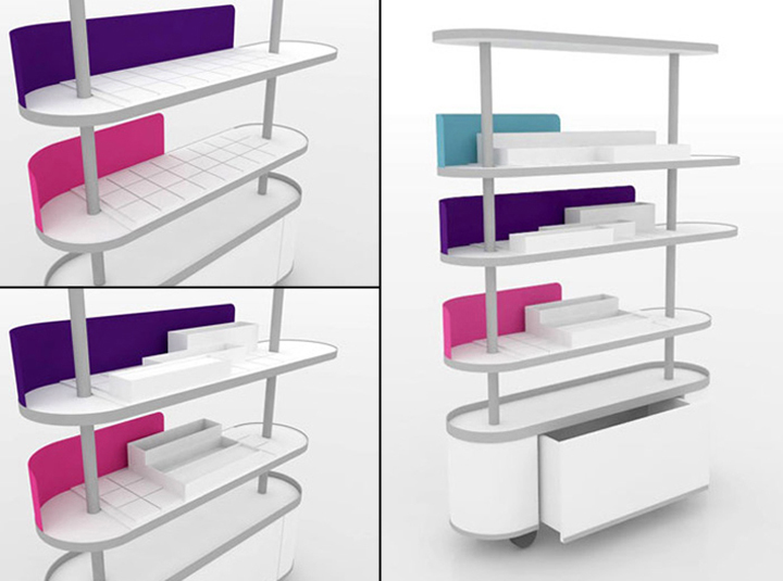
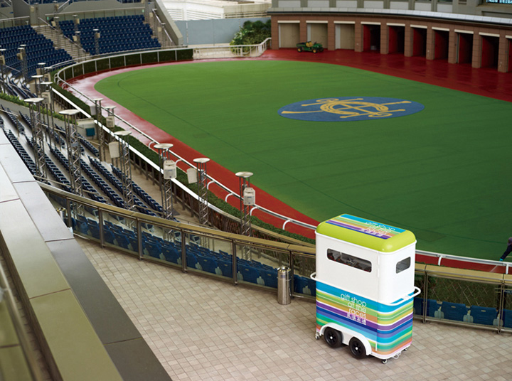
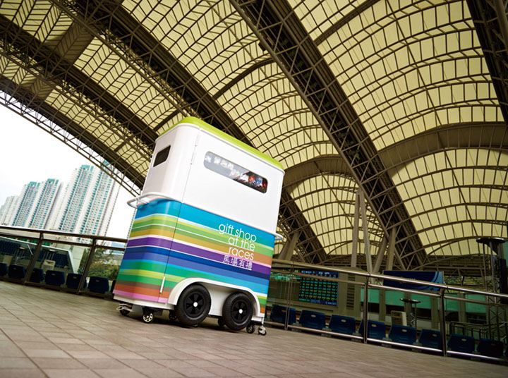
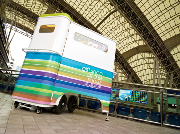
The concept for the shop interior, and mobile retail cart also played homage to the energy and speed of the races. Both feature white-on-white walls, with energetic bursts of light and colour, a true extension of the brand identity. Designed for maximum flexibility, storage and mobility, the retail system (seen below) makes use of the Gift Shop’s limited space, and accommodates the large clusters of shoppers attending the races.
“For the cart, we were really inspired by the general charm of the equine transport trailer.’ Explains Hing Chiu. ‘The shape and structure of the trailers look quite cool, and that I wanted to find a way to translate that into our design.” An exercise in reinventing tradition, the team at Marc & Chantal used hints of irreverence, and tongue-in-cheek humour, energetic colours and bold contrasts to really grab the attention of a younger, hipper demographic, making the Gift Shop at the Races a true reflection of the Hong Kong Jockey Club’s ability to move with the times and progression of the City.


Add to collection
