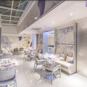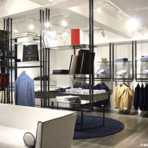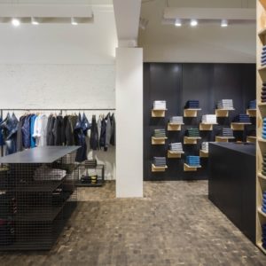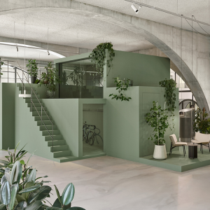

New York, NY — Retail design consultancy Sheridan&Co has styled a new look for Blow, the New York blow dry bar. Sheridan&Co’s salon design gives customers a full blowout experience, works efficiently for the stylists and showcases the hair care product line blowpro®. The Sheridan&Co design team worked with Blow to create a salon interior that feels sophisticated and metropolitan, and communicates the confidence and expertise of the Blow brand. The space is bright and fresh – every detail carefully considered to make the environment highly functional as well as stylish.

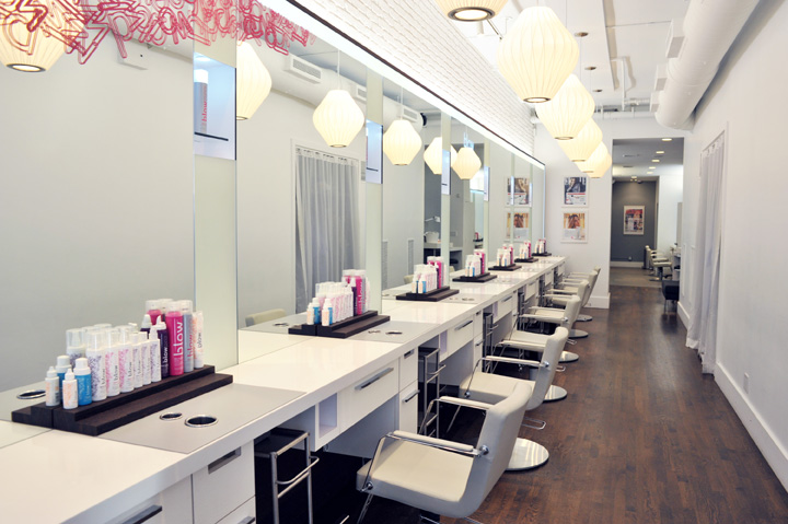
Sheridan&Co has created a strong visual language through use of materials and finishes. Deep grained white veneer and sandblasted wenge creates a rich textural feeling against a background of industrial white brick and exposed ducting. Corian and back-painted glass walls add a sense of polished modernity. Customers are welcomed in to 1,200 square foot salon with a bold logo graphic in hot pink slashed across the window. A bespoke curved reception desk sits at the front of the space next to a counter/bar serving as waiting area where customers can check out the range of services on two built-in IPads.

Central to the scheme is a long bar which runs the length of the space against a wall of mirrors. By replacing the traditional individual workstations Sheridan&Co has created a sense of community and shared experience for the customer. Above it hangs a line of LED lighting adding to the rich texture of the scheme. Sheridan&Co has created a bespoke retail and merchandising system for the brand, which can easily be adapted to other salons or translated into free-standing kiosks in department stores. Finished in white gloss laminate and glass the system will display and store the full product range.

The stylish bespoke blow-dry stations designed by Sheridan&Co take every detail into account. From ample storage to sound and heat dampening silicone mats. Integrated counter display plinths organize the stylist’s tools, while enabling the customer to view the full range of blowpro hair care products. Illuminated product glorifiers attract the customer’s eye. There are built-in handbag hooks and iPhone storage nooks complete with charger.

“Sheridan captured our brand’s vision for the newly renovated flagship location perfectly. The redesign creates a 360-degree experience for clients and reinforces our leadership position and authority in the burgeoning blow dry industry,” said Blow founder and president Stuart Sklar. “Every aspect of the blow dry bar reflects the brand’s DNA. After 7 years of beautiful blowouts, we could not be more pleased with our new look.”
“We worked with the Blow team to create a space that reflects their customer – chic and urban – while still managing to feel approachable and fun,” said Sheridan&Co Head of Design U.S. Kevin Lindberg. “The site is located in the Meatpacking District of New York City, which is one of the most stylish and dynamic neighborhoods here, and now, more than ever before, Blow looks and feels like it belongs there.”


Add to collection

