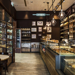

The program is divided between the two existing plants, on the ground floor a more informal, and at the top, a Michelin Star restaurant. This ground floor space as a continuum of the square, with a large opening in front and a continuous concrete floor, becoming a door space between public and market. The layout creates two working parties on both sides of the flow of people: one open, where the layout of the kitchens in perpendicular promotes cooking watch the show, and one closed to the dirty area with access from the outside service. Lighting along the length of the place reinforces the idea of continuity, turning the square into a restaurant and the restaurant plaza.
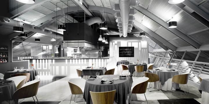
The first floor is achieved by a great cabinet space; positioned asymmetrically in the room, creates four places between the perimeter of the facades and to which never touches, so that the container and metal beams have continuity deployé. The floor, with references to aerial photographs of fields, indicating the importance of raw material at a restaurant in this category, while carpets generates three intensities of gray that individualize each table space, avoiding the feeling of great dining room.
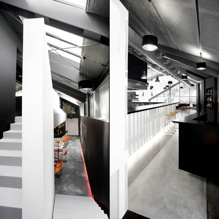
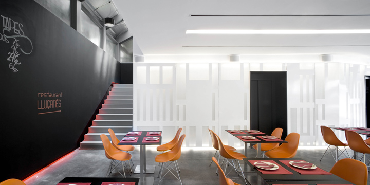
The walls painted black background reinforce the sense of infinity from the public space. On the ground floor facing a large blackboard acts black, while the facing first floor fragments to locate the necessary furniture, leaving two large openings that give visual continuity to the deck in the double-height space. This furniture is situated opposite the skylights to increase light coming downstairs. The materiality of the proposal seeks to maintain the industrial character of the market, using steel plates and concrete.
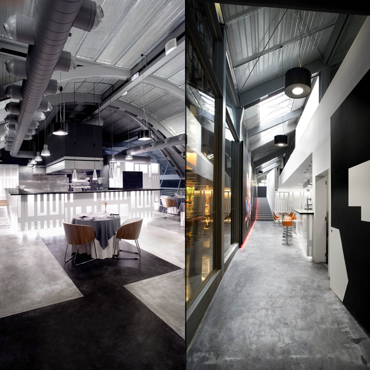
The architectural solutions to distribute the program are both light and acoustic response of the space. The lamp is solved by a steel plate painted white and perforated according to a mosaic that remembers your settings so characteristic of the neighborhood where the restaurant is situated. Behind the plate, perforated fabric absorbs while acoustically diffuses light.
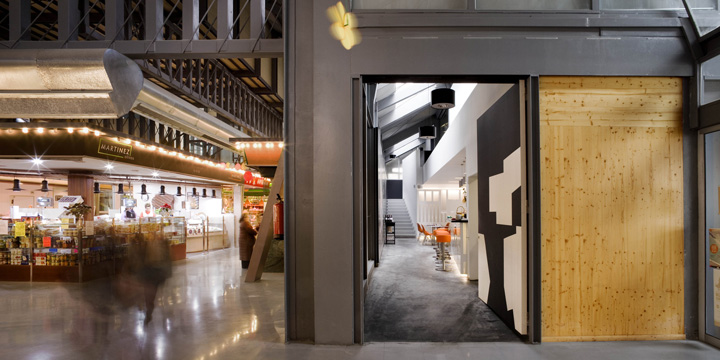
Gray tones on the first floor are repeated in the dress of the tables, as if they were part of the floor, while ground floor provides a single color, orange, which qualifies the different types of premises. This color is always at the height of the sight of the person sitting on chairs, stools, aprons. The white wall-lamp at an altitude of just 2.80, from which the black takes away space for installation.
Designed by Josep Ferrando
http://www.archdaily.com/273552/michelin-restaurant-josep-ferrando/


Add to collection
