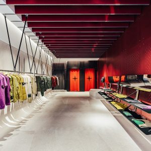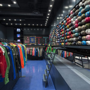

The new-look Benetton store on Corso Buenos Aires, Milan, looks to the future and interacts with fashion. Inaugurated by Alessandro Benetton, this is the latest leg in the journey of international style and modernity that began in Istanbul, and will continue in other major European cities
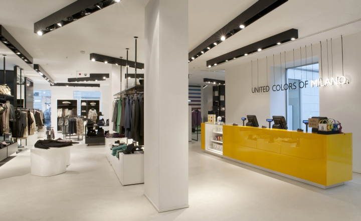
20 September 2010. Benetton’s Milan flagship store reopens on 24 September, attended by Alessandro Benetton, Executive Deputy Chairman of the Group. With a new design by Piero Lissoni, in which innovation goes hand-in-hand with Milanese tradition, the store is located in a neo-classical building on Corso Buenos Aires, a key international shopping destination. It occupies three floors, with a design concept that successfully blends Benetton’s innovation-driven identity with the sophisticated spirit of Italy’s fashion capital.
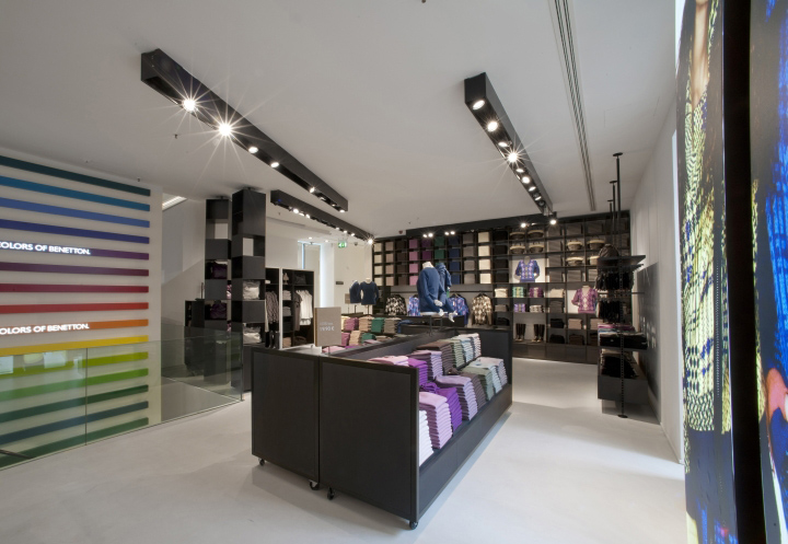
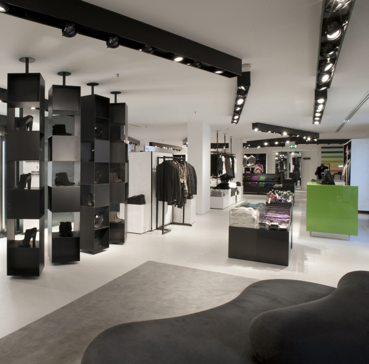
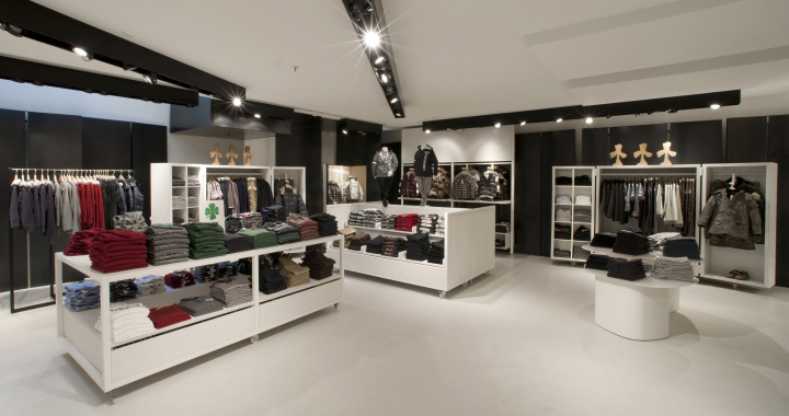
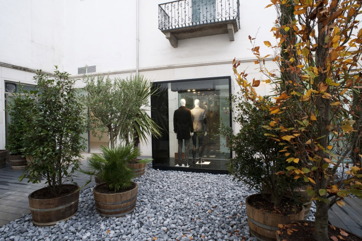
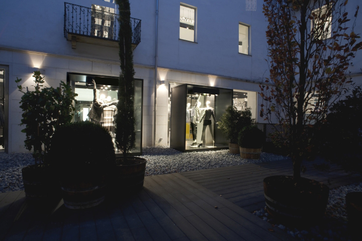
In Milan the work on the building began by enhancing the existing spaces, reorganising the interior using large, waxed, coarse sheet-metal boxes, at double height in some points, and restoring the original courtyard, which is overlooked by the inner store windows, so as to emphasise the characteristics of the collections with absolute elegance.
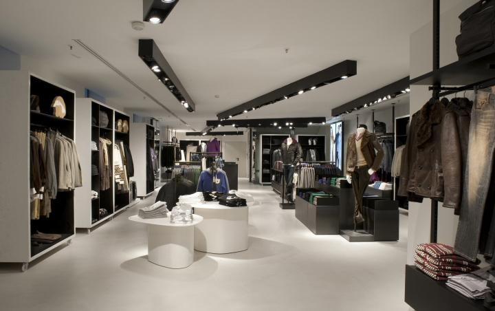
The lower ground floor houses Benetton kids and Sisley young; the ground floor hosts the Benetton woman collections, the new knitwear corner and the men’s and women’s collections from Sisley, the Group’s most glamorous brand; and Benetton woman and man are on the first floor, as is the accessories corner.
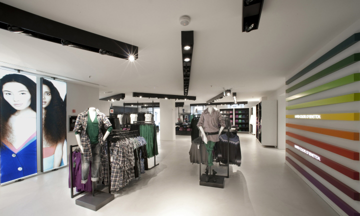
“For the Milan store, we opted for light, clear, bright spaces that would offer a discreet reflection of the spirit of this city, of the location which accommodates and animates them,” commented Piero Lissoni. “Light is an important structural element of the space, and is emphasised by a palette that focuses on white, into which the pure volumes of the perfectly technical, functional fittings are introduced. The materials chosen for the store fittings are deliberately simple, yet exude qualities of strength and elegance. The metal box motif has been expanded spectacularly well to form the divisions within the space, becoming a real strength of the design.”
The main stairway is a prominent architectural feature, in folded iron sheet, flowing like a ribbon between the three floors; it resembles a huge piece of origami, and gives the place an unreal atmosphere. The lift is contained within a white glass tower, and on its surface are ribs of opaline glass offering a half-revealed glimpse of the lift as it travels up and down, and the white neon light indicating the floor level.
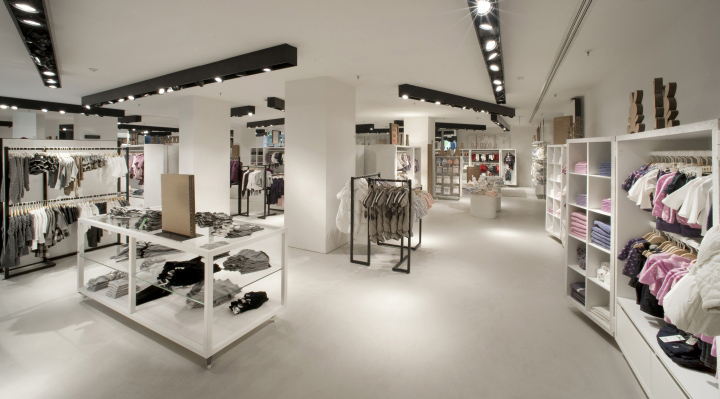
The interior decor is purposely designed by Lissoni, with the exception of the Bubble Rock sofa from Living Divani. The furniture is in metal or wood, with closets on castors, tables reflecting nature in their shapes, systems of rails, shelves and hanging racks that recall the large, light and sohisticated bookshelves of the Fifties, illuminated by a system of suspended lighting: a group of elements designed to present a neatly arranged showcase of Benetton apparel and accessories, the true features of this space.
The flooring is in beige cement-resin, except for the ground level, where it is dark grey: this choice is designed to distinguish the Sisley area, as the key tones for this brand lie along an elegant scale of grey. References to colour, an essential element in the Benetton identity, accompany visitors as they move through the different floors: a gradual succession of 40colours extends through the entire height of the store up the rear staircase, where each step corresponds to a different colour.
The world of communication and the language of aesthetics – key Benetton themes – are alluded to in the cardboard panels/screens designed by Piero Lissoni, printed with quotes from Italo Calvino’s Invisible Cities, a visible manifestation and written testimony to Italian culture.
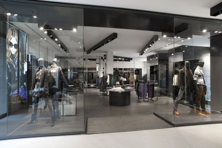
The Benetton Milan megastore revamp and the brand’s partnership with Lissoni are part of Opening Soon…, a programme of sales network orientated investments aimed at implementing new architectural and design concepts in the retail spaces of a number of cities that are icons of the world’s transformation.
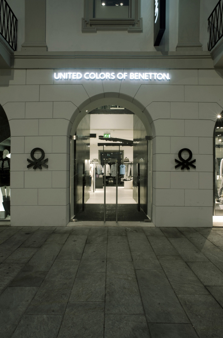
This international itinerary into style and progressiveness was launched in Istanbul in 2009, with a flagship store entirely designed by Piero Lissoni, followed by other stores in striking buildings in major European cities, from London to Paris, to Frankfurt, each expressing and interpreting the local culture.


Add to collection
