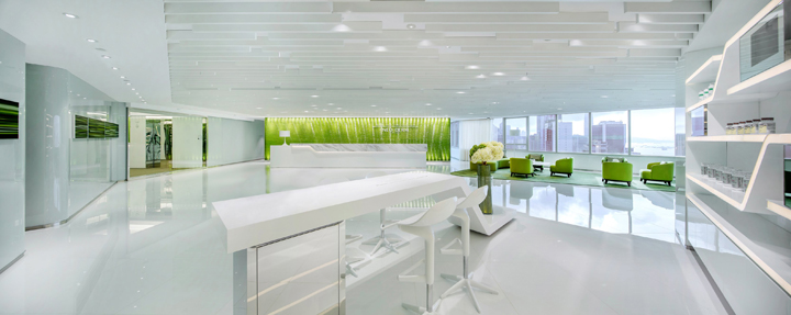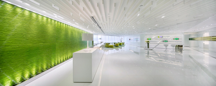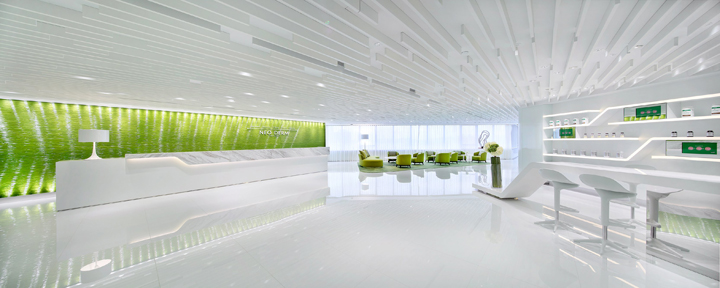
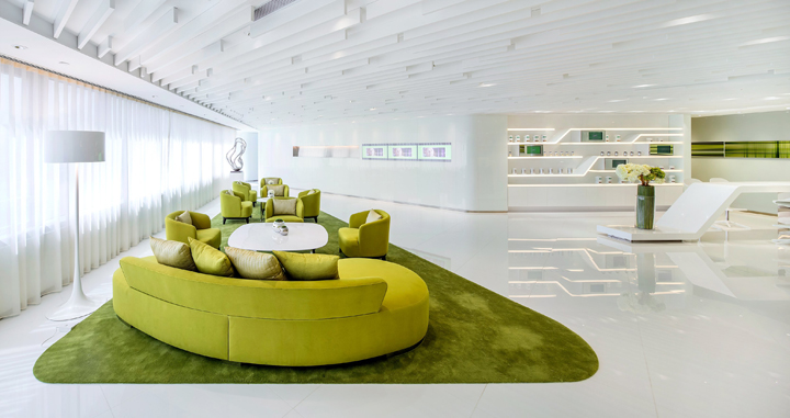

Taking ‘line’ and ‘lime‘ as the representation of dynamics, young and energetic to respond to the design brief, designer creates this 15000 sq. ft. lifestyle space with a concept of sustainability and continuity. Backdrop of the reception is a lime color wall with a front layer of translucent recycled resins panel, the embossed lines on the panel are just like the light beams dashing around to embrace the space speedily. A clean white high-gloss paint reception island landed on the reconsistute stone flooring create a contrast to the backdrop.

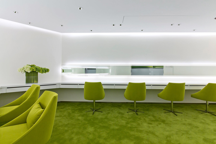
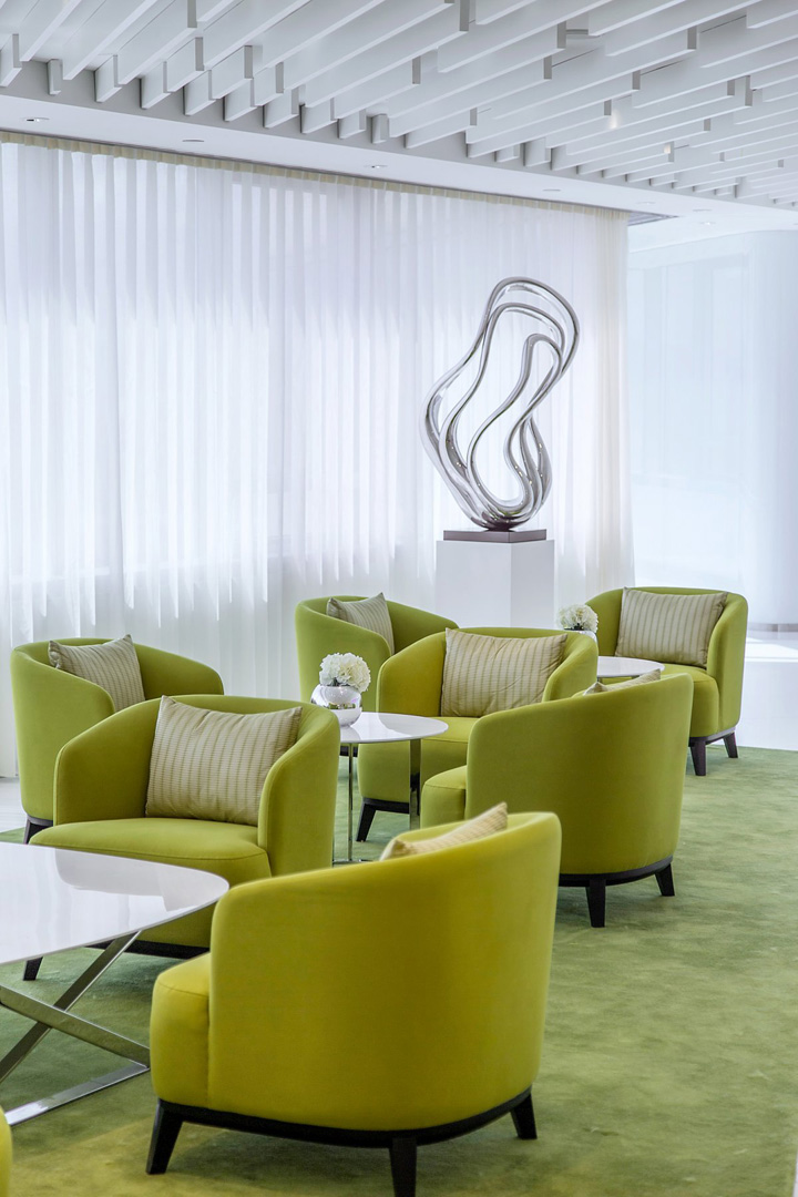
Beams of white dashing lines are running throughout the white ceiling and extending to the surrounding space with dynamics. The relaxation zone adjacent to the reception is set on a lime on lime color tone from furniture to carpet that emphasizes the young and rejuvenated brand essence by overviewing the Victoria harbor. Fabric sofas are designed with rounded ends to offer a comfortable and warm mood to welcome customers.

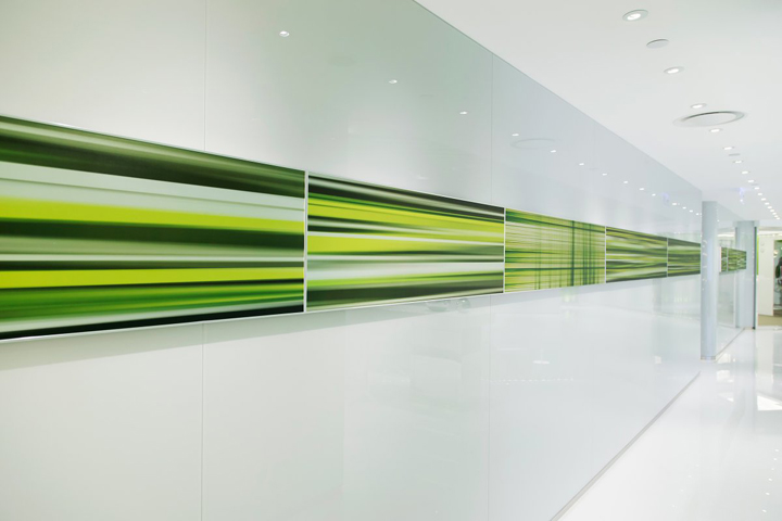
Lines lead the way when the customer is walking into the treatment area. Following the dashing line pattern on the reception backdrop and ceiling, lines continue to take the lead in the corridor where product display shelves with LED lightings were lining up on the wall. The wall on the opposite side of the corridor is echoing with a long piece of line artwork. Lines in different forms are spreading around to keep the dynamics in the space.

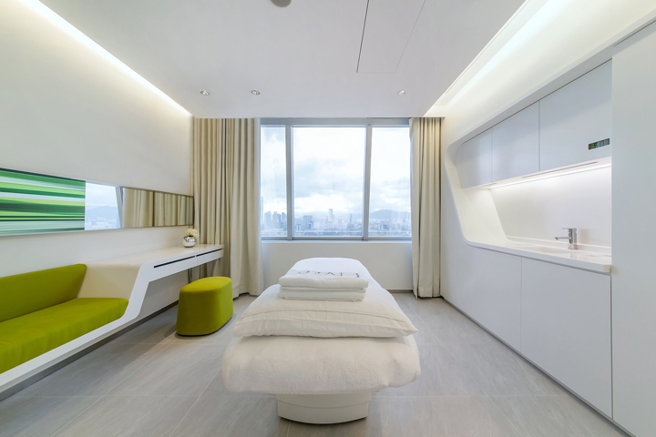
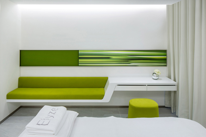
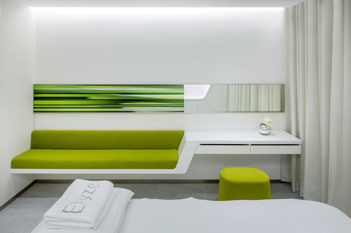
Privilege is a special key attracting the young customers. Treatment rooms in this skin care center are specially designed as a multifunctional room that is capable to perform as a cosmetic room, an entertainment room as well as a treatment room to fit with their needs. Where a ‘line’ sliding picture is designed to cover the mirror on top of the cosmetic table. This tricky design helps to prevent the reflection inside the room during laser treatment is in operation.

Catching the flow, the high gloss paint wall panels are set as subtle line features to lead the flow. Where the table is connecting to the seating, basic counter top is connecting a hanging cabinet demonstrating the concept of ‘continuity’, all the things are getting connected and bringing forth into other space.

In the makeup room, its special triangular shape demonstrates a play of intimate reflection. In the treatment room and makeup room, the main characters are always the user, which marks the meaningful connection to the continuity of lines. From curtains, furniture, ceiling patterns, artworks to every details of the space, it is carefully designed to resonate the theme of lines, and lime color highlights are just enough to demonstrate the dashy and energetic design brief for this particular skin care center.
Designed by Beige Design


http://www.contemporist.com/2012/10/04/neo-derm-interior-by-beige-design/
