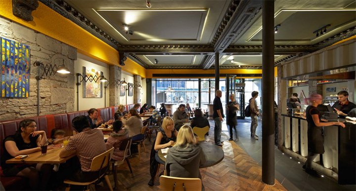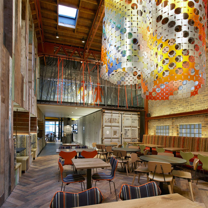

BuckleyGrayYeoman’s latest restaurant design for Nando’s has opened in Dundee. Housed within two conjoined historic buildings on Nethergate, at the heart of the Scottish city’s retail and entertainment district, the design of the 100 cover restaurant restores period features and makes bold additions to create a colourful, contemporary space that is unmistakably Nando’s.

A key design challenge for the restaurant was merging the architectural identity of the Grade II listed Victorian building that makes up the front portion of the restaurant with the industrial character of the adjoining 1920s warehouse to the rear.

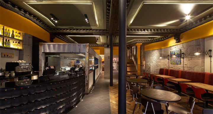
Working closely with conservation officers, BuckleyGrayYeoman removed a modern suspended ceiling within the Victorian building to reveal concealed period detailing. In the former warehouse, the
architects removed an outdated plant room to create a capacious double height area with an exposed timber roof and structural steelwork that emphasise the spatial qualities and industrial character of the building. These newly restored details have been given a playful overhaul, taking centre-stage in an interior design that expresses the vibrancy of the Nando’s brand through an eclectic palette of materials and colour.

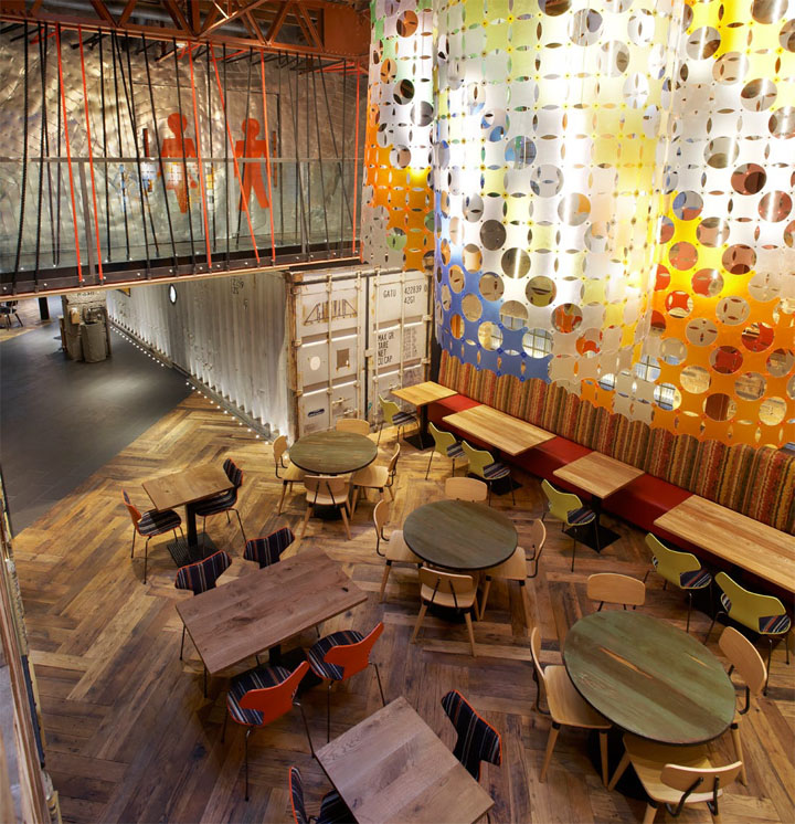
BuckleyGrayYeoman has introduced a 40ft shipping container to house the kitchen at the heart of the restaurant. This reference to the roots of the Nando’s brand in South Africa, where shipping containers are commonly used as spaces for restaurants and shops, chimes with the quirky maximalism and materiality of the design.

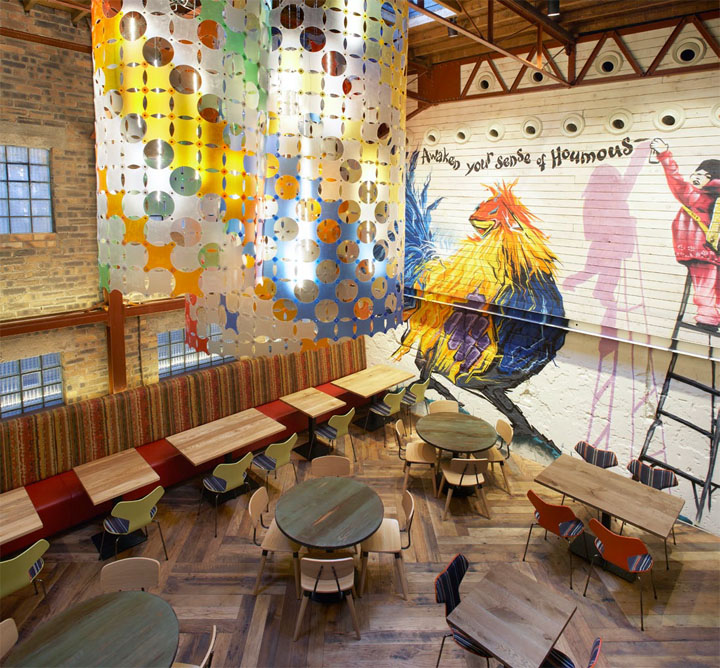
A five metre-high graffiti mural, by local artist Marc Delaye, fills the rear wall of the warehouse building, continuing Nando’s commitment to commissioning art. BuckleyGrayYeoman used the full
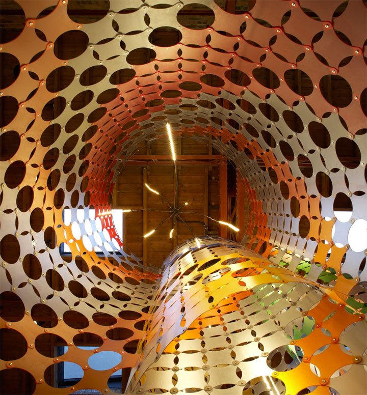
height of the warehouse space to create a delicate pendant light sculpture, creating a play of colour above diners’ heads.

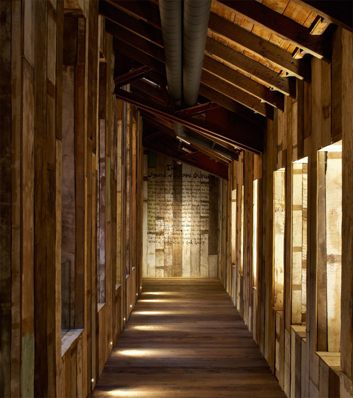
In the central space that links the Victorian and warehouse buildings, a staircase made from reclaimed Balinese timber leads up to a mezzanine overlooking the warehouse dining area. The mezzanine level accommodates the washrooms, which have been clad in reclaimed galvanized steel spiral ducting and feature bespoke wash basins innovatively cast using concrete infused fabrics. Carefully considered detail runs throughout the project, which uses furniture from Fritz Hansen upholstered in Paul Smith fabrics.

Matt Yeoman, the Director in charge of the project at BuckleyGrayYeoman said, “Nando’s is a high street brand that is genuinely interested in adventurous design. When you combine this enthusiasm with a site that has fantastic heritage assets and spatial qualities, you end up with a truly enjoyable project from an architectural point of view. “We set out to reveal the various layers of both buildings’ past by celebrating their period features and materiality. We then unified the two spaces with an eclectic design treatment that draws upon elements of Nando’s South African heritage and funloving, youthful brand.”
