

Terrace seats outside the facility also give advertising effect to the people who walk by.
BELG AUBE is a Brasserie that mainly serves Belgium beer. It is placed inside the facility of Tokyo Art Theatre which is the origin of Art and Culture. Every day, the Brasserie is full of people who come to see the theater and concerts and people who sponsor them. In this design, we combined the individuality of Belgium beer and the comfortness being suitable for the general so it will fit into the location in the best way. First of all, variety of beer is one of the characteristics of Belgium beer. To bring in the variety of beer into the design, we structured an open counter.

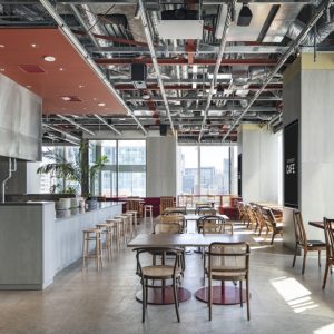
The Brasserie is separated into two parts; the public space and the private space. Though the public space is located indoors, it has an atmosphere of terrace seats. The bright colors with slight contrast make a comfortable place to enter.
This counter represents the characters of the brasserie directly. While on the other hand, stocks of beer are placed in the hanging cupboards. Here is the creative point. In order to stir the anticipation of the customers, we chose to hide part of the beer and not show all the stocks. For the designs, when viewed from different angles, you can get unequal glimpses of the arch-shaped window space. This will add another amusement aspect to the creative point as mentioned above. This is the biggest visual identity of the brasserie.

Awning tent and accordion window bring open impression, and depth to the whole room.
Table seats are arranged in the public space of the facility. So in total, the brasserie will look as if there are terrace seats. We intentionally created the space with light atmosphere. As for the color scheme, by minimizing the contrast, we have created usability. On the other hand, details are made with greatest care and used aging process to create constant high grade atmosphere.
Designer: Aiji Inoue, Yuki Kanai / DOYLE COLLECTION co.,ltd.
Photographer: Satoru Umetsu/ Nacasa&Partners

Counter seats create independent atmosphere.

Sophisticated counter designs match the impressions of Belgium beer’s history. Variety of beer can be seen from the arch-shaped windows. This will capture the interest of the customers.

Functional looking counter and spacious seats make comfortable combination. Through the round-shaped window at the back of the room, you can see people walking by the main street located in front of the brasserie.

Ranges of different glasses are part of the design. The hanging cupboard has complex cross-section shape and this combines both traditional and modern impressions.

Arched-shaped window space of the hanging cupboard. Details.


Add to collection
