

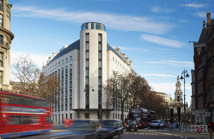
The triangular site of the ME Hotel on the corner of Aldwych was once the home of the Gaiety Theatre, which was damaged during the war and demolished to make way for an office development. Completing the grand sweep of buildings that make up the 1920s crescent, the new scheme repairs the urban grain and restores a little lost glamour to the heart of the West End.

The project, which is due to open in summer 2012, is the first flagship hotel in which everything, from the shell of the building to the bathroom fittings, has been designed by Foster + Partners – the result is an elegant fusion of interior and exterior design that signals a new contemporary approach for London’s boutique hotels.
The design seamlessly integrates the construction of a new 157-bed hotel with the restoration of the adjacent 1904 Marconi House, whose interior has been entirely restructured to accommodate 87 apartments. In the 1970s, the building’s façade underwent considerable alteration – the project involved reinstating the mansard roof in natural slate tiles, recreating the original dormer windows and restoring the masonry using carefully matched Portland stone. The new hotel building corresponds in height, scale and materials to its neighbour.

Its minimal detailing, simple, triangular oriel windows and Portland stone facade give a sense of cohesion, and the setback of the hotel’s upper level terraces follows the mansard roof of Marconi House. Projecting from the façade, the hotel’s triangular bays reveal long views of the Strand, while maintaining similar proportions to the windows of Marconi House.
An elliptical tower on the corner of the hotel defines the end-point for the Aldwych Crescent and marks the main entrance at street level, which is sheltered beneath a wide glass canopy. The corner tower is topped by a glass cupola – a contemporary reinterpretation of the Edwardian-style domed roof opposite.

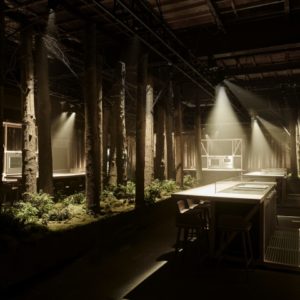
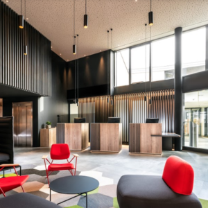
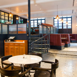
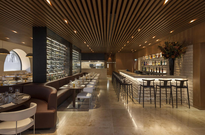
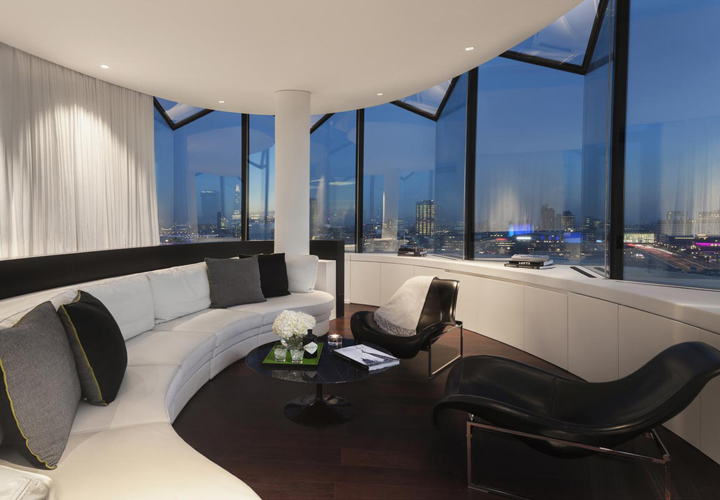
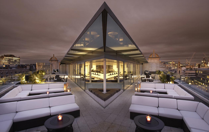
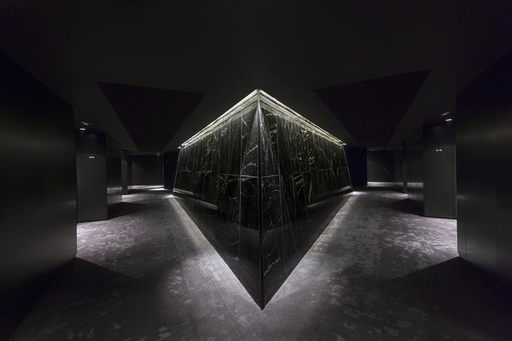
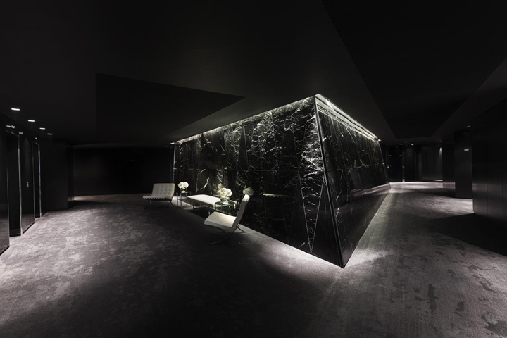
The arrangement of functions establishes a natural hierarchy of privacy, which extends from the public spaces at street level to the guest terraces and roof garden at the very top of the building. The interior concept fuses contemporary detailing with classical traditions, its dramatic monochrome palette a combination of rich textures and luxurious natural materials. On the top floor, the hotel’s rooftop terraces are an urban oasis, with a sky bar and gardens with spectacular views of the river and Westminster skyline.



http://www.fosterandpartners.com


Add to collection
