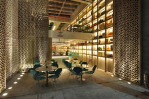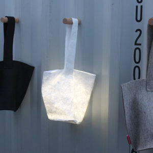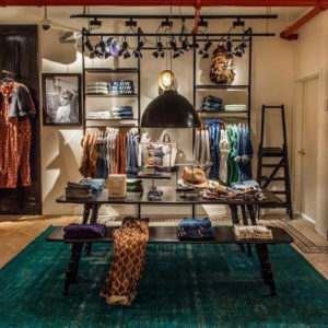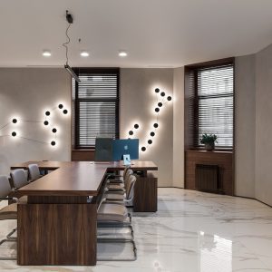

One bright disused space located in an eighteenth century building in the historic center of Milan – just behind Piazza del Duomo – is transformed into a contemporary craft shop, where the manufacture is living along with hospitality and sale.
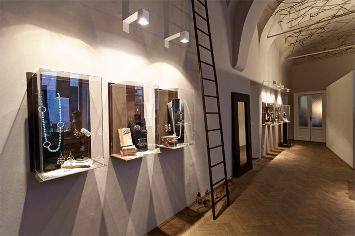
The project was born from a dialogue between the architect and the owner. Daniela De Marchi is a designer of jewelry with a sensitive and very personal language. Her creations represent a world of
romance and attraction for surfaces corroded by time. Her shapes are organic, inspired by nature. His manners are inclusive, welcoming the people is a specific aspect in her work and her life.
The way of relating of Daniela – who tends to create relationships of complicity with her clients – inspired in a definitive way the project. During long conversations it was decided – through a
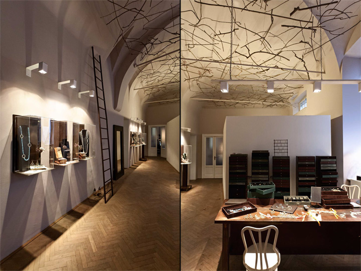
minimal intervention played on the color palette and the selection of the materials – to preserve the elegance of the existing structure, freeing it of all the technical and functional additions stratified over time and such restoring dignity to the space.
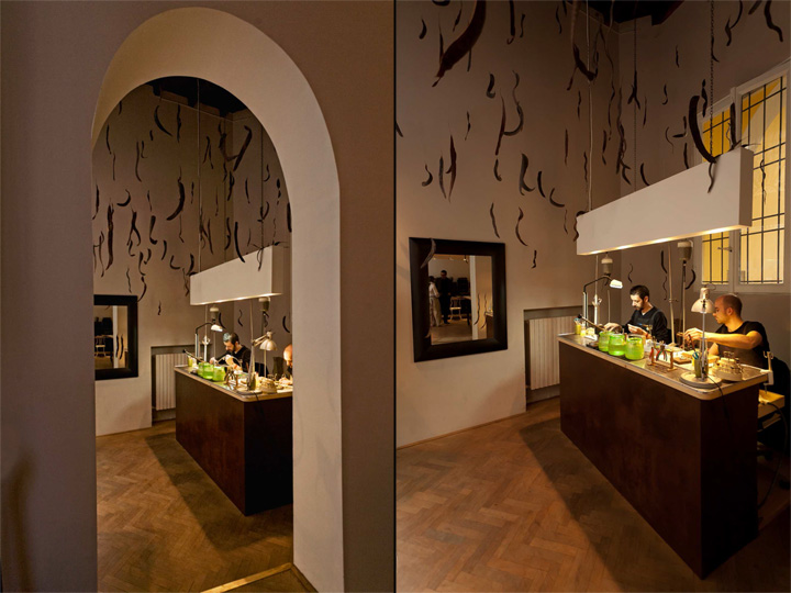
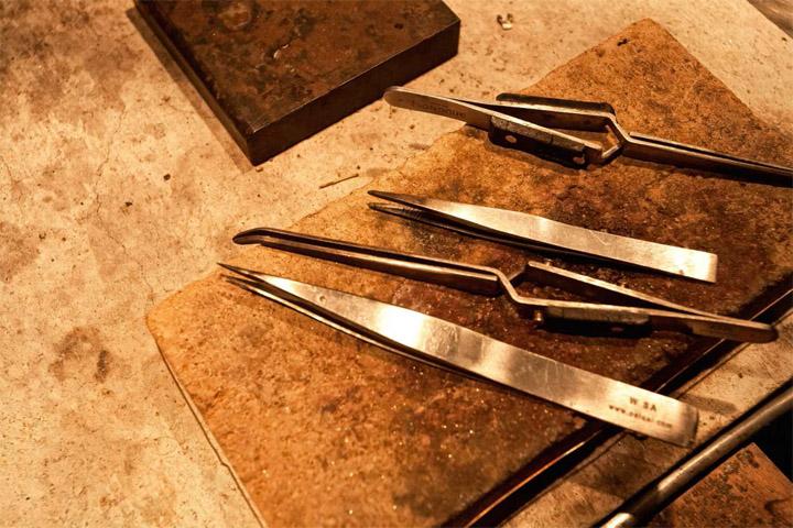
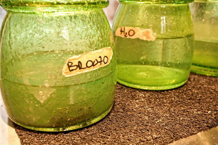
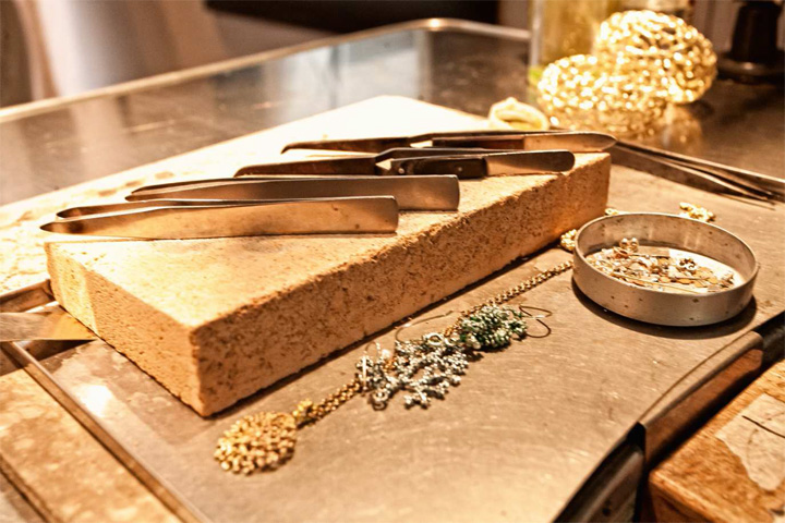
At the entrance, under an original wooden ceiling, it’s staged what is commonly behind the scenes: the workmanship and craftsmanship. It’s the place where the creations of Daniela see the light,
where materials and forms are experienced.
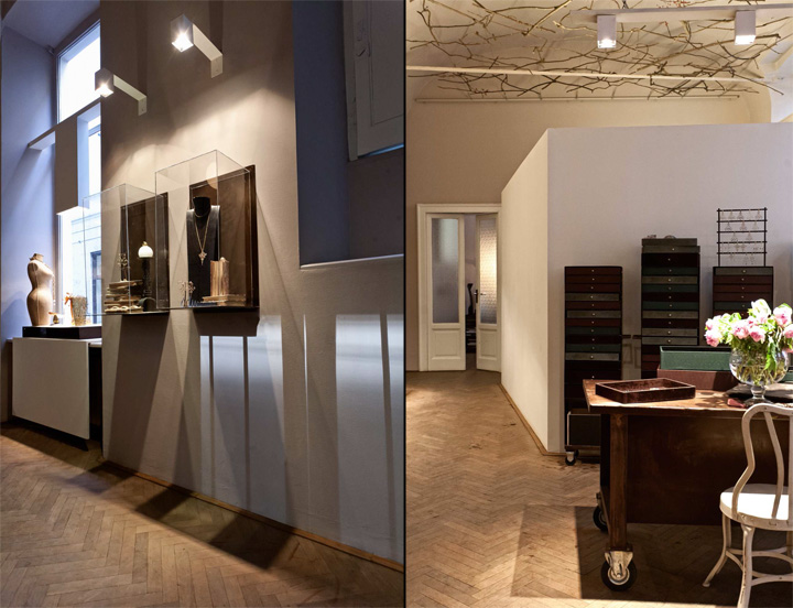
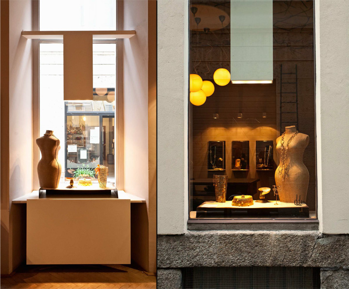
From here you get access to a large central area with vaulted ceiling, located at street level, lit by long narrow windows that allow the use of natural light as a real material. A predominant flat color is chosen as a wrapping sensitive skin that reacts to changing light during the day, shifting from pale beige to dark gray with a range of brown shades of purple. The organization of space occurs through the superposition of a few essential features to the existing context. A volume placed inside the main space, with the lightness of a sheet, functionally separates the display and sale areas from a restricted one.
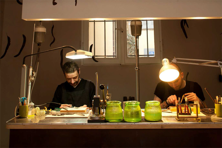
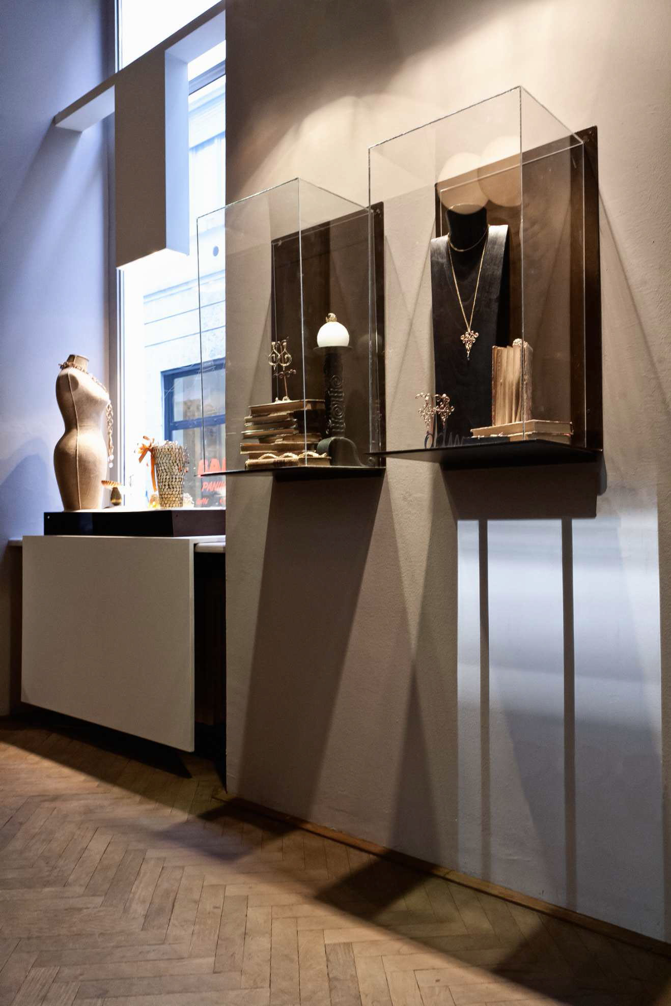
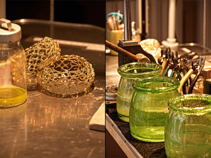
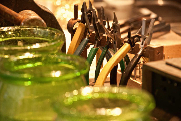
In interpreting a specific taste made of details, of pieces found and readapted, of care in matching the old with the new, the design of furniture and display accessories was inspired by workbenches, using the color and the surface qualities of oxidized iron as an exhibition frame.
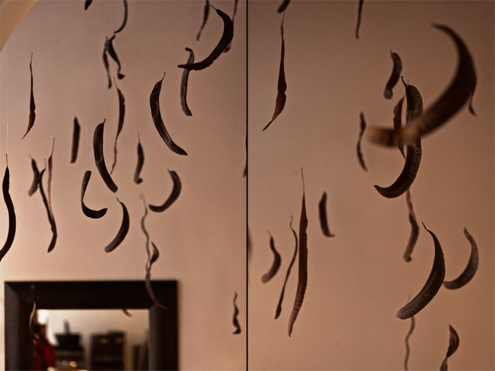
An installation of natural elements – branches and leaves – is floating under the vault of the ceiling as another charming narrative element. It informs us that in this personal place, so clearly expressing the soul of the owner – a real place of intimacy – nothing is artificial, and that design echoes the adaptability of life.
Designer: Paolo Cesaretti + Daniela De Marchi, Milano
Assistant: Manuel Villiotti
Ceiling installation: Marianna Merisi, Serena Forti, Milano
Photos: Stefano Stagni / paolo+stefano, Bologna


Add to collection
