
Add to collection

This project was developed from the very beginning (even from within the product), a very unique ice cream: a shaved ice cream imported from Taiwan, and with a texture somewhere between sorbet and ice cream.

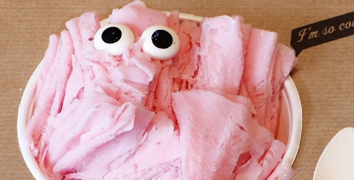
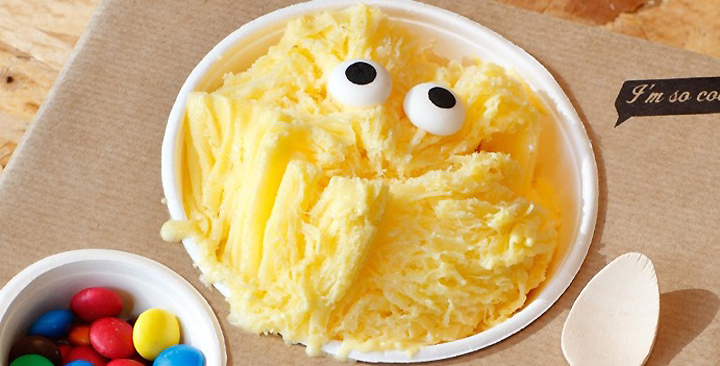
There was a certain level of complexity for two reasons: first, this type of ice is unknown in Europe, implying a teaching job to overcome initial logic distrust. On the other hand, from the aesthetic criteria about local food, this ice cream is not very attractive, but rather ugly: an amorphous mass of ice cream with lots of sauces and toppings falling above and the sides. The ice cream was so so ugly … we decided to make a virtue of it by creating a creative strategy around this.

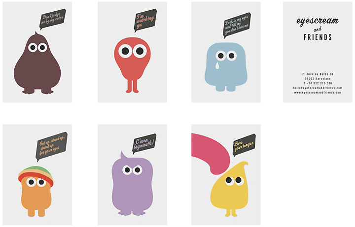
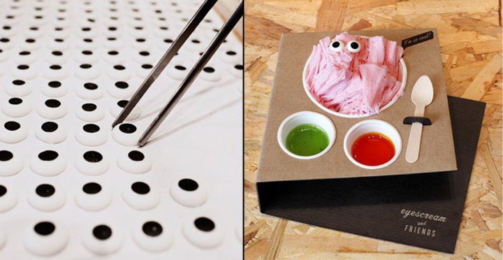
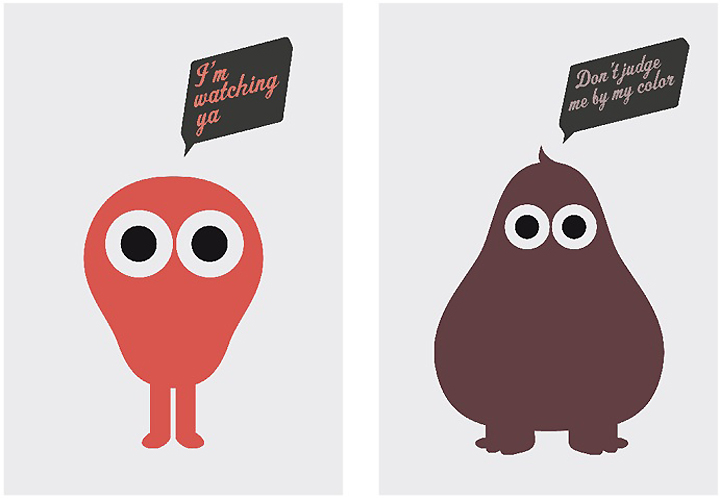
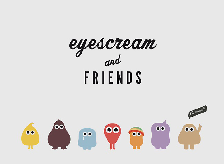
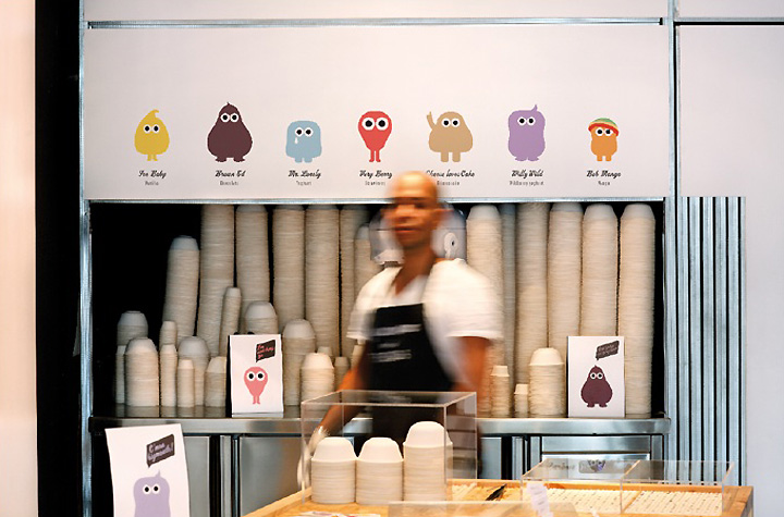
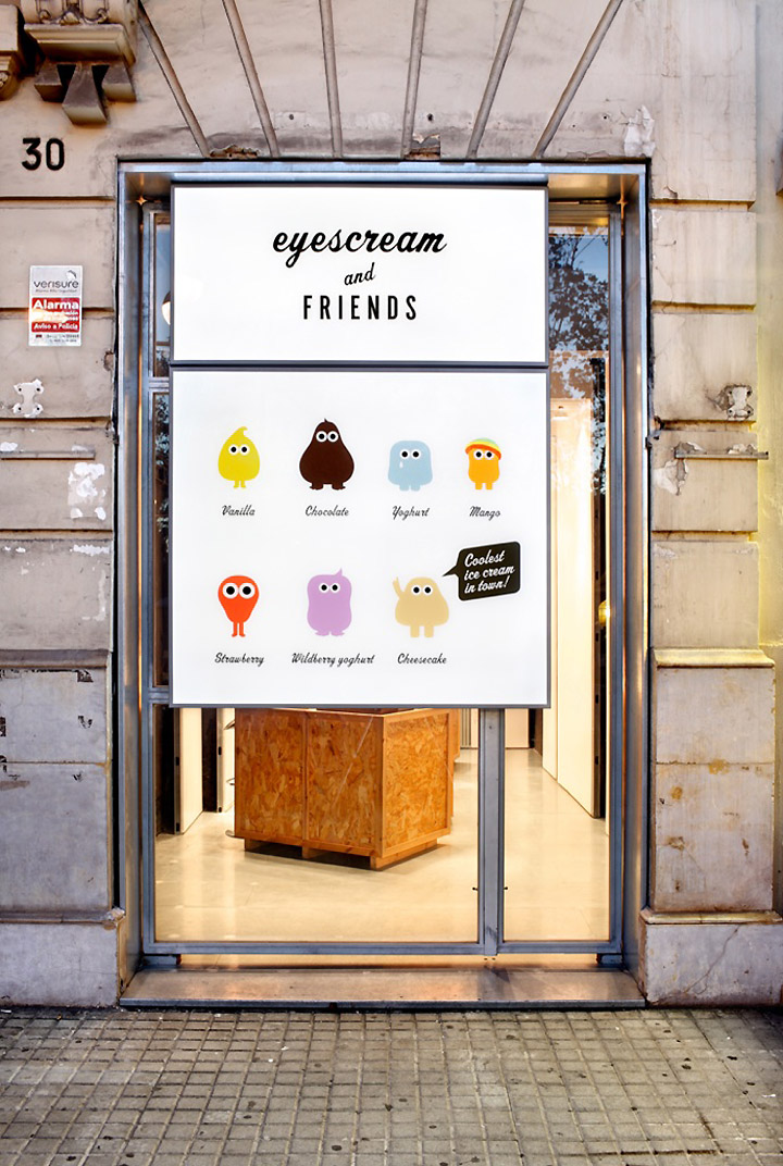
We worked up the product working closely with the client (Joad López and Federico Mendoza), that had at all times a receptive and constructive attitude. We started a “deconstruction”, separating the ice cream and toppings. As key creative twist, we put two sugar eyes on the top of this ice cream mountain, making it a character-monster that looks you in the eyes and immediately gives it life and personality. The effect you get with a some simple eyes is just amazing.

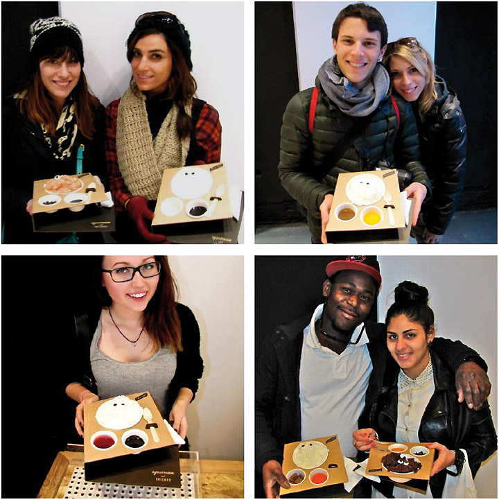
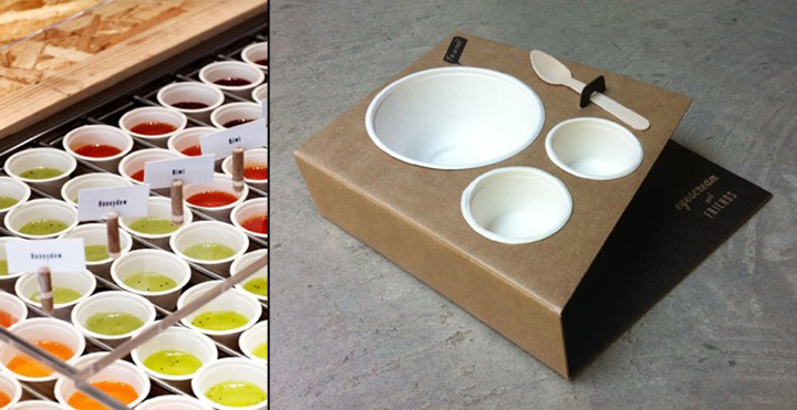
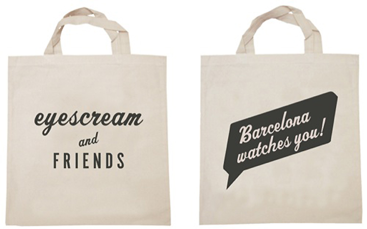
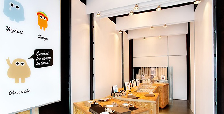
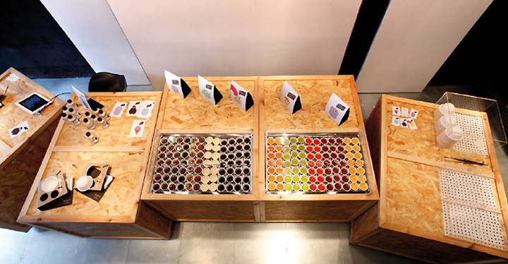
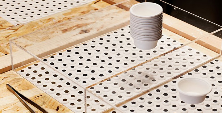
From there, the naming came almost alone: Eyescream, which in English is pronounced like ice cream, but also makes direct reference to the eyes. We invented a monster and a character for each flavor. Then we developed a very sophisticated packaging but with a very simple and economical construction: a kind of tray that fit the ice cream container and two containers for toppings (jam, chocolate sauce, caramel, etc.).

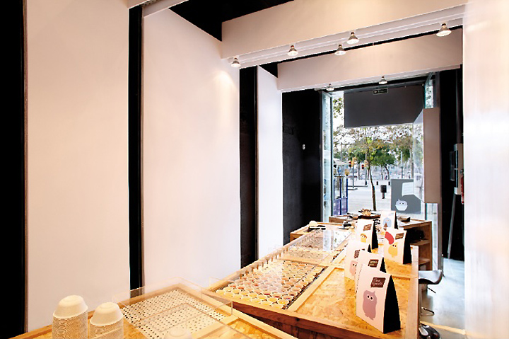
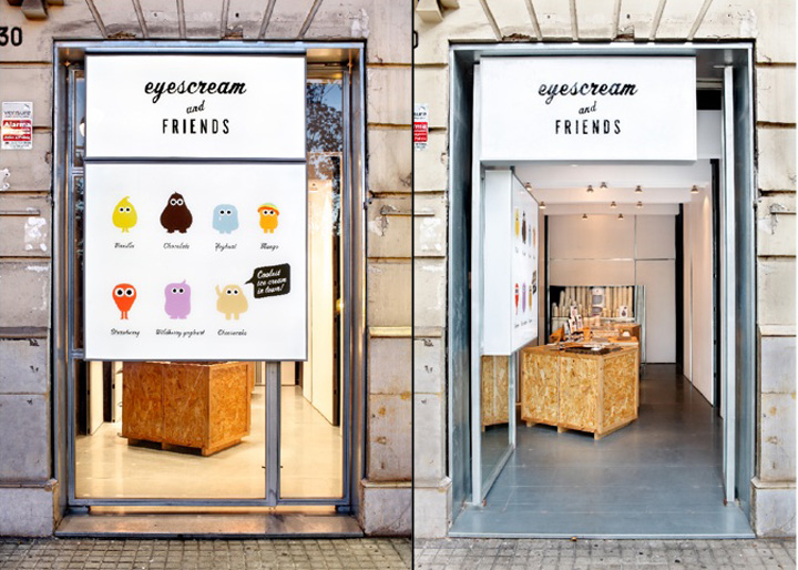
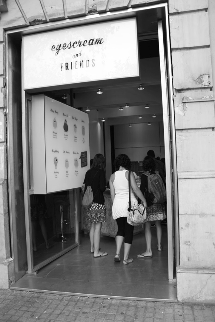
Being confronted with the actual location, we realized that the selfservice formula would best fit the product. We built wooden low cost boxes for selfservice, concentrating all the consumer experience. And we organized a fragmented facade, constructed from a large sign with “legs” that has the ability to break down into a number of signs, when open to the public. One for external identity and another, when opened, works as informative product menu.

Designed by m Barcelona
Client: Joad López, Federico Mendoza
Naming: Jorge Virgós
Production: Sandra Coll
Photographer: Daniel Loewe


Add to collection