![](https://retaildesignblog.net/wp-content/uploads/2023/05/MA420_BRAC_press-03-300x300.jpg)
![](https://retaildesignblog.net/wp-content/uploads/2013/04/Chiaro-packaging-by-Nolan-Marketti.jpg)
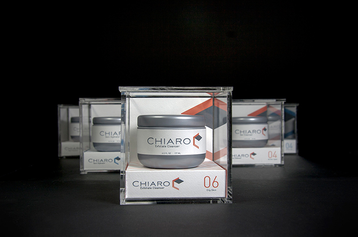
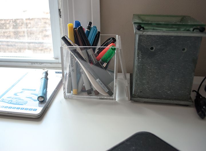
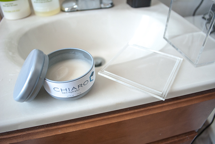
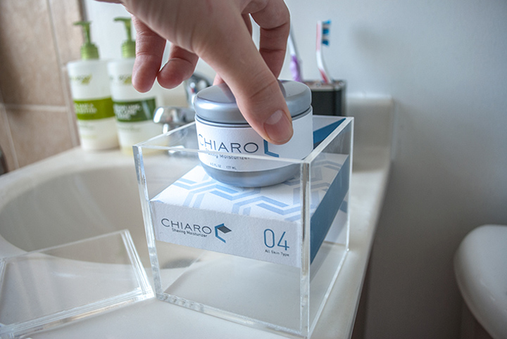
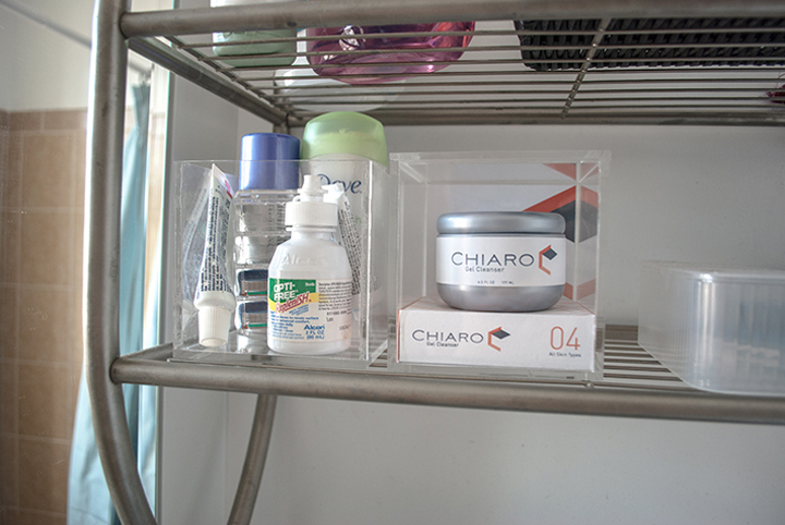
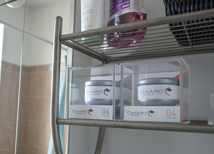
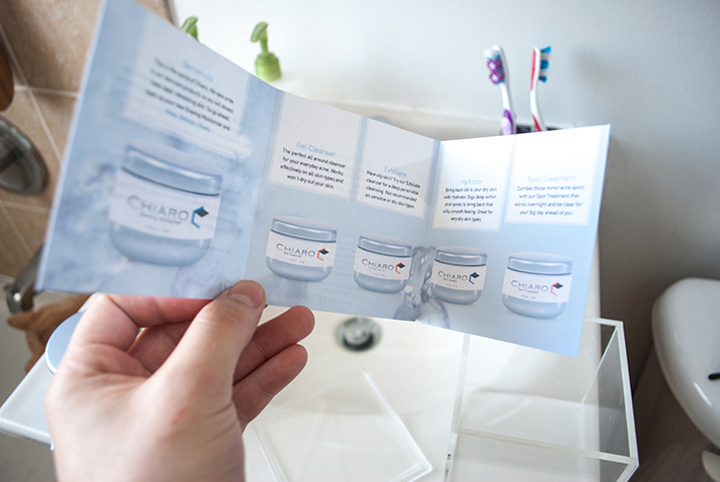
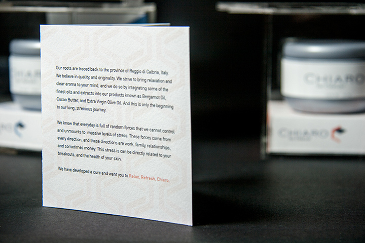
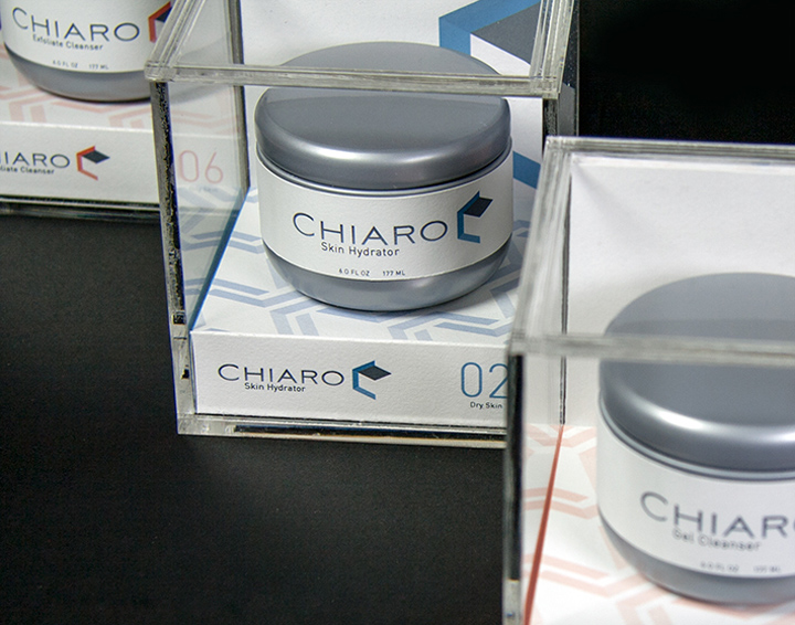
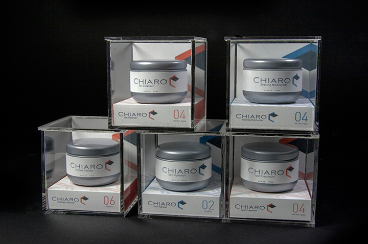
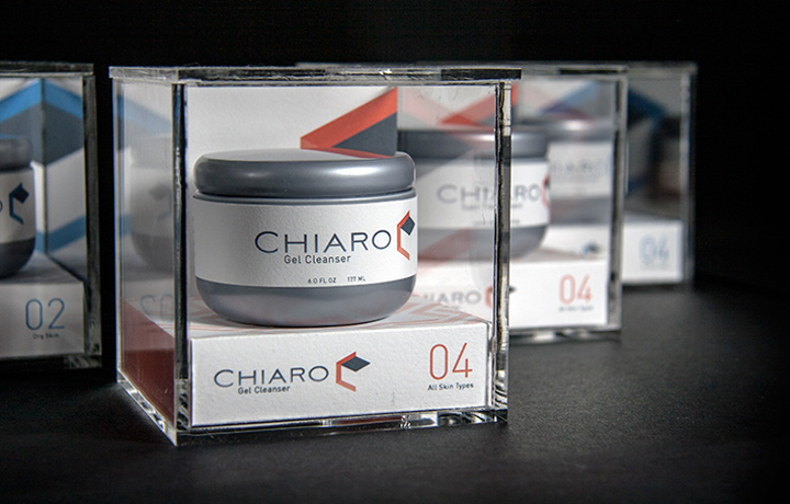
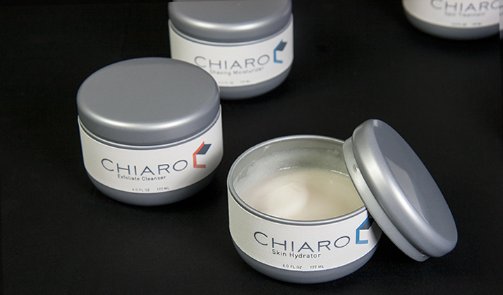
Chiaro is a conceptual package line that I have developed. Chiaro is the word for “clear” in italian and is the conceptual focus for this line. Being clear is what skincare is all about. I reflected this idea by choosing a Acrylic cube that encloses the silver tin. The base is magnetic, which holds the tin in place without it moving around inside the cube. This line has a very sophisticated look and feel, but is balanced with bright colors to create a friendly sensibility. The acrylic enclosure serves as a sustainable piece and is re-usable as a container to store various household items.
Designed by Nolan Marketti
![](https://retaildesignblog.net/wp-content/uploads/2013/04/Chiaro-packaging-by-Nolan-Marketti-12.jpg)
![](https://retaildesignblog.net/wp-content/uploads/2013/04/Chiaro-packaging-by-Nolan-Marketti-11.jpg)
![](https://retaildesignblog.net/wp-content/uploads/2013/04/Chiaro-packaging-by-Nolan-Marketti-10.jpg)
![](https://retaildesignblog.net/wp-content/uploads/2013/04/Chiaro-packaging-by-Nolan-Marketti-09.jpg)
![](https://retaildesignblog.net/wp-content/uploads/2013/04/Chiaro-packaging-by-Nolan-Marketti-08.jpg)
![](https://retaildesignblog.net/wp-content/uploads/2013/04/Chiaro-packaging-by-Nolan-Marketti-07.jpg)
![](https://retaildesignblog.net/wp-content/uploads/2013/04/Chiaro-packaging-by-Nolan-Marketti-06.jpg)
![](https://retaildesignblog.net/wp-content/uploads/2013/04/Chiaro-packaging-by-Nolan-Marketti-05.jpg)
![](https://retaildesignblog.net/wp-content/uploads/2013/04/Chiaro-packaging-by-Nolan-Marketti-04.jpg)
![](https://retaildesignblog.net/wp-content/uploads/2013/04/Chiaro-packaging-by-Nolan-Marketti-03.jpg)
![](https://retaildesignblog.net/wp-content/uploads/2013/04/Chiaro-packaging-by-Nolan-Marketti-02.jpg)