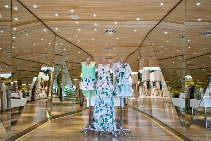
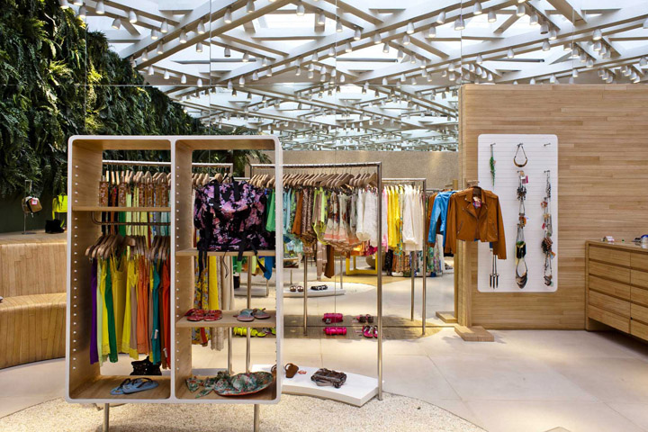

We converted this old house´s narrow access, with a low ceiling height, into a gallery inspired by a kaleidoscope, where a set of mirrors reflects the walls and ceiling. In the end of this path there is a more literal version of a kaleidoscope, where a highlighted production may be seen through a small hole on the wall.

The shape of this gallery was brought to the facade, where it can be seen through an iron frame inspired by traditional Brazilian wicker craft work. Although we use this texture as part of the brand identity in every one of the projects we designed for this brand (over 40 all over Brazil) it appears in a different and surprising way in every new project.

The backyard received a glass ceiling on a steel structure so the store could happen in this adapted garden, where the disposition of furniture and displays leads to a sinuous path, reinforcing its identity by the abundant natural lighting and a strong presence of green.
Designed by be.bo.
Photographs by Marcos Bravo
