Pharmacy Van Dijck by Zware Jongens, Bree – Belgium
posted by retail design blog on 2017-01-19
Schenectady
Add to collection

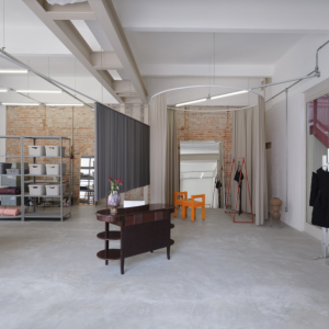
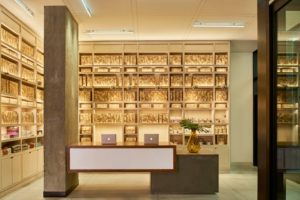
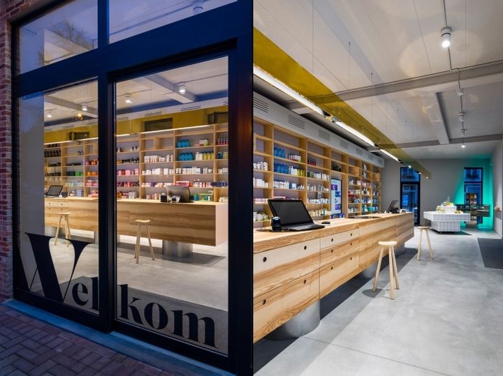
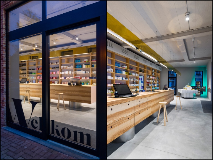
Concept agency Zware Jongens reimagined the traditional pharmacy to create this warm-toned space in Belgium that includes a refreshment station and “free-flowing” island counter. The Belgian agency got involved with the Pharmacy Van Dijck as it was moving from its home of 100 years to a new building down the street. Its vision for the pharmacy, located in the Flemish city of Bree, was of a space that customers would feel positive about spending time in. “There prevails more negativity than positivity in the majority of pharmacies,” said Filip Janssen of Zware Jongens. “The interaction is often impersonal and the environment is in most cases very stereotypical, from material to lighting and so on.”
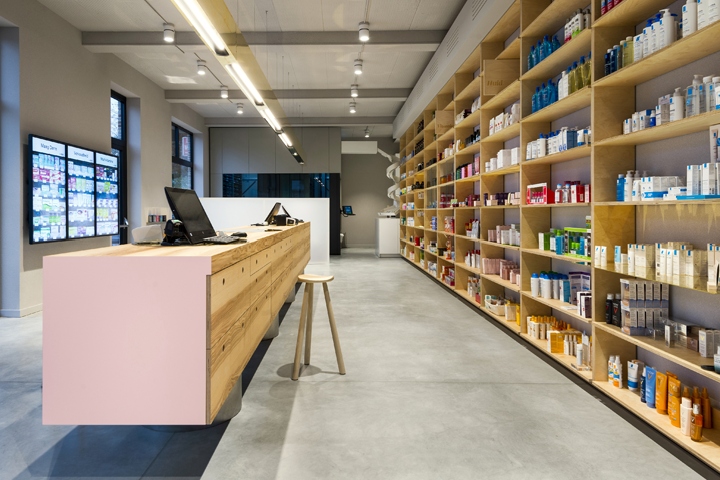
“In most cases people would rather be out as fast as possible.” Zware Jongens worked with pharmacy owner Joeri Van Dijck, London-based spatial designer Mark Pimlott and Delft-based architecture practice Hoek & De Wit to develop the concept. The design is centred around an island counter that customers can freely circulate around, standing next to the pharmacist if they wish. “We started off from a free-flow idea,” said Pimlott. “Basically everybody can walk where he or she wants.” “You no longer stand ‘at the cash register’, but if you want to you can stand next to the pharmacist at a central bar with top contact surfaces finalised in subtle rose.” Colour was a primal consideration in the design.
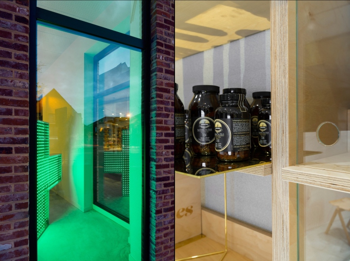
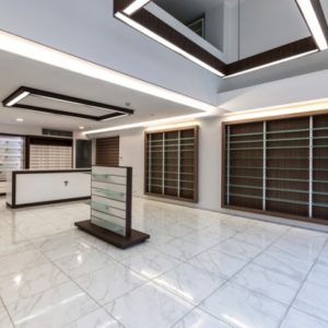
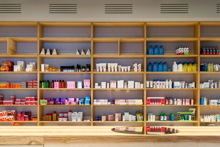
Noting that white, with its clinical connotations, was the usual choice for pharmacies, the design team chose colours that were warm and homely, but also related to good health. The space has birch-topped plywood cabinetry with rose pink and brass details, and an illuminated green cross by Eindhoven studio V3RS sits in one corner. A smaller, white-tiled counter on one side of the room holds jugs of fruit-infused water that invite customers to pause for refreshment. Only a limited selection of common pharmaceuticals is on display on the store shelves. The rest is stored away away in a discrete cubicle on one side of the store and accessed through an automated dispensing system. The pharmacist enters the order into one of the computers on the store counter, and the products are dispensed down a spiral slide on the left-hand side of the space.
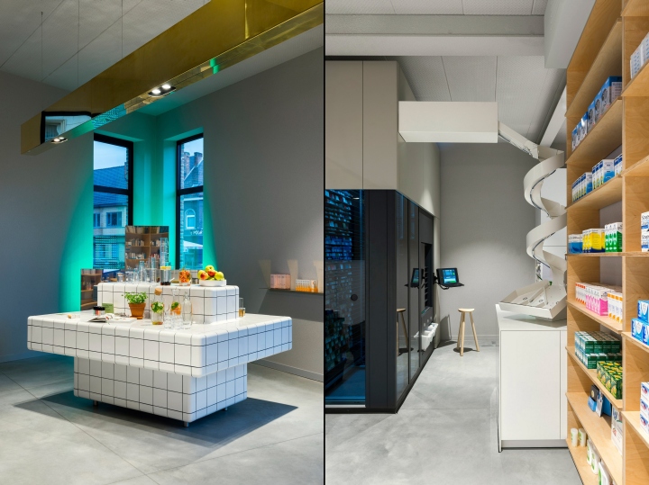
Although interaction with the pharmacist is encouraged by Pharmacy Van Dijck’s design, customers may also use the computer terminals themselves to access some over-the-counter medicines. The pharmacy is the latest example of a medical centre using interior design to create a more friendly and welcoming environment. One dental clinic in Taiwan was recently designed to make patients less afraid to go, while a dentist training centre in Australia based its design on natural materials with the aim of easing anxiety. Another pharmacy to take a similar approach is Fuji in Tokyo, which Japanese firm Hiroyuki Ogawa Architects designed with pale oak walls and muted furnishings aim to promote “tranquility and kindness”.
Design: Zware Jongens
Photography: Stan Koolen


Add to collection