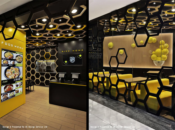

Located in Guangzhou City, China. “Rice Home”, a newly launched premium casual dining brand originated from Hong Kong, paid attention to the pursuit of superior rice quality, attentive and dedicated service, elegant and clean dining environment, emphasizing on unique and contemporary recipes, creatively blended modern and innovative food made with rice with diversification to meet the young and trendy customers’ needs, to pursue new stimulus from their dishes to interior design with style, highlighting and showing the charm of cosmopolitan in new era.

Four Lau and Sam Sum, Chief Designers of AS Design, used the shortest time to complete the design concept. They tried to get customers to have a visual impact and experience on this new casual dining brand, to expand the fun and design possibilities, but also to break the whole dull and boring culture of the industry.

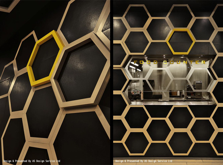
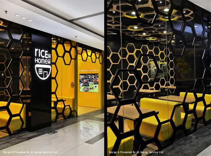
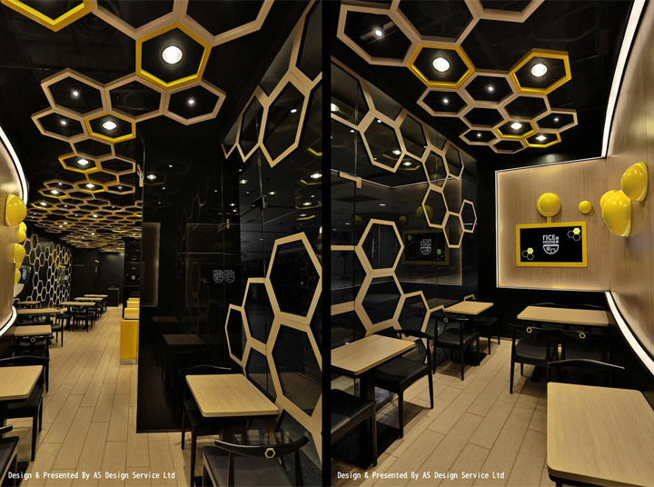
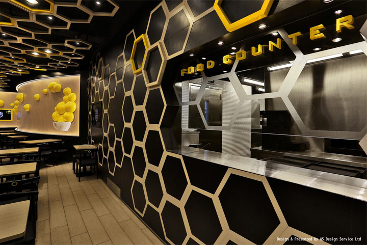
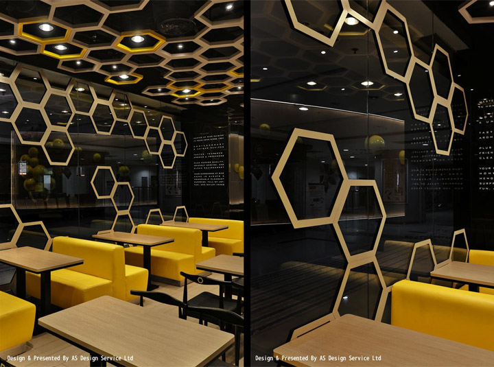
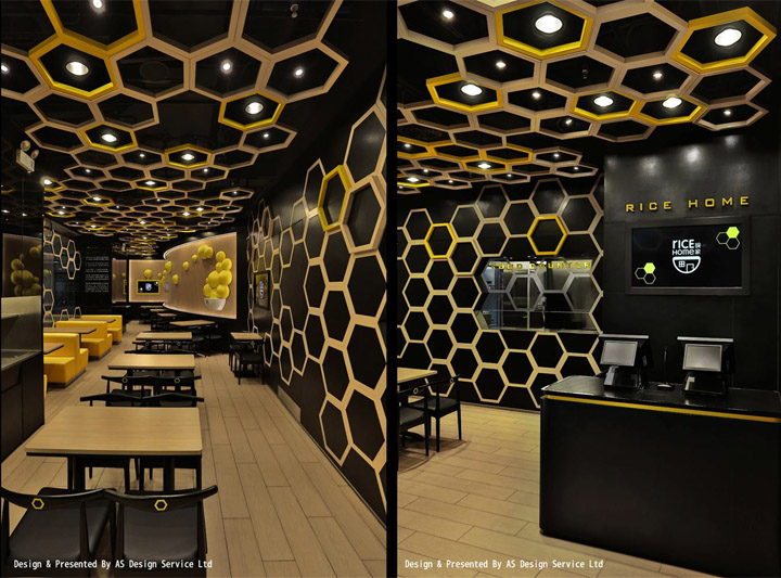
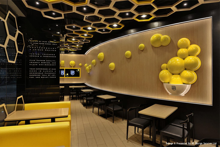
The design language is for young people to understand — “Hexagon & Bright Yellow” as a symbol, which is easy to think of beehive in nature. We distributed this natural structure in every corner, represents a dynamic “Home / Living space” and young & dynamic image of the brand, with the meaning of being hard working to delve into new food products.

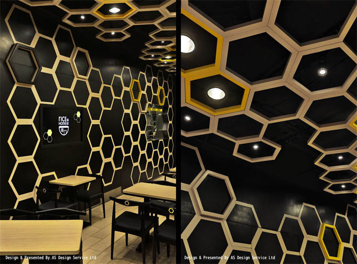
Irregular hexagons give customers the sense of dynamic, and also enhance spatial layering at the shop front, where 3—dimensional black hexagons are surrounded by the inner and outer increasing contrast in colors, which made the indoor dining space particularly warm.

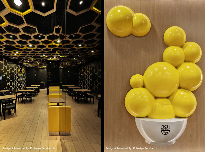
Interior walls were decorated with light—colored hexagons and black background, completely desalinated a huge wall, prompting a sense of space to an infinite extension. The 3—dimensional hexagons at the ceiling is to connect indoor and outdoor, with bright yellow and lighting effects that injects a huge 3—dimensional sense of tension into the small space and also hides all of the air conditioning.

The bowl—shaped sculptures at the curved wall create visual sense of food aroma and arouse appetite. The yellow spheres are symbolic of certain food elements / particles; it connect to the TVs are used to promote new food product. The food menus are demonstrated by TV to achieve the high—tech effect. Designers hope to use simple elements to create space diversity, activating the imagination and expectations of this fast food brand.
Design & Presented By AS Design Service Ltd
Photography by Sing Studio By Sum Sing
