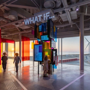

Global architecture firm NBBJ transformed their San Francisco location in early 2012 to be more flexible, transparent, and to better embody the company brand. In addition to improving their work experience, the firm used the opportunity to create an office that helps clients become educated and connect with the design process.
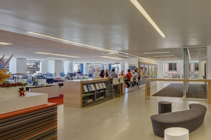
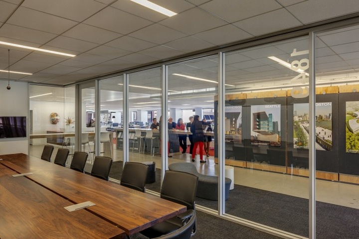
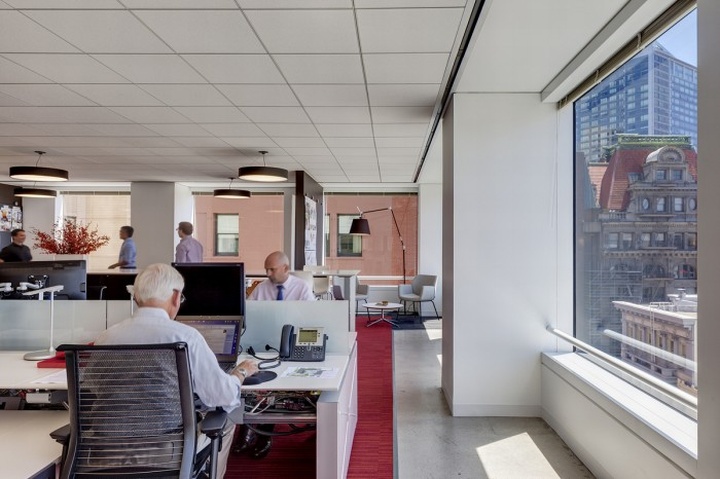
With the new office came the opportunity to implement a more flexible environment. NBBJ chose to provide staff with a variety of activity-based work spaces like collaboration bars, small and large meeting rooms, and unassigned hot zone seating in addition to their open-plan workstations. The variety of spaces allow for both individual work and quick collaborative efforts. The firm notes:

“By distributing the collaboration spaces throughout the work area and increasing the transparency and visibility of all types of activity, the general sense of collaboration and collective energy is heightened. These areas maximize space utilization, and can accommodate formal functions, like seminars and discussions, student classes and team charrettes, to spontaneous occurrences such as clients checking email, product displays and lunches, and social gatherings”
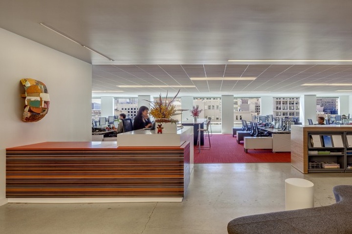
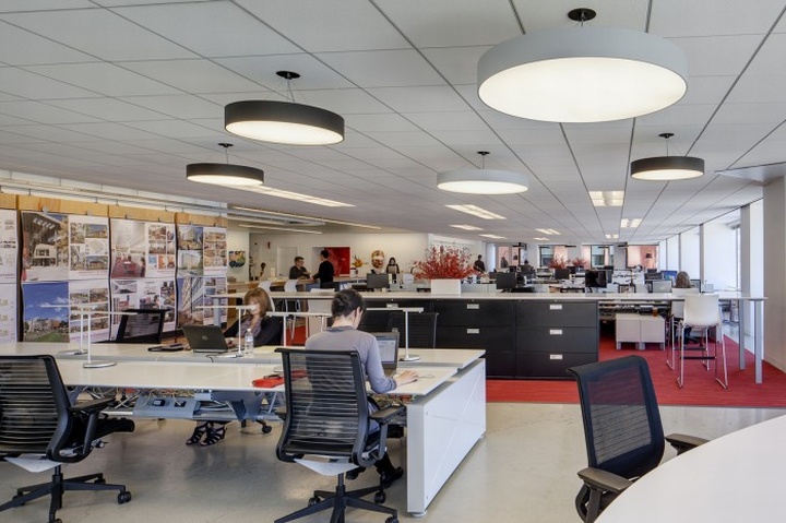
As an office where clients regularly visit, the new, more open style gives a much better understanding into the design process. The space also works to show how simple design choices can add more life and creativity into a work environment, without adding zeroes to the cost. An example is the staggered placement of standard light fixtures over the workstations which work to add some visual life to the space.
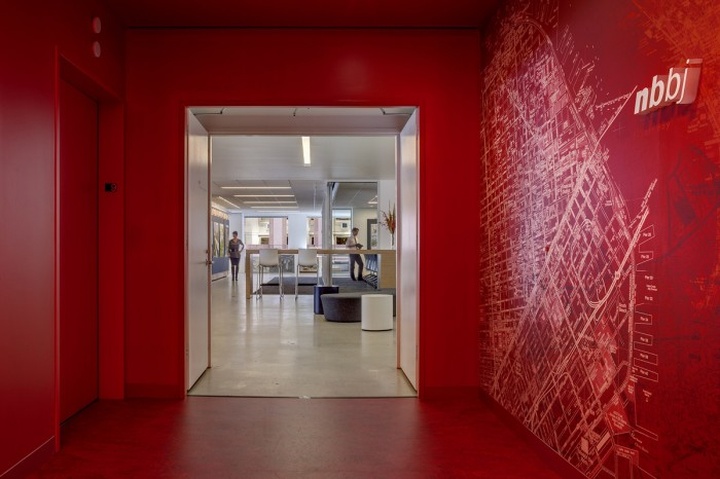
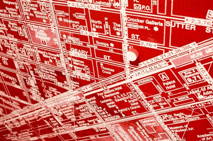
The driver of many of the design decisions in the project was the goal of bringing NBBJ’s brand into the workspace. One visual way branding came through was in the elevator lobby – NBBJ explains, “Visitors are greeted at the lobby by a deep but vibrant white-on-red, large scale, multi-layered map graphic depicting the firm’s eight worldwide locations, conveying global and local presence.” During my most recent visit to San Francisco, I was able to spend some time in the space and I found myself drawn into the office right from the start of the visit.

Having been occupied for just over a year, the team believes that the branding has been successfully infused beyond just the visual by designing a space that fosters company values like hospitality, communication, innovation, and equality. The project is also tracking LEED Gold.
Design: NBBJ
Project Team: Alan Young, PIC | Kaz Baba, Design Leader/Project Designer | Mee Lee, Project Architect | Bronwyn Paterson, Project Manager | Jennifer Hehemann, Designer | Matthew Ridenour, Designer | George Waters, Designer | Laurie Chambers, QA/QC | Tim Jones, IT | Eric Levine, Environmental Graphics | CJ Brockway, Lighting | Janet Samples, Move Coordination | Chris Dixon, Specifications | Sean Airhart, Photographer
Photography: Sherman Takata, Takata Photography
http://officesnapshots.com/2013/05/13/inside-nbbjs-open-and-flexible-san-francisco-offices/


Add to collection
