Replays store Titan plaza by David Torres, Bogota – Colombia
posted by retail design blog on 2013-07-10
Add to collection


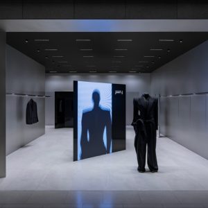
The renewed and growing interest in the development of “business architecture” to demanding that sports stores are based on an identity that communicates and characterize the meaning of the brand in the market with the sole purpose of providing a multidimensional experience and customer this begins with the same location of the project, which in turn is the major design challenge.

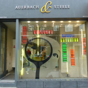
The initial location of the store faces a dilemma that is their own space blocked by a set of escalators within the largest circulation corridor shopping center and in turn tucked into a corner store that mimics within the set of structural elements. The challenge facing giving a part of the shop to attract customers and break the rhythm of flat glass facades commercial landscape creates a second showcase that attacks one of the directions of movement by overlapping planes that facilitate spatial identification from an optimal focal length.

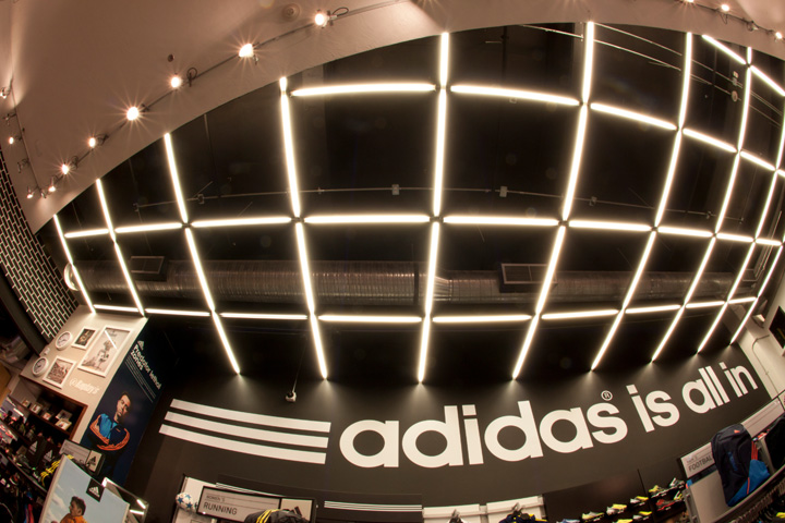
The store is defined by the diagonal of the façade by a set of brackets guideline defines the large diagonal identifiable design that takes to the ceiling and to the floor together with the mixture of materials divided into two areas inside the store (a sporting and other urban are brand identity). It generates a grid that becomes the basis of artificial lighting and breaks the rhythm of the diagonal to create a counterbalance to the ceiling plane to provide conceptual symmetry and balance within the space.

The dressing retake the subject of green grass for greater customer convenience, payment point maintains a prime location within the context since it is easily viewed from the entrance and exit of the customer to the store, the movement of the locker and access to the cellar, and in turn easily see the location of the space box from which you enter the store.

The vintage concept of the facade is iconic within the mall, balanced with the use of modern finishes like bright modern painting black polyurethane and the dazzling brightness to white warning highlighting the name of the store to create an optical illusion that creates customer recall.
Developed by David Torres


Add to collection