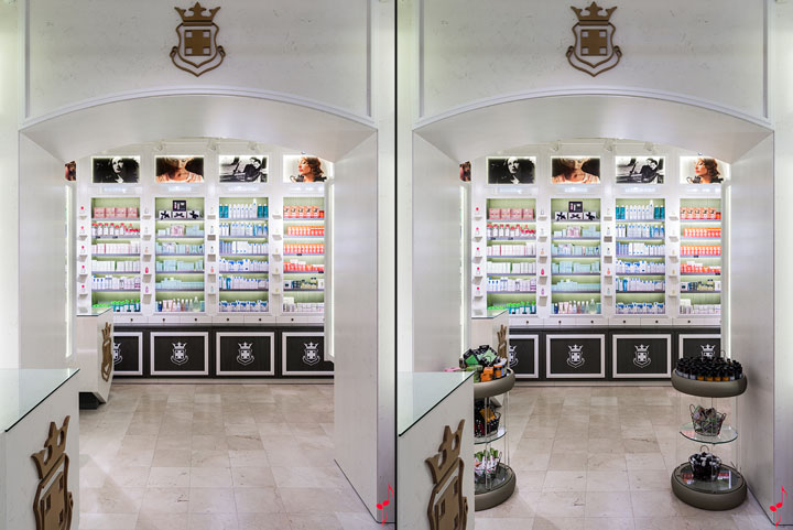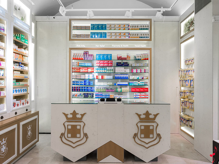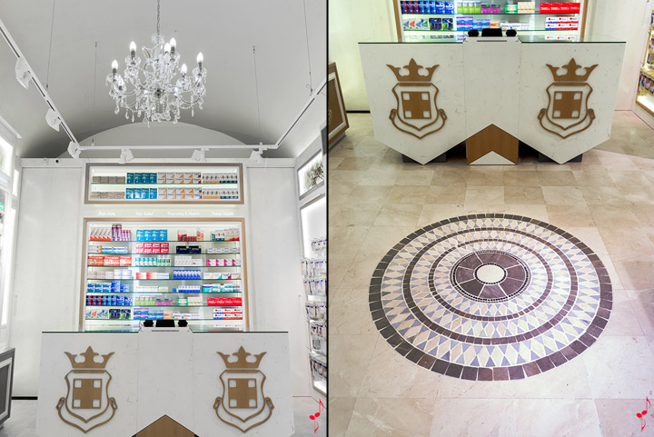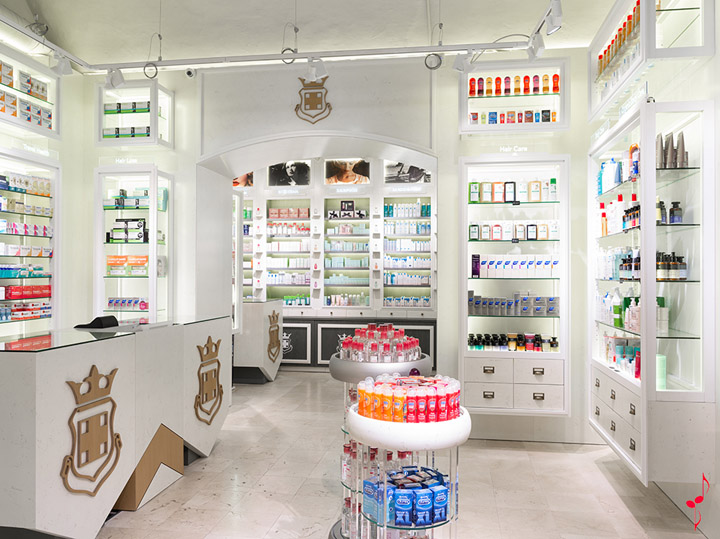


Everyone who’s visited it says it’s the most exquisite and elegant pharmacy they can recall. It is located in the Palau de Moja, a neo-classical aristocratic house built in 1774 whose current address is 118, on the corner of Portaferrisa, one of the most popular tourist sights in Barcelona. A Palace: this was our creative concept for the Palau Pharmacy, a new brand on the pharmacy scene.

A shop front with three entrances, just under 70 m2 divided up into three rooms of different sizes, a listed building and the need to display as much stock as possible for customers who are mostly foreign tourists, who we knew would most likely never set foot in the pharmacy again. This was our challenge.

As always, we paid special attention to all of the details involved in creating the sales atmosphere and product presentation: from the mosaic floor design, the art nouveau lamps, the layered lighting used to illuminate the products on display, then the labelling in English, graphic illustrations featuring plants and photographs of women, to the characteristic smells and fragrances associated with each of the three rooms: medicines, nature products and cosmetics.

“Vintage is In”. Nostalgia for authenticity, for the past that is all around us – this holds true for the foreign tourist more than anyone. The logo is inspired by the family’s ancient crests and by the aged wood panels that share the space with the yellow LED lighting, by the copper strongboxes with their centuries-old coats of arms. An old iron cabinet serves as the backdrop for creating window displays. Welcome to the Palau Pharmacy, after you madam.
Designed by MARKETING-JAZZ

