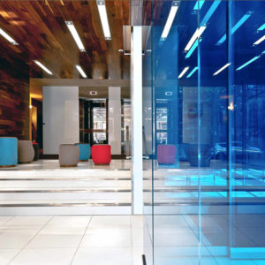


Women are key customers for shopping centers around the world. For them a trip to the mall should be a pleasant experience associated with a relaxing walk, not an exhausting marathon. The space of the Korona Kielce center was designed to satisfy their needs and to make shopping enjoyable. The project created by Dodoplan studio included a complete visual information system along with 3D media, infographics, multimedia elements and a parking information system.

The starting point for the studio’s concept were discarded pieces of the building’s facade. Hundreds of discs made of dibond taking up space in the Investor warehouse inspired us and soon transformed into three-dimensional trees created from 1896 elements.

The shadows of the trees became a model for the creation of graphics for the 2600 m2 walls for common spaces. Multicolored, raster print on the wallpapers livened up the walls of the corridors, giving the center a fresh, feminine character. The colors of the graphics: green, orange and blue, designate the different parking levels and are a significant element of the communication system.

The places of intensive use such as the ATM sites, thoroughfares and food court islands were coated with a special layer protecting from destruction. The visual information system and the information counters were designed with the use of Corian. Owing to the unique construction properties of this material, the elements created are light and self-supporting, referring to the architecture of the building in shape.
Design: dodoplan
Project: Wayfinding system, Wayfinding graphics, Signage, Car park signage /Parking Guidance System, Info desk, 2 600 m2 interior graphics, Furniture and decorative objects


http://plusmood.com/2013/04/public-space-for-women-by-women-dodoplan/
Add to collection
