

Add to collection
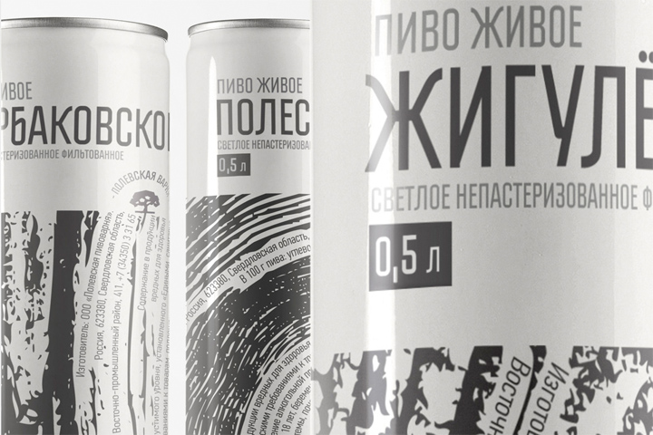

Beer package concepts are usually very beautiful. But in reality, the Russian’s law demands placing a lot of additional mandatory information on the bottle. And this becomes a problem, because sometimes this information occupies more than 50% of label space.

Looking on the brewery’s logo in a shape of a tree, we have chosen direction of eco-labels and used the texture of tree bark and felling. We embedded all mandatory information about consist and limitations to the natural wood texture, saving the visual harmony and purity of idea.
100% of mandatory information shown, 100% of idea saved, 100% not fake and already in stores
Agency: Red Pepper, Ekaterinburg, Russia
Creative Director: Danil Golovanov
Art Director: Ulia Uzkih, Irina Korotich
Copywriter: Artem Zverev


Add to collection